
Techniques
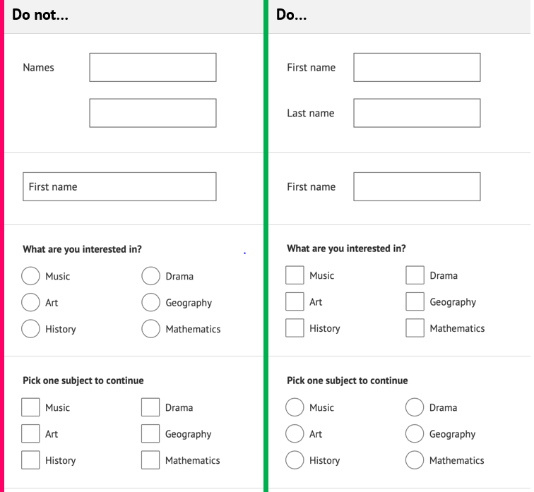
Ask only for the information you require
- Completing forms requires significant cognitive load. Users get tired quickly when filling in information, which can lead to errors, mis-information or very basic responses.
- If your form has a mix of optional and mandatory information each question must be marked accordingly, adding to the cognitive load.
Tip: check your form for any optional questions – do you really need to ask this information at this point or could you collect it later?
Make sure it is obvious which fields are required
- Use the ‘aria-required’ attribute to denote required fields. You can also use the HTML ‘required’ attribute, however note that in some browsers, any empty fields with this attribute may prevent form submission, so your validation may not happen and your error messages may not be triggered.
- Do not simply use a red asterisk next to the form label to denote a required field:
- an asterisk will be announced to screen readers as “asterisk”;
- an asterisk will need to be defined somewhere on each page, close to the form – if your form is long this key may not be obvious.
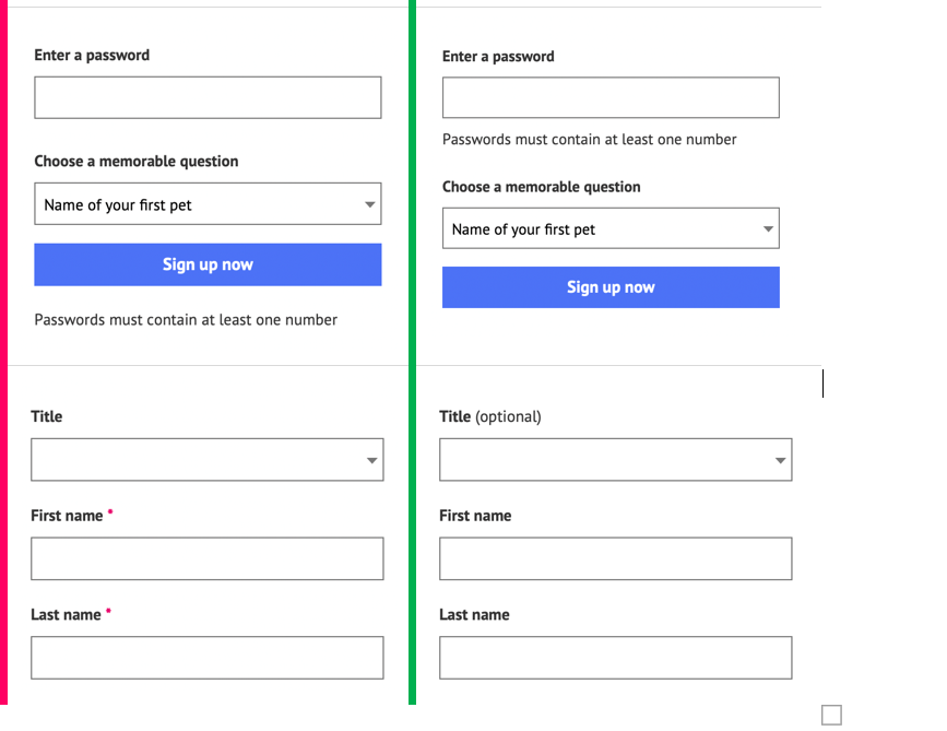
Tip: rather than specifying required fields visually, consider a) informing the users that most questions are required, and b) specifying optional fields instead, using a text suffix to the question, for example, ”Title (optional)”.
Create a clear path through the form
- Use a single-column layout; avoid multi-column layouts unless absolutely necessary;
- Large groups of radio buttons and checkboxes can be laid out in two or three columns to make better use of the screen real estate. Be aware that these elements will have to appear in a single column at mobile breakpoints so ensure you do not have too many options in one question.
Make your form is accessible by keyboard alone
- Provide alternative input options for complex form elements, such as allowing direct text input for date entry so users do not have to use a complex date picker.
Make sure ALL form elements have a label – this is non-negotiable!
- Every single or multiline text box, drop down list, radio button and checkbox must have a label. This is so assistive technology, such as screen readers, can tell users what they need to input into or select from the form fields they are presented with. Without a label, it is not possible to accurately complete a form;
- All form labels must be clear, succinct, sensible and unambiguous. Use simple language and be direct in what you are asking users to input or select;
- Make labels unambiguous. For radio buttons and checkboxes, try to make the label text self-explanatory, for example 'Yes, I have read the terms and conditions' rather than just 'Yes';
- Never use a ‘placeholder’ as the only form label. While they are recognised by some screen readers they are not a substitute for a label and, critically, once a field has been typed into the placeholder is no longer visible.
- Users with memory problems such as dementia, and users with cognitive disabilities rely on permanently visible labels to remember what each field is asking of them. Relying on placeholder text makes checking the form for errors very difficult for users.
- Default placeholder styles also frequently fail contrast ratio guidelines;
- If an input does not have a visible label because its expected input is obvious from the design, layout or proximity to other similar input fields – such as a search box, where the label is implied by the ‘Search’ text on the corresponding button – you must still include a label, although it is acceptable to hide it visually. There are several approaches you can use:
- The preferred option is to use a <label> element. You can use CSS to hide it from view;
- Alternatively, you can use aria-label=”text-goes-here” to provide a label which will be read out by screen reader users;
- If an appropriate label already exists in text on the page and it is contained on its own, in an element with an id, you can use aria-labelledby=”id-of-element-with-appropriate-text” to provide a label which will be read out by screen reader users;
- You can also use aria-describedby to associate help text or instructions with form fields – see WebAIM’s Advanced Form Labelling page;
- If you are using aria-labelledby, make sure this label includes the text of the visible label, so that users with impairments can rely on the visible label as a means to interact with the form element.
- Note: users who are less digitally literate, or who have cognitive impairments may not be able to determine the purpose of an input field from its associated iconography alone, so a visible label is always recommended. Visible labels allow users who use voice input to navigate, to interact with form elements more easily.
Place labels above input fields and to the right of radio buttons and checkboxes
- Labels should be explicitly associated with their form fields to avoid ambiguity;
- Placing labels above input fields reduces the need to rework the page structure at lower breakpoints;
- Positioning labels above input fields also reduces scanning time and improves accuracy.
Always use the most appropriate form element for the question
- If it requires a few, free-text words, such as a name or street, use a text input box;
- If it requires selecting any number of options from a pre-defined list, use checkboxes;
- If it requires selecting a single option from a pre-defined list:
- use radio buttons if you have fewer than 7 or 8 options;
- use a dropdown if you have a large number of options, or if the default option is the recommended one.
Make use of auto-complete
When a browser or screen reader understands the type of data an input field is anticipating, it has the potential to call on information already stored on the system or browser, to ‘auto-complete’ the field. This has significant benefits for users who have problems with dexterity.
Additionally, assistive technology is capable of displaying additional icons or labels that a user may have specified to help users with visual or cognitive impairments better understand what the form wants from them.
Here is a list of input purposes that can be used with the 'autocomplete’ attribute when form fields collect information about the user. See also Understanding SC 1.3.5 Identify Input Purpose.
Keep forms short and break them into manageable sections
- Be succinct – only ask for the information you need. A good way to test for this is to see how many ‘optional’ questions you have included. If any questions are optional then you should consider removing them;
- Split long forms into logically separate pages and allow users to move freely between pages;
- Indicate users’ progress through the form – for example, Step 2 of 4 – and allow them to navigate back and forth between pages – this is a hierarchical list so should be coded as an order list <ol>
- Make sure each section has an accurate and accessible name.
- If using a fieldset, make use of the <legend> element; otherwise, use a heading.
Group similar items together and order questions logically
Often there will be a number of input fields in a form that relate to each other, such as name and title fields or address fields – make sure you group these questions together. Groups of questions should be coded in a way that is accessible to screen readers. You can use the <fieldset> element or the aria-role=”group” attribute to group form items that belong together.
Using <fieldset> to group items
- Use a <legend> element to provide the title for a <fieldset>
- Use CSS to style the <fieldset> and <legend> items appropriately – you can remove all styling from these elements if necessary, however it will help users understand the nature of question blocks if you do communicate their grouping visually.
- If you have a lot of options in a dropdown you can also arrange these into groups with titles, using <optgroup>, to make them easier to read.
- Nested fieldsets can become complex to convey to users. If your form has several nested fieldsets, consider breaking your form up using headings instead (of the outer fieldset) or splitting your form over more than one page.
Using the ARIA group role to group items
- Use aria-label to provide the title for the group
- Nested groups can become complex to convey to users. If your form has several nested groups, consider breaking your form up using headings instead (of the outer group) or splitting your form over more than one page.
Do not add a “Reset” button to your form
Reset buttons are almost never necessary and carry a very high risk as they can easily be selected by mistake.
Do not automatically advance the cursor to the next field when the preceding field has been completed
Automatically moving the focus to the next field can confuse screen reader users as they will naturally tab to the next field themselves – changing focus will most likely result in screen reader users missing form fields, causing errors.
This approach is often seen where a number or reference is made of several numbers or characters, for example a bank sort code; a gift voucher with a long number, split into groups of four digits.
Do not submit a form or move to the next page unless the user has specifically performed that action
Only a button or link at the end of the page should move the user through the form. Do not use selections in dropdowns, radio buttons or checkboxes to advance forms or pages automatically.
Remember, this is a cross-team effort
- Labels must be associated with their respective form element – this is your responsibility, along with appending any help text to labels and coding the grouping of form elements – see examples;
- Instructions and help text are key to users being able to successfully complete forms – help text must look like it belongs to the form element without disrupting the flow of the form. Form design should be handled by your design team and content producers may be able to help with instructions and text that helps users recover from errors.
Code examples
Using native HTML to provide a label for a form field
- <label for="password">Enter a password</label>
- <input type="password" id="password" />
Using aria-label to provide a label for a form field
- <input type="password" aria-label="Enter a password" />
Using aria-labelledby to provide a label for a form field
- <p id="password-label">Enter a password</p>
- <input type="password" aria-labelledby="password-label" />
Using aria-describedby to associate help with a form field
- <label for="password">Enter a password</label>
- <input type="password" id="password" aria-describedby="password-help" />
- <span id="password-help">Passwords should be 8 characters or more</span>
Using native HTML to group form questions
- <fieldset>
- <legend>Your name</legend>
- <div>
- <label for="title">Title</label>
- <input type="text" id="title" />
- </div>
- <div>
- <label for="first-name">First name</label>
- <input type="text" id="first-name" />
- </div>
- <div>
- <label for="last-name">Last name</label>
- <input type="text" id="last-name" />
- </div>
- </fieldset>
Using ARIA to group form questions
- <div role="group" aria-labelledby="your-name">
- <p id="your-name">Your name</p>
- <label for="title">Title</label>
- <input type="text" id="title" />
- <label for="first-name">First name</label>
- <input type="text" id="first-name" />
- <label for="last-name">Last name</label>
- <input type="text" id="last-name" />
- </div>
Examples of good and bad form design
Table 1 - What to and what not to do when designing form
References
WCAG 2.1
- 1.1.1 Non-text Content (A)
- 1.3.1 Info and Relationships (A)
- 1.3.5 Identify Input Purpose (AA)
- 2.4.6 Headings and Labels (AA)
- 2.5.3 Label in Name (A)
- 3.2.2 On Input (A)
- 4.1.2 Name, Role, Value (A)
EN 301 549 v 2.1.2
- 9.1.1.1 Non-text Content
- 9.1.3.1 Info and Relationships
- 9.1.3.5 Identify Input Purpose
- 9.2.4.6 Headings and Labels
- 9.2.5.3 Label in Name
- 9.3.2.2 On Input
- 9.4.1.2 Name, Role, Value