
Table of Contents
Foreword
Introduction
Glossary of Terms
Written Communication
Spoken and Signed
Spoken and Signed Communication
Communicating with persons who are d/Deaf or those who are hard of hearing
Dealing with difficult situations
Digital Communication
Digital and Web Based Communication Guidance
Web Content Accessibility (WCAG) 2.1
Designing and Developing Usable Websites
Accessibility based on WCAG 2.1
Apps for Smart Phones and Devices
Communication Design Question Sets
Foreword
I am delighted to welcome publication of the updated and newly titled ‘Customer Communications Toolkit for Services to the Public — A Universal Design Approach’. This edition includes improvements made as a result of user feedback, and updates to reflect recent changes in legislation and terminology. These latest updates ensure the toolkit continues to be a vital resource to support the design of trusted, effective and accessible communications.
Since its initial publication in June 2017, the Toolkit has improved how we communicate with customers. It helps to ensure we provide services that are accessible to everyone. The Toolkit has been widely used across the Public Service to inform planning, training and procurement, and to guide suppliers when providing services on behalf of, or to, public service organisations.
The Toolkit explains the importance of simple, clear language for effective communications. It contains guidance on written, spoken and signed communications, plus specific guidance on designing forms, documents and signage. It also highlights the importance of offering communications in more than one format. In addition, it provides guidance on developing and maintaining high-quality online services, which are user-centred, regularly updated and easy to navigate.
The Civil Service Renewal 2030 strategy provides a clear commitment to bring service users to the centre of everything we do, so that our services are more accessible, effective and better value for money. This updated Communications Toolkit is one of a number of initiatives which supports us to achieve these goals and to deliver customer-focused, innovative services to the public. I am confident these commitments will feature prominently in the forthcoming programme of transformation for the wider Public Service, and the Toolkit will be an important support as we implement continued transformation.
I am especially pleased that the Toolkit continues to be an example of successful collaboration in the Public Service. I would like to thank the Centre for Excellence in Universal Design (CEUD) at the National Disability Authority (NDA) for their dedicated work in developing this edition with the Public Service Transformation Delivery team in the Department of Public Expenditure NDP Delivery and Reform.
I would also like to recognise the work of the Quality Customer Service Network and Steering Group, made up of Public Service representatives, in ensuring continuous improvement in the standard of services we provide, and for their input in developing this update. Finally, I would like to thank the many sectoral experts and representative bodies who helped shape this latest edition of the Toolkit, including the National Adult Literacy Agency (NALA).
The guidance in this Toolkit supports our public service to deliver better services which adhere to the guiding principles of Quality Customer Service. The Toolkit supports organisations to ensure all communications created by them (or on their behalf) are accessible. Importantly, by applying the guidance in the Toolkit, public service bodies and others can demonstrate they are meeting their statutory obligations.
I encourage anyone engaged in providing services to the public, either direct or contracted, to use this updated edition of the ‘Customer Communications Toolkit for Services to the Public’. This will ensure that, together, we continue to provide excellent services to the people of Ireland.

Paschal Donohoe, T.D. Minister for Public Expenditure, National Development Plan Delivery and Reform

Ossian Smyth, T.D. Minister of State for Public Procurement, eGovernment, Communications and Circular Economy
Introduction
Welcome to the updated and newly titled Customer Communications Toolkit for Services to the Public — A Universal Design Approach. This Toolkit replaces the 2019 version. It now reflects feedback from users and changes in legislation and terminology.
The guidance in this Toolkit complements the Plain English Style Guide for the Public Service developed by the Department of Public Expenditure, National Development Plan Delivery and Reform in partnership with the National Adult Literacy Agency (NALA).
This Toolkit has design guidance on communication under three areas:
- written
- spoken and signed
- digital
Who is this Toolkit for?
This Toolkit is for organisations who provide services to the public. It is for communications managers, content writers, editors, people who work in customer services, trainers and suppliers (including designers) who are committed to applying a Universal Design Approach.
What is a Universal Design Approach?
Universal Design is about creating an environment that can be accessed, understood and used to the greatest extent possible by all people, regardless of their age, size, ability or disability. A Universal Design Approach can improve the outcomes of any design process by prioritising the user needs of people with more diverse characteristics, capabilities and preferences. Design process guidance relevant to communication design on engaging with disabled people and on prioritising diverse needs can be found in the guidance Participation Matters and in Designing our Public Services.
Why is this Toolkit important?
The public expects to receive the best possible customer experience when they contact the Public Service, no matter what form that communication takes. That is why it is important for organisations to provide communications in more than one format where possible and be prepared to offer alternate formats on request. Statutory obligations also require that communications do not exclude or discriminate. At the end of this introduction, you can find a list of statutory obligations related to communications.
The goal of this Toolkit is to help you ensure that the communications you create, procure (buy) or provide can be accessed, understood and used by everyone. A Universal Design Approach helps organisations address their obligations.
What are the benefits of using a Universal Design Approach?
By applying a Universal Design Approach to customer communications, you can:
- make information accessible to everyone
- improve trust in your organisation
- reduce miscommunications and misunderstandings
- reduce repeat requests for information
- improve customer satisfaction
- save time and money
How do I use this Toolkit?
You can read this Toolkit from beginning to end or you can dip in and out of it for specific guidance. The Toolkit has a glossary, hyperlink functions to aid navigation, checklists for quick self-assessment and Tools, Tips and Learn more boxes that link out to additional information.
The Toolkit has been designed and prepared to help you:
- plan your communications
- train your staff and inform your suppliers
- procure (buy) communication products and services that are accessible to everyone
Public bodies are required to specify accessibility as a mandatory requirement when procuring communications products and services. They can do this by including accessibility criteria as part of the technical specifications or in the award criteria, or both. Where accessibility standards exist, public bodies are expected to use these as the basis of the accessibility criteria.
The Public Sector Equality and Human Rights Duty
Public bodies must also adhere to the Public Sector Equality and Human Rights Duty in Section 42 of The Irish Human Rights and Equality Commission Act 2014. It places a statutory obligation on public bodies to eliminate discrimination, promote equality of opportunity and treatment for staff and persons to whom it provides services. It also protects the human rights of staff and service users. This Act also requires public bodies to assess, address and report on human rights and equality issues in their strategic plans and annual report. Inclusive communication is key to meeting these obligations.
Learn more
Irish Human Rights and Equality Commission have developed an introductory eLearning module on Equality and Human Rights in the Public Service.
Some statutory obligations related to communications
Directive 2014/24/EU (Procurement)
Directive 201425/EU (Procurement)
European Accessibility Act 2019
EU Web Accessibility Directive 2016
Official Languages (Amendment) Act 2021
Public Sector Equality and Human Rights Duty 2019
United Nations Convention on the Rights of Persons with Disabilities 2006
Some standards and guidance related to communications
Standards:
I.S. 374:2019 Customer Communications for Utilities — A Universal Design Approach
Guidance:
Appropriate Terms to Use about Disability
Guiding Principles of Quality Customer Services
Plain English Style Guide for the Public Service
Connecting Government 2030: A Digital and ICT Strategy for Ireland’s Public Service
Glossary of terms
Accessibility — extent to which products, systems, services, environments and facilities can be used by people from a population with the widest range of user needs, characteristics and capabilities to achieve identified goals in identified contexts of use. [Sourced ISO 21902].
Accessible meetings and events — organising meeting and events so that everyone can participate. The World Wide Web Consortium (W3C) has guidance on making meetings and events accessible. Find more information at Accessible meetings and events
Alternate formats — different ways of presenting information and conducting communication. Find more information at Alternate formats
Braille is a system of raised dots. It is the primary literacy medium for people who are blind, deafblind, or have severe low vision. There are different types of Braille that may be requested.
Described Video is when a narrator reads action scenes and on-screen text.
Digital Audio can be in MP3 format, with human voice.
ePUB is an electronic book format.
E-Text a document that is read in digital form.
Large Print is print enlargement on paper.
Video Captioning is the translation of audio into subtitles that usually appear on the bottom of the screen.
Alternative (Alt) Text — text associated with images or media that conveys the same essential information as the image. Screen readers announce alternative (Alt) text in place of images. Find more information at Alternative (Alt) Text
Assistive Technology — equipment, product system, hardware, software or service that is used to increase, maintain or improve capabilities of individuals. [Sourced ISO/ IEC Guide 71:2014/ 2021].
Colour Contrast Analyser — is a tool that examines the contrast between two colours and evaluates the contrast levels. Find more information at Colour Contrast Analyser
Communication — includes languages, display of text, Braille, tactile communication, large print, accessible multimedia as well as written, audio, plain-language, human-reader and augmentative and alternative modes, means and formats of communication, including accessible information and communication technology. [Sourced Article 2 of UNCRPD].
Easy to Read — is shortened and simplified text that is supported by images. The images help explain the text making it easier to read and understand. Find more information at Easy to Read
Irish Sign Language (ISL) — is the sign language used by the majority of the Deaf community in the State. [Sourced ISL Act 2017]. Find more information at Irish Sign Language
Irish Text Relay Service (ITRS) — translates text into voice and voice into text. Find more information at Irish Text Relay Service
Plain language — A communication is in plain language if its wording, structure, and design are so clear that the intended readers can easily find what they need, understand what they find, and use that information. [Sourced The International Plain Language Federation]. Find more information at plain English and plain Irish
Public Sector Duty — The Public Sector Equality and Human Rights Duty places a statutory obligation on public bodies to eliminate discrimination, promote equality of opportunity and protect the human rights of the public sector staff and service users and inclusive communication is key to meeting these obligations. Find more information at Public Sector Duty
Quality Customer Service Initiative (QCSI) — aims to improve design and delivery of public services and how public service organisations engage with customers. It is based on 12 ‘Guiding Principles’ for Quality Customer Service, which underpin the design and delivery of all public services in Ireland. The Quality Customer Service Network develops, promotes and implements the QCSI. [Sourced gov.ie].
Readability checker — is a tool that generates a score to show how easy it is for a reader to understand written text. Find more at page 81
Universal Design — is the design and composition of an environment so that it can be accessed, understood and used to the greatest extent possible by all people, regardless of their age, size or disability. Find more information at Universal Design
Web Accessibility — means that websites, tools and technologies are designed and developed so that people with diverse abilities can use them. [Sourced W3C]. Find more information at Web Accessibility
Written Communication
Written Text Guidance
Below are some key considerations for designing written communication. Clear written communication can improve communication with your customers and members of the public.
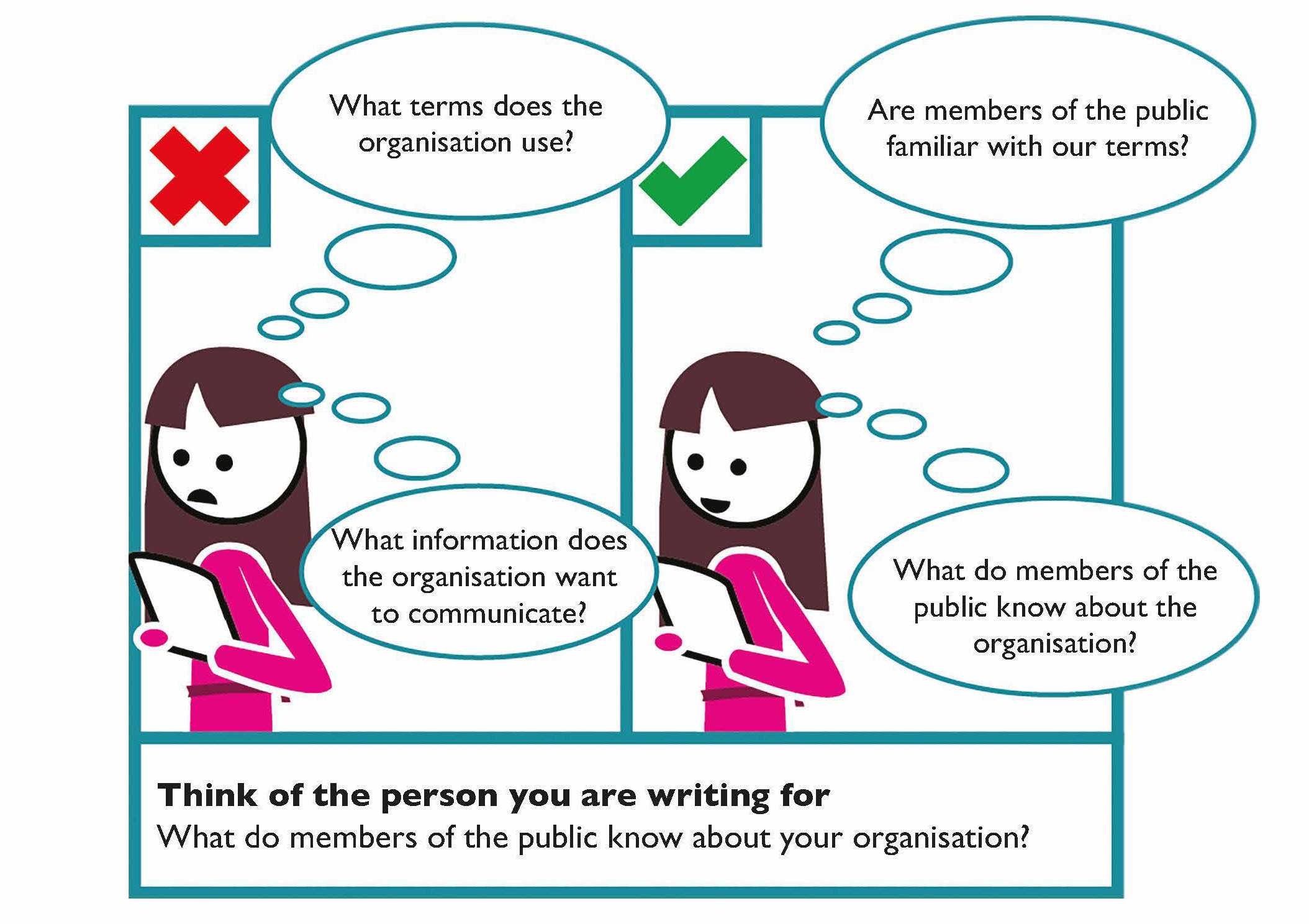
The way you communicate with members of the public is very important; your tone, the words you use and the way you write matters. It is important to think about whom you are writing for (members of the public) and what they know about your organisation (particularly their familiarity with the technical terms you may use).
Think of the person you are writing for
- What background information do they know about your organisation?
- Are they familiar with the technical terms your organisation uses?
- How will they read the document? Will they just skip to the section of interest to them?
Learn more:
The Official Languages (Amendment) Act 2021 was enacted in December 2021 and amends and extends the Official Languages Act 2003. This legislation sets out the duties of public bodies regarding the provision of services in Irish and the rights of the public to avail of those services.
Further Guidance on the Official Languages Acts 2003 and 2021 is available on the website of An Coimisinéir Teanga.
Alternate formats
Alternate formats are different ways of presenting information and conducting communications. Some examples of alternate formats, described in the glossary, are:
- Braille
- Described Video
- Digital Audio
- ePUB
- E-Text
- Large Print
- Video Captioning
Make text easy to read and understand
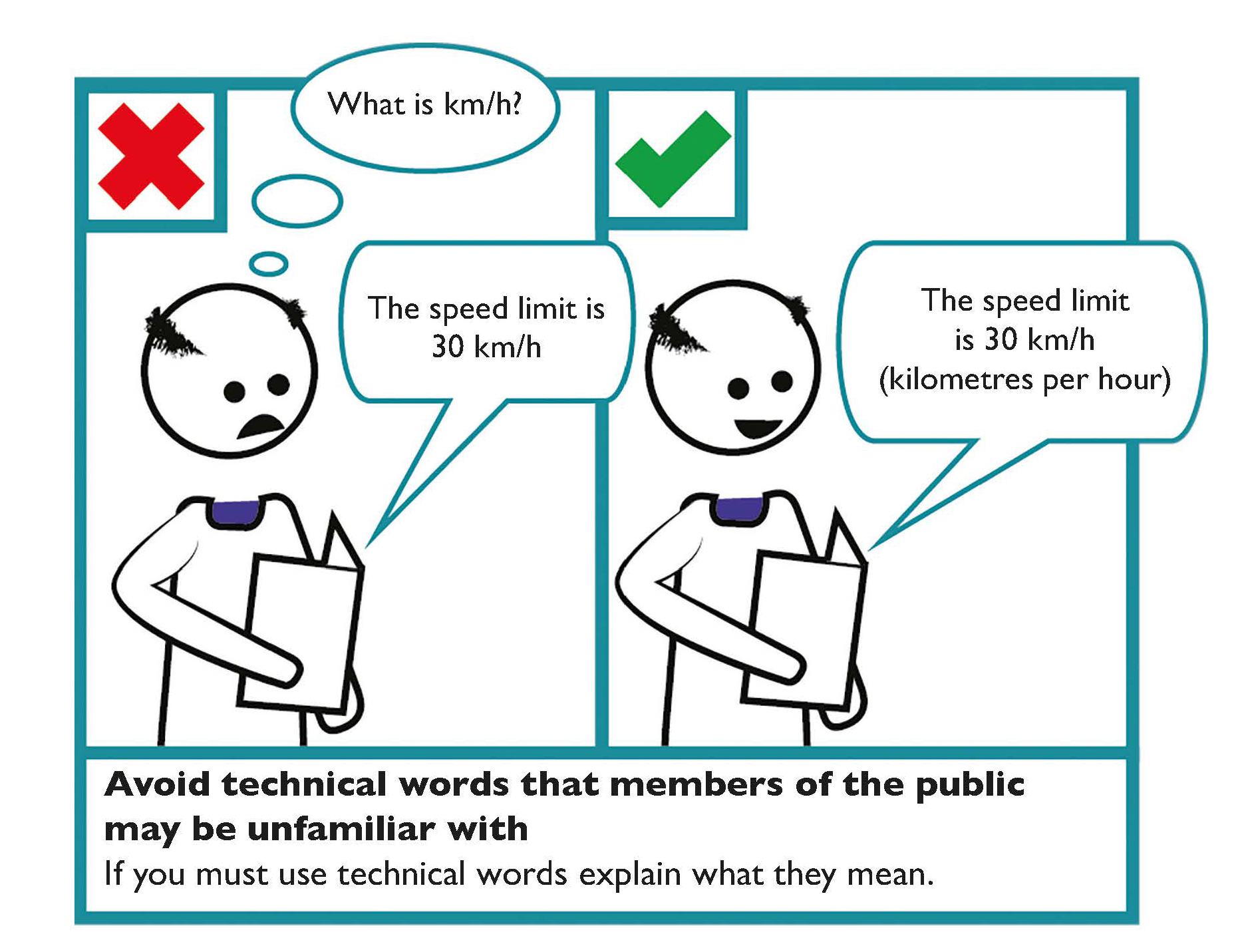
Always use the simplest and clearest language possible. Avoid technical language that members of the public may not understand. If you must use technical language, clearly explain what it means.
Use plain language
Communication is in plain language if its wording, structure, and design are so clear that the intended readers can easily find what they need, understand what they find, and use that information.
- Always use the simplest and clearest language possible.
- Avoid using technical words that may not be used by a member of the public.
- If you must use technical language, clearly explain what it means.
- Present information in a user friendly way.
Learn more
The National Adult Literacy Agency (NALA) provides plain English guidance and training, writing and design tips.
The Publications Office of the European Union provides guidance on writing clearly in Irish: Scríobh go soiléir sothuigthe.
Keep sentences short
Aim to use no more than 15 to 20 words in any sentence. Too many short sentences in a row may appear slightly aggressive to the reader. Mix sentence length. This will provide variety for the reader and sustain energy in your writing.
Break up sentences with full stops, rather than semi-colons. Use one space after a full stop to help with accessibility, particularly for readers using text-to-speech software.
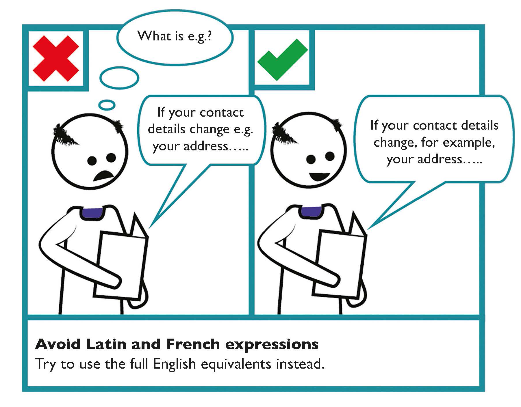
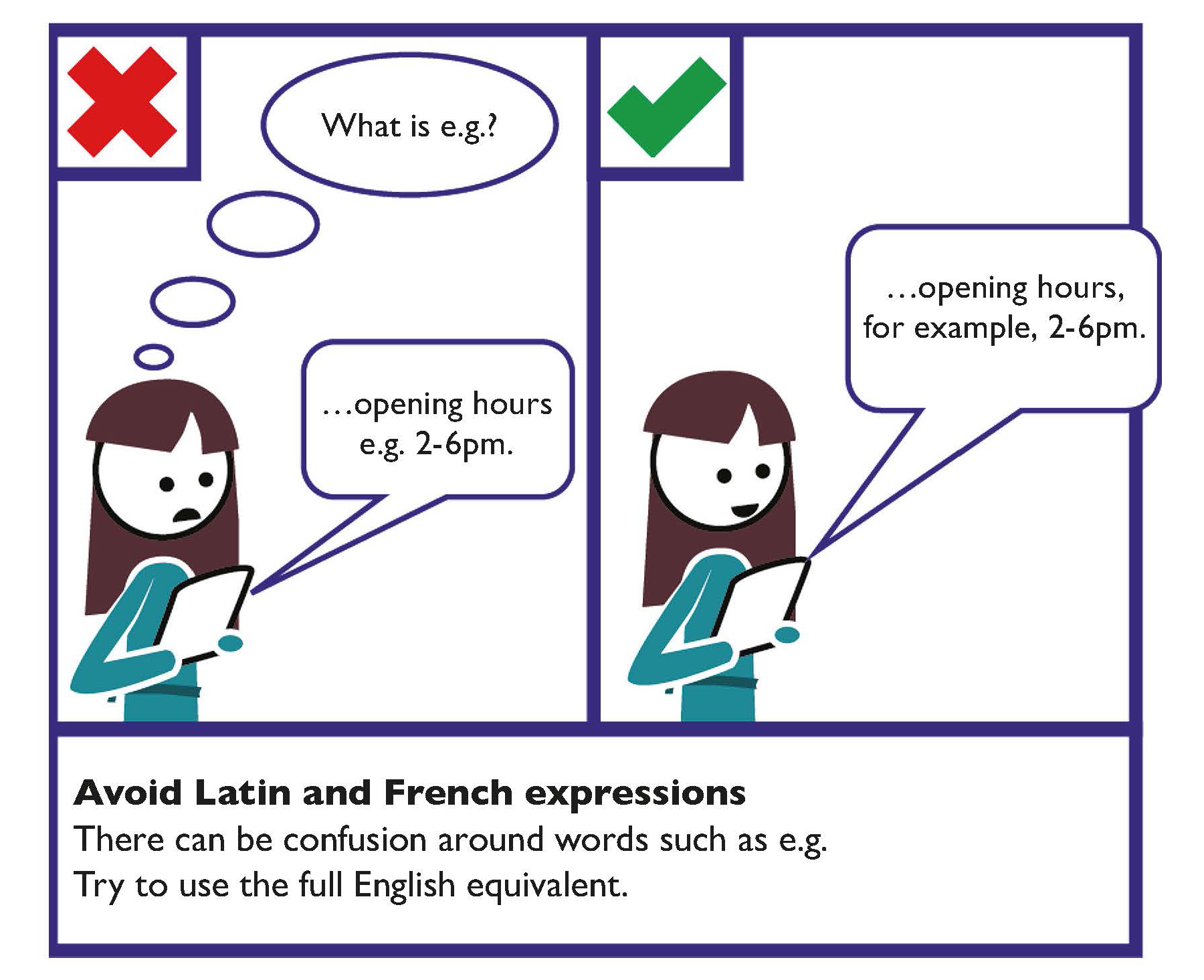
Avoid Latin and French expressions
There can be confusion around abbreviations such as e.g., i.e. and etc.
Try to use the full English equivalents such as ‘for example’, ‘that is’ and ‘and so on’.
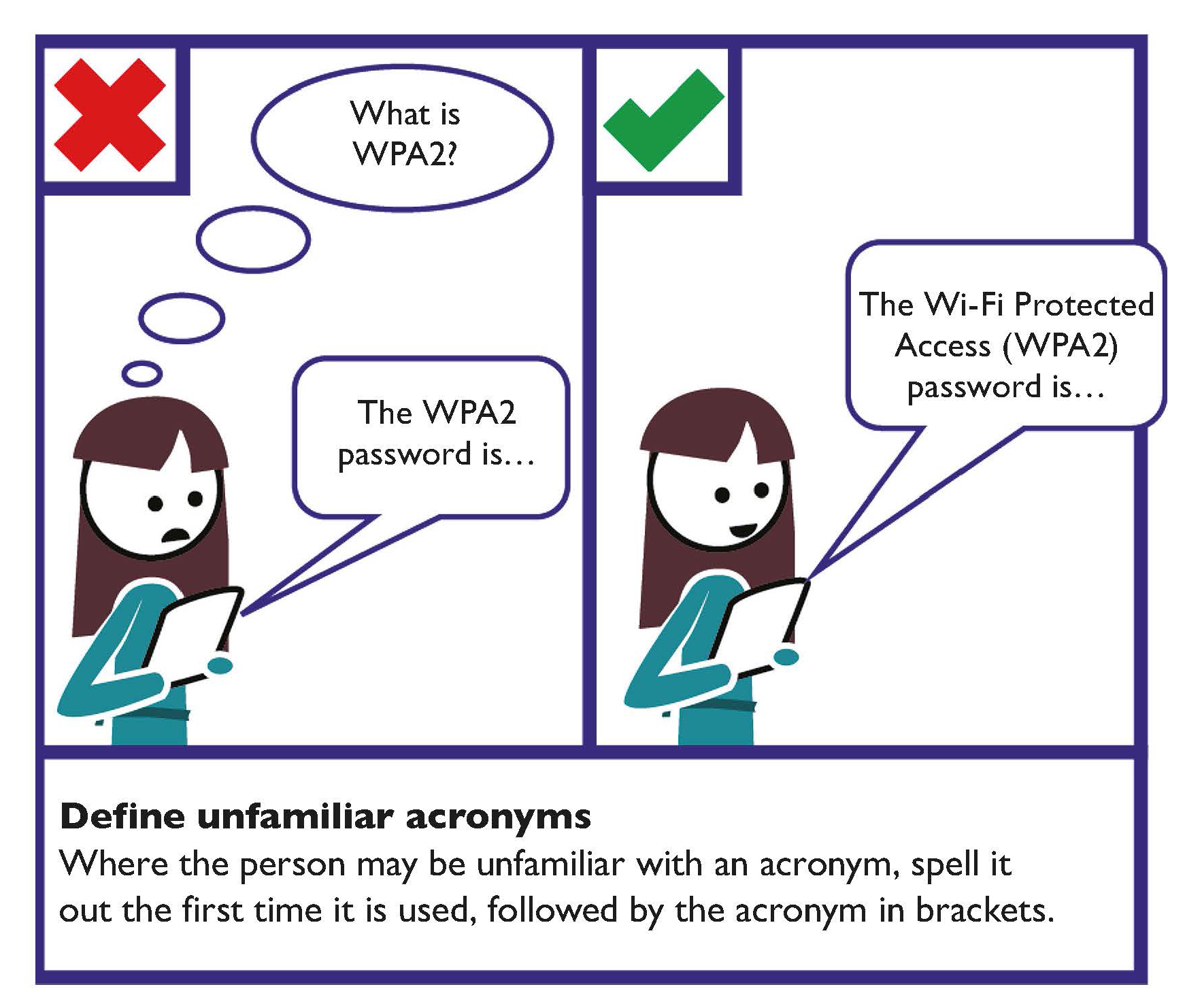
Define unfamiliar abbreviations or acronyms
Where a member of the public may be unfamiliar with an acronym, spell it out the first time it is used followed by the acronym in brackets.
For example, Pay As You Earn (PAYE).
Try to keep unfamiliar abbreviations or acronyms to a minimum.
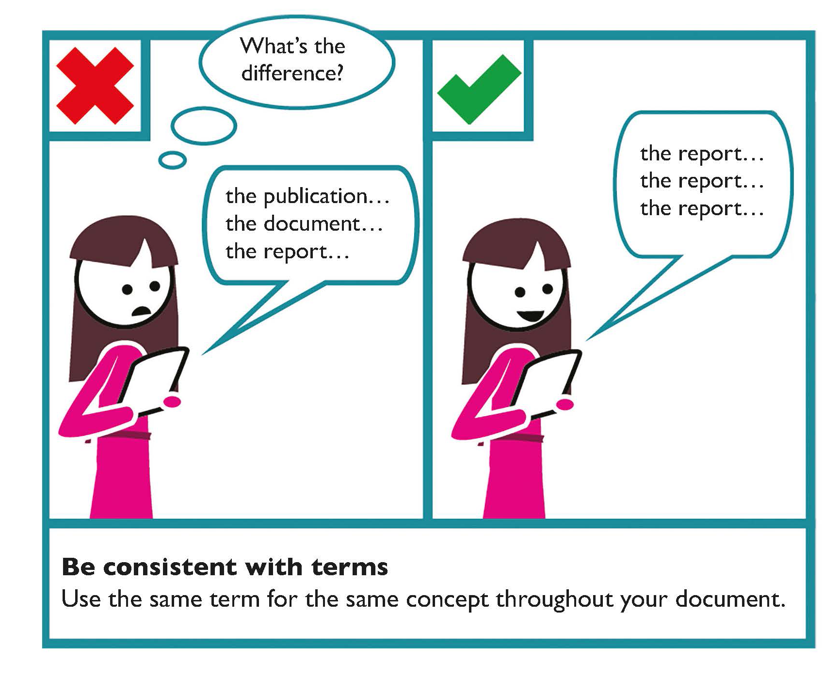
Be consistent with terms and formats
Use the same terms and formats for the same concept throughout your document. For example, make sure you write dates and numbers consistently; don’t change from using the word ‘seven’ to writing the number ‘7’.
Use questions and answers
Questions and answers help to get information across or emphasise certain facts.
Proofread your document
It is important to proofread your document. Do this at least an hour after you have finished writing, though preferably 24-hours later. This helps you see the document with fresh eyes, making you more likely to notice mistakes. If possible, ask someone else to proofread it as well.
Use a set of terms, phrases and explanations
Create a set of terms, phrases and explanations of technical terms that everyone in your organisation uses repeatedly. This can also be applied to writing and layout standards for your written communication.
- Do you have standard explanations for technical terms that you use for people outside your organisation?
- What standard explanations for technical terms may not be understood by all members of the public?
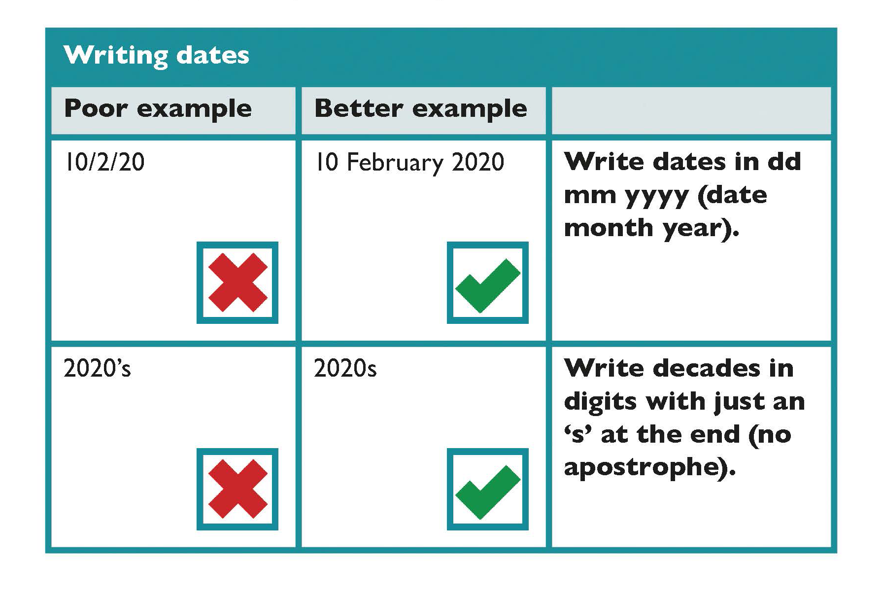
Writing dates
Some considerations for writing dates include:
- Write dates in dd month yyyy (date month year).
For example, 12 February 2020.
- When referring to a range of dates, use a hyphen in the middle.
For example, 12-13 February 2020.
- Write decades in digits with just an ‘s’ at the end (no apostrophe) — for example, the 2020s.
- Do not write nd/th as part of a date.
For example, 24 February 2020 not 24th February 2020.
- Insert a comma when including the name of the day before the date - for example, Friday, 10 February 2020.
Using hyphens and dashes
When using hyphens or dashes consider that:
- Dashes are used more like commas or colons to set off information or say this is related but a separate point. A dash is longer “—”.
- Dashes are used to extend sentences. For example, this Toolkit informs the design of 3 different forms of communication — written, spoken and signed and digital.
- Hyphens are used between closely related words. A hyphen is shorter “-”.
- Hyphens are used for certain prefixes to avoid confusion. For example, up-to-date information, 12-point text, co-ordinate and co-operate.
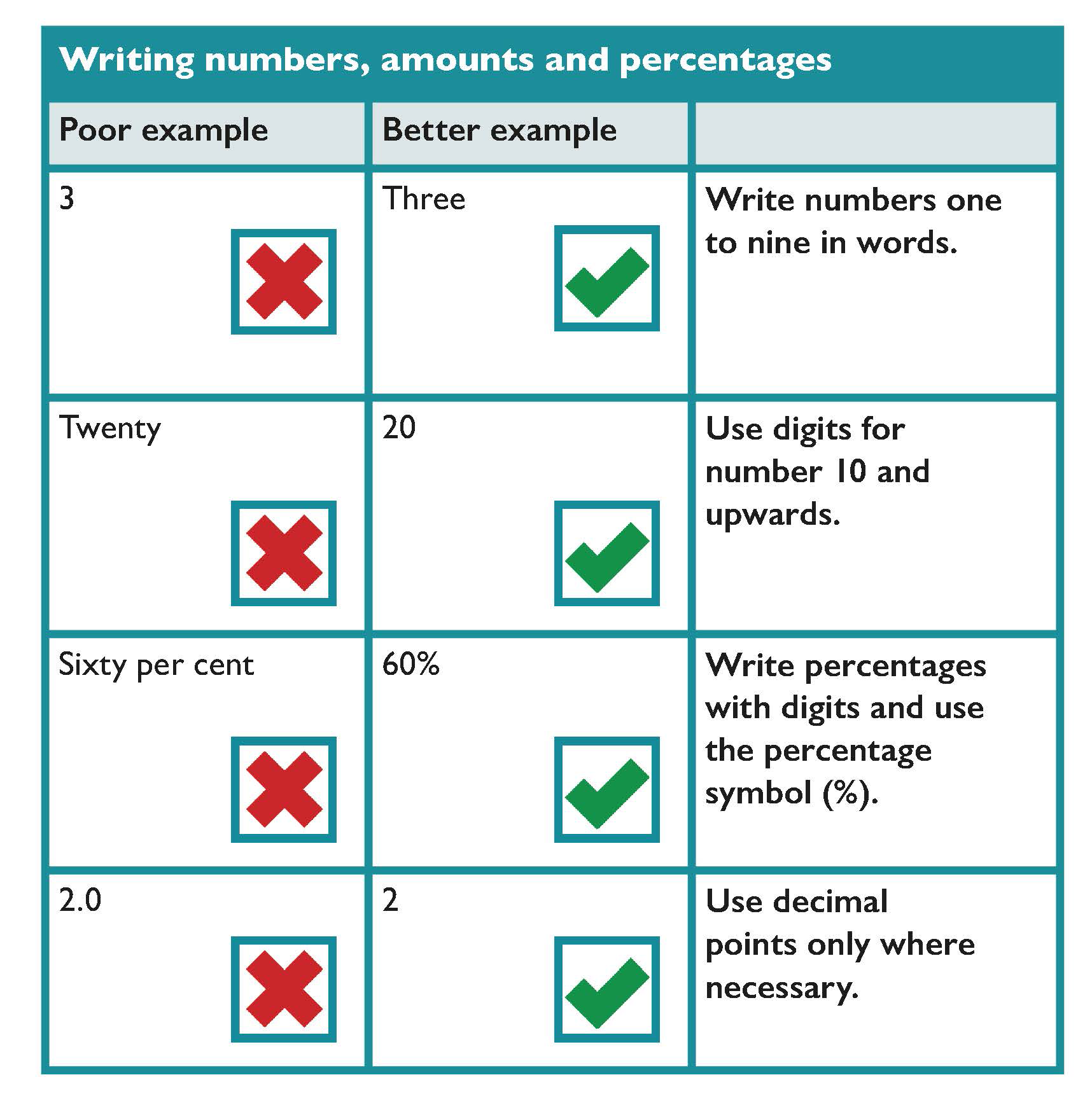
Writing numbers and amounts
Some considerations for writing numbers and amounts include:
- Write numbers one to nine in words and use digits for number 10 and upwards.
- If a sentence starts with a number, write the number in words, and if it is a double digit over 20, insert a hyphen between the words.
For example, Twenty-one.
- If writing digits, group them in threes from the right, inserting a comma to separate each group.
For example,
Four digit numbers: 2,345
Five or more digits: 20,999 345,345 5,456,678
- The numbers 3, 5 and 8 can be misread and, with some fonts, 0 and 6 can be confused. Choose a font that has clear numbers, such as, Tahoma or Verdana.
- When using tables, make sure the numbers and borders are not too close together.
- Use decimal points only where necessary, as they can be difficult to see.
Writing percentages
Some considerations for writing percentages includes:
- Write percentages with digits and use the percentage symbol (%).
For example, 60%.
- Replace ‘rounded’ percentages with a fraction.
For example, almost three-quarters (74%) of employees in the ICT sector are new to the sector.
- Treat the percentage as a singular or plural according to the subject in the sentence.
For example, singular — 50% of paper and board produced globally ‘is’ used for packaging, or, plural—50% of bananas produced globally ‘are’ exported to other countries.
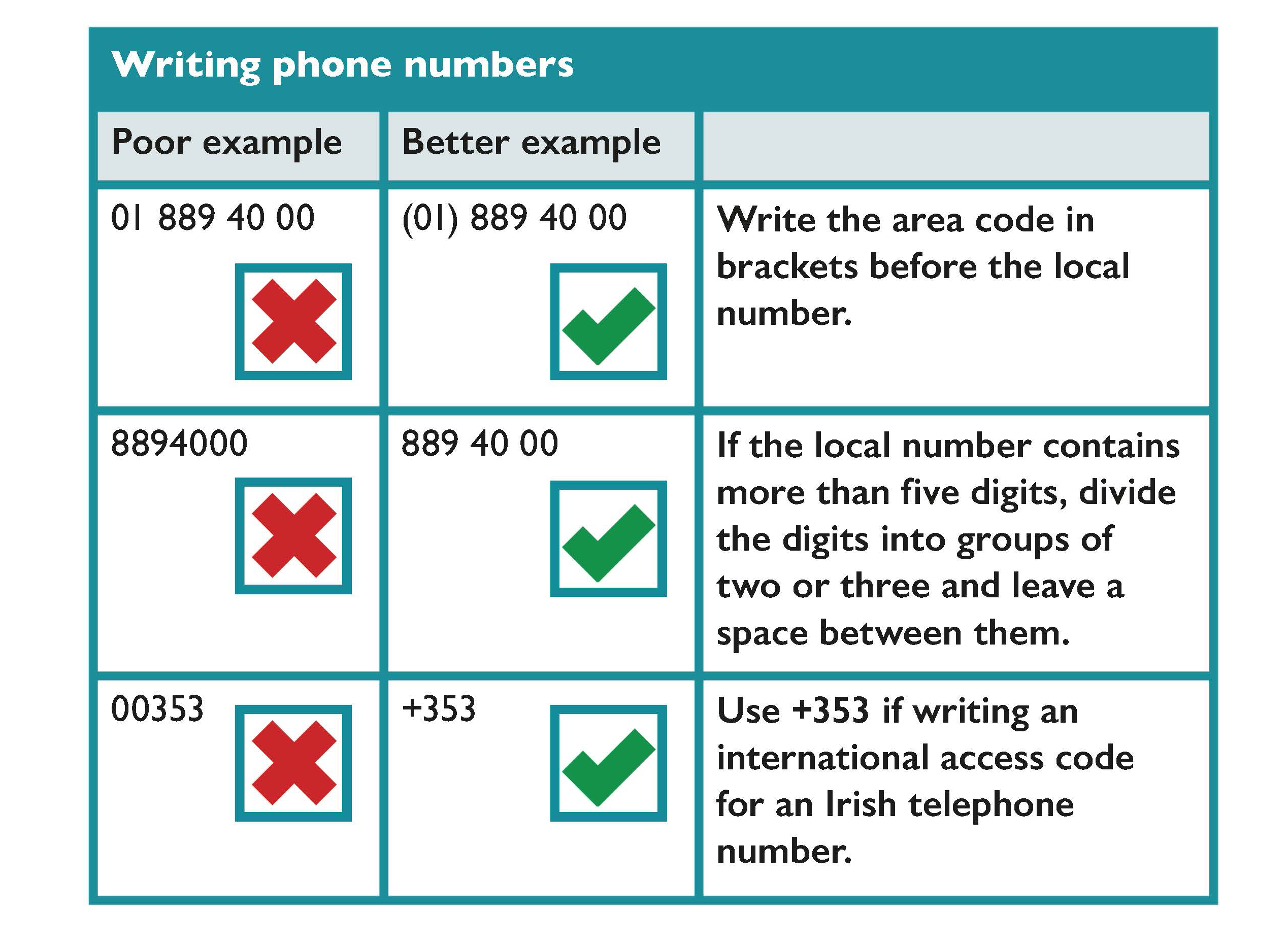
Writing phone numbers
Some considerations for writing phone numbers includes:
- Write the area code in brackets before the local number.
For example, (071) 66522.
- If the local number contains more than five digits, divide the digits into groups of two or three and leave a space between them.
For example, 209 26 24.
- Divide the digits in Freephone or LoCall numbers according to how easy it is to remember them.
For example, LoCall 1890 600 20 20.
- Use +353 if writing an international access code for an Irish telephone number.
For example, write +353 1 800 94 000 instead of 00 353 1 800 94 000.
- Write and tag a phone number in electronic systems so it can be clicked to place a call.
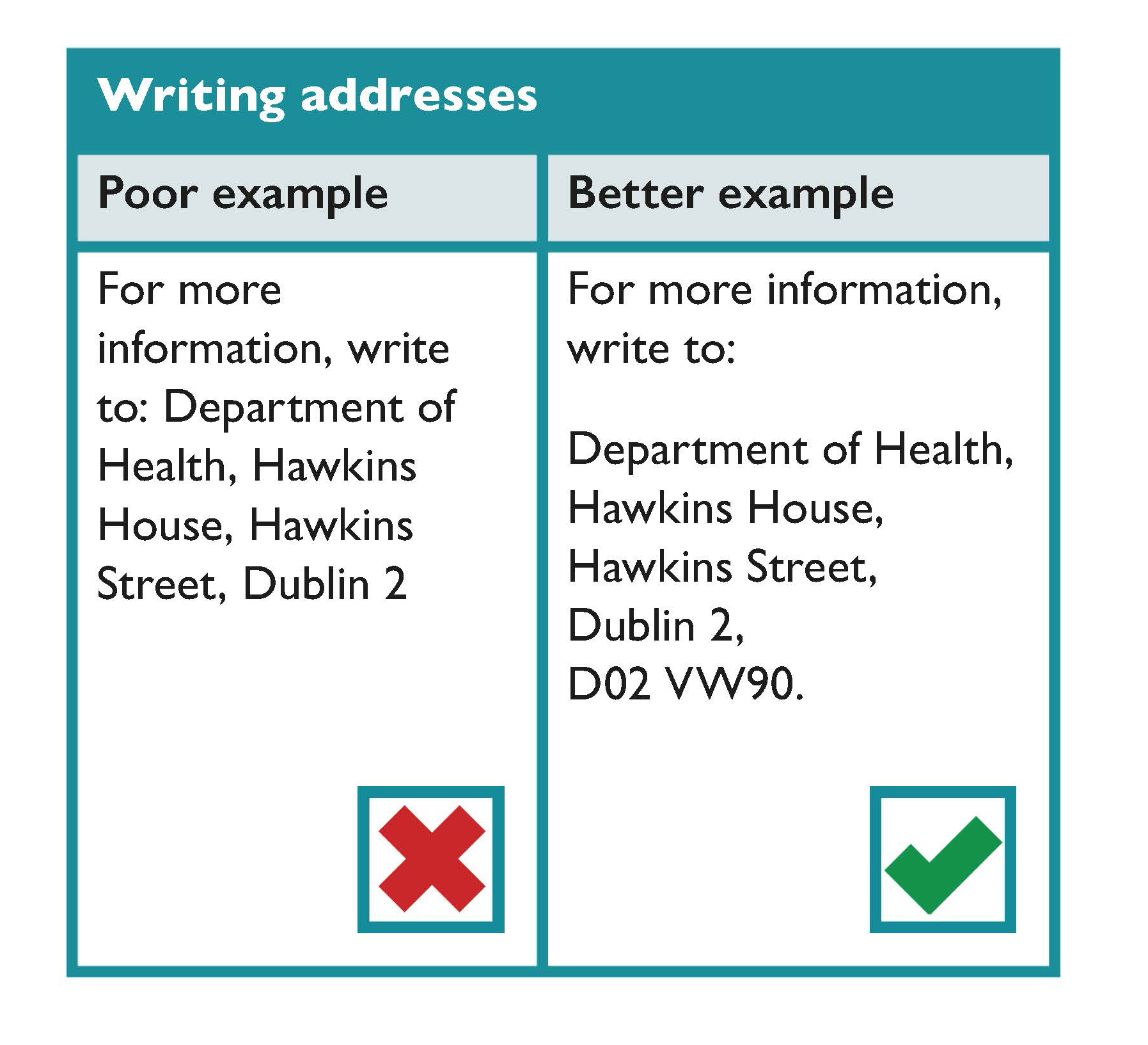
Writing addresses
Some considerations for writing addresses include:
- If space allows, write an address the way it would appear on an envelope.
- If the address appears in this way as part of a sentence, include a colon before the address and put a full stop after the last line.
For example,
For more information, write to:
Department of Public Expenditure,
National Development Plan Delivery and Reform,
Government Buildings,
Dublin 2,
D02 R583.
- If space is tight, put the address on one line, with a comma after each part of the address and a full stop at the end of it.
For example,
For more information, write to:
Department of Public Expenditure, National Development Plan Delivery and Reform, Government Buildings, Dublin 2, D02 R53.
Written Text Checklist
- Check that your document meets all the requirements of the Official Languages Acts 2003 and 2021.
- Use plain English.
- Keep sentences short; 15 to 20 words in each sentence.
- Avoid technical words, unfamiliar abbreviations or acronyms; also avoid French and Latin expressions.
- Be consistent with terms throughout your document.
- Have your document proofread for correct spelling and punctuation.
Dates, Numbers and Percentages Checklist
- Write dates in dd mm yyyy (date month year).
- Write the numbers one to nine in words and use digits for the number 10 and upwards.
- Write percentages with digits and the percentage sign (for example, 60%).
- Write addresses the way they would appear on an envelope.
- If a local phone number contains more than five digits, divide the digits into groups of two or three and leave a space between them.
Document Design
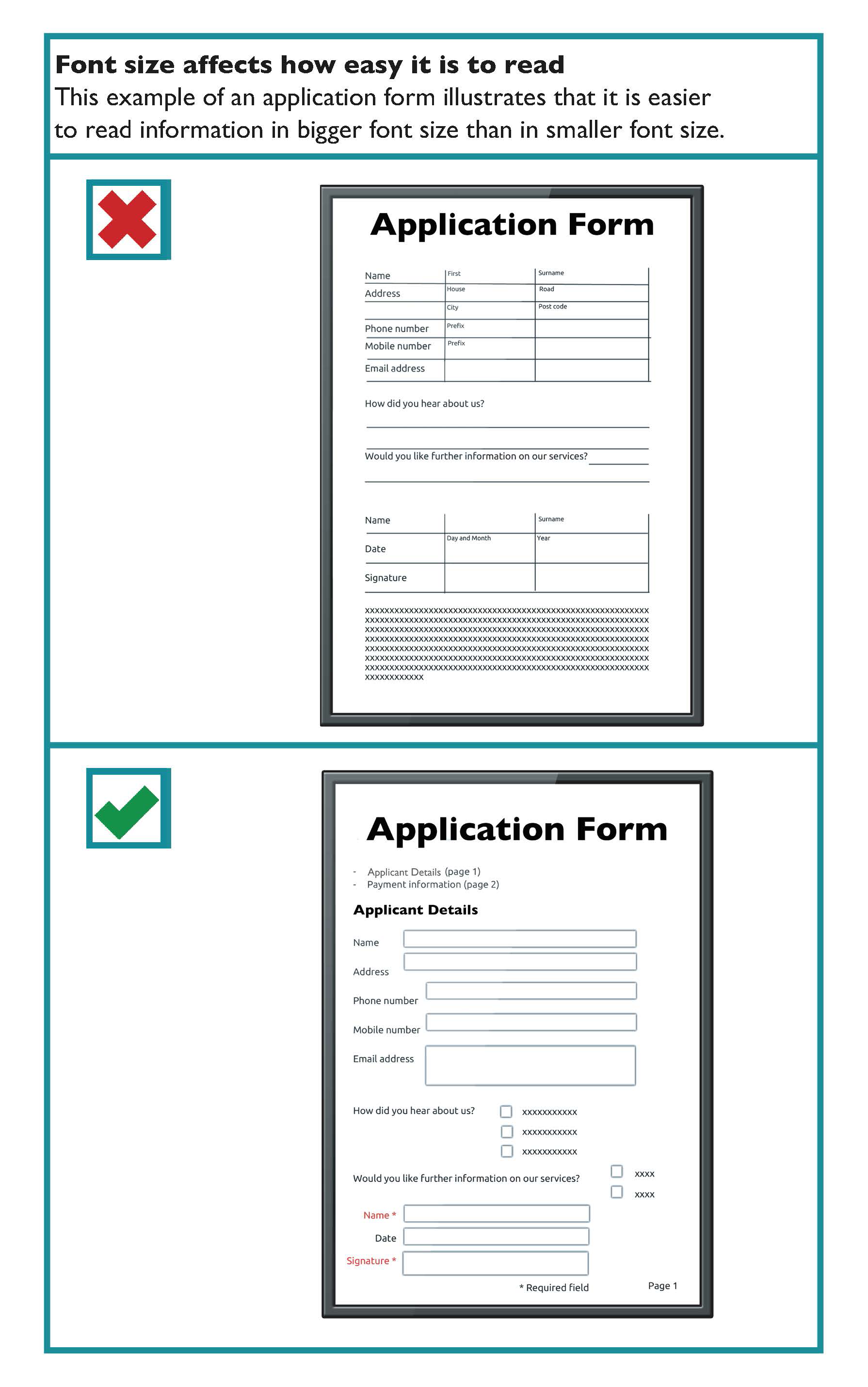
When designing and developing written communication, remember the importance of selecting a reasonable font size, good spacing and a clear font type. This will make your written communication easier to read by all members of the public.
Key guidance in the design of documents includes:
Use at least 12-point font size
This Toolkit recommends the use of sans serif fonts at a minimum of 12-point font size. It is recognised that some organisations use 11-point or other font sizes. Providers of written communications should be prepared to offer larger font size upon request.
Tip
Different fonts look bigger than others — the size of the ‘x’ is usually the best guide. If the size of the ‘x’ is small in the font you have chosen such as Times New Roman font, it is better to use a 14-point font.
For example,
- This is 12-point text in Tahoma.
- This is 12-point text in Verdana.
- This is 12-point text in Franklin Gothic Book.
- This is 14-point text in Times New Roman.
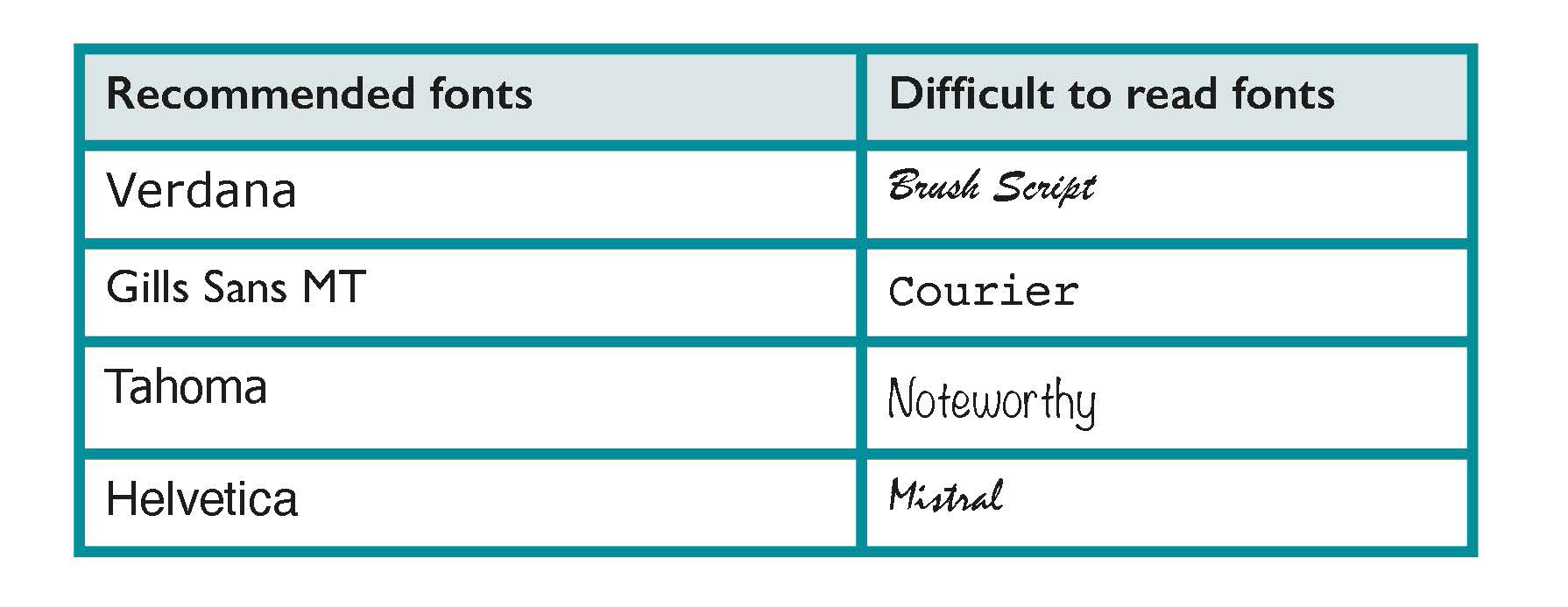
Use a clear familiar font
Use a clear font that people are familiar with and recognise easily. Sans serif fonts like Verdana or Helvetica work well. Font style and font size can make written communication, such as documents and logos, easier to read for members of the public.
Examples of easy and more difficult to read fonts are illustrated below:
Learn more
Easy to Read is shortened and simplified text that is supported by images. The images help to explain the text making it easier to read and understand. It is of specific benefit for people with intellectual difficulties. It may benefit younger readers and people with very low literacy levels. Inclusion Ireland provide Easy to Read publications, leaflets and guidance on how to make Easy to Read documents.
Information for all, European Standards for making information easy to read and understand.
Make important points stand out
People often scan through documents, brochures and letters, so it is useful to emphasise important information, headings or paragraphs of text.
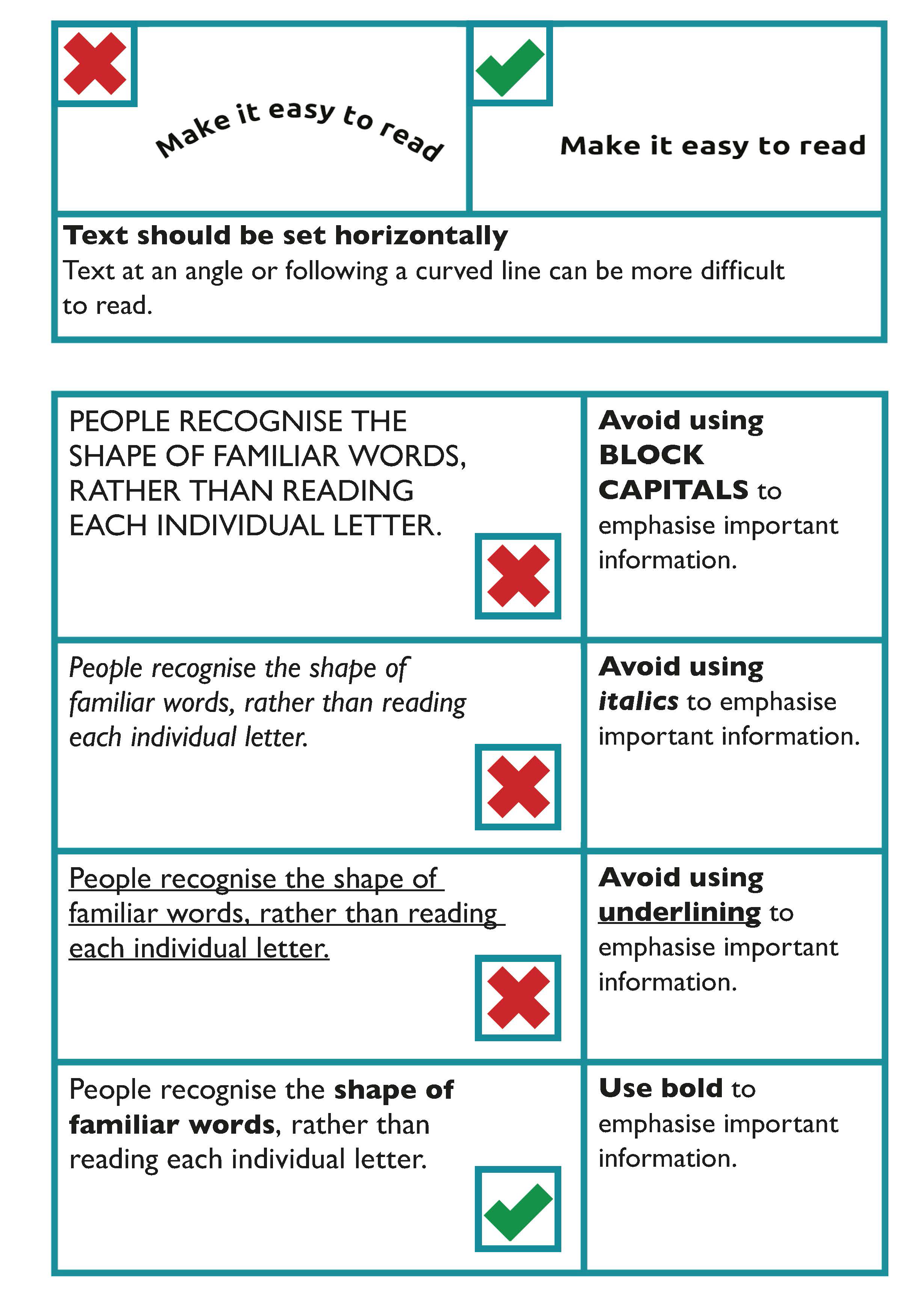
The general guidance in emphasising important information is to:
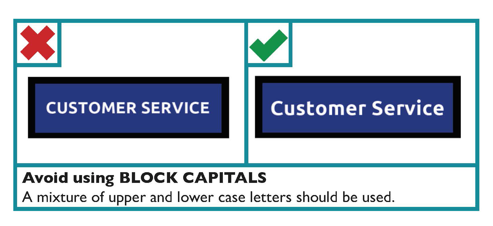
- Avoid using BLOCK CAPITALS
- Avoid using italics
- Avoid using underlining
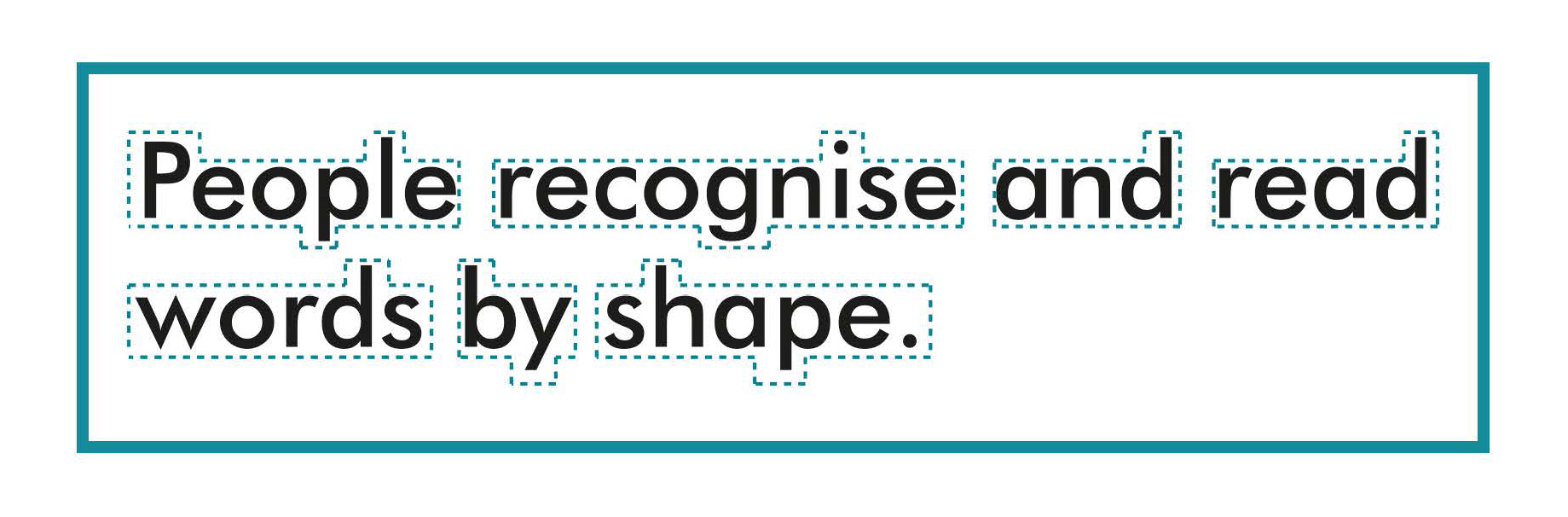
People recognise the shape of familiar words, rather than reading each individual letter. Setting a word in CAPITAL LETTERS, italics or underlining distorts the shape of the word, which makes it more difficult to read, particularly for people with a visual impairment.
Use bold or bigger sized font to emphasise text
To show the importance of a word or parts of your text, use a bolder type weight or bigger sized text.
However, bold text should be used for emphasis rather than being used consistently in the main body of the text.
Learn more
ISO 24509:2019 Ergonomics — Accessible design — A method for estimating minimum legible font size for people at any age provides a method for estimating minimum legible font size for single characters, but not for words or sentences, in self-luminous or reflected mode, used in documents, products labels, signs and displays.
Text should be set horizontally
Text at an angle or following a curved line can be more difficult to read. People should not have to rotate your document to read it.
Avoid splitting a word between two lines
Avoid splitting a word between the end of one line and the beginning of another as it disrupts the flow of the text. When using Microsoft Word, and similar programs, this can be controlled by turning off the hyphenate function.
Templates with accessible formatting
Some organisations may develop their own templates with embedded accessible formatting for documents such as letters, reports and lists which can also be used to produce documents which will be published online.
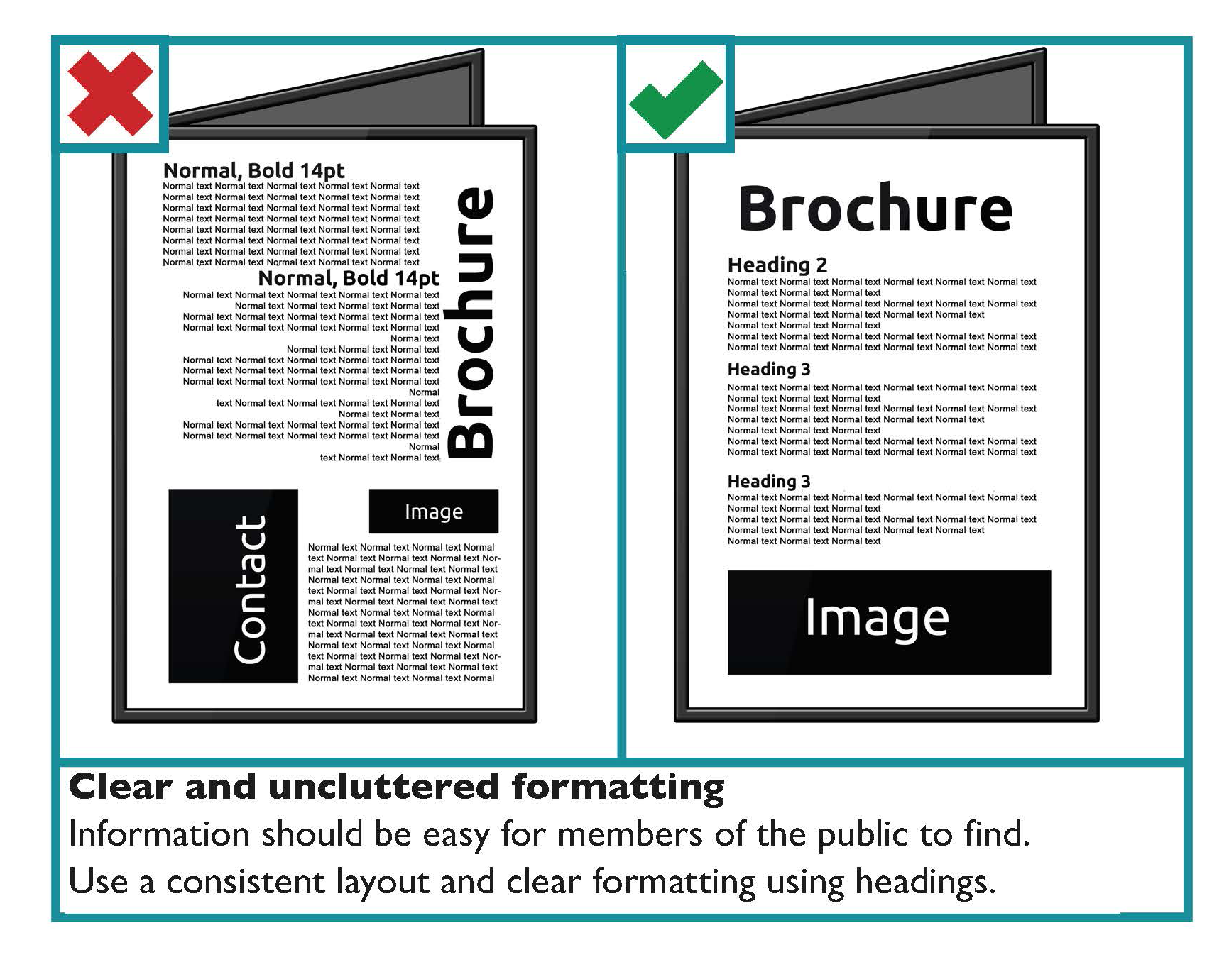
Headings and Sub-headings
This helps people to find information on a page. A table of contents may be generated from a heading structure.
Table of contents
A table of contents at the start of a long document helps people to navigate to the information they are particularly interested in.
To create a table of contents that’s easy to keep up-to-date in Microsoft Word or similar programs;
- Apply heading styles. For example, apply Heading 1 and Heading 2 to the text that you want to include in the table of contents. Word finds those headings, uses them to build the table of contents, and can update the table of contents anytime you change the heading text, sequence, or level.
- Click where you want to insert the table of contents. This is usually near the beginning of a document.
- Click References. Then click Table of Contents and then choose an Automatic Table from the gallery of styles.
Learn more
Accessible formatting prepares a document for online use. Learn more in the Digital section of the Toolkit where you can find guidance on How to make accessible documents.
Use a consistent and logical layout
Use a consistent layout for each section to make information easier to find for the user. Use recurring features such as positioning headings, logos and page numbers in the same place in each section. This acts as a navigational aid for users. Use:
- Bullet point lists: these are used to break complex text into lists.
- Introductory paragraphs: the introduction can give a summary of the section if a section of a document is particularly long.
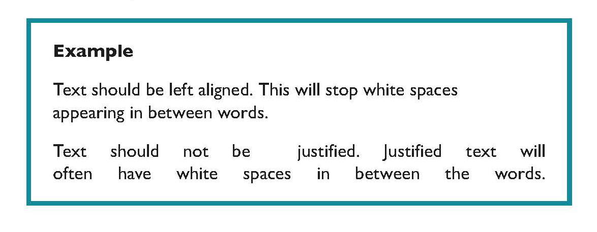
Use left aligned text
Avoid justified text as it can lead to large spaces of text between words. This can make sentences more difficult to read, particularly if a person uses text-to-speech software.
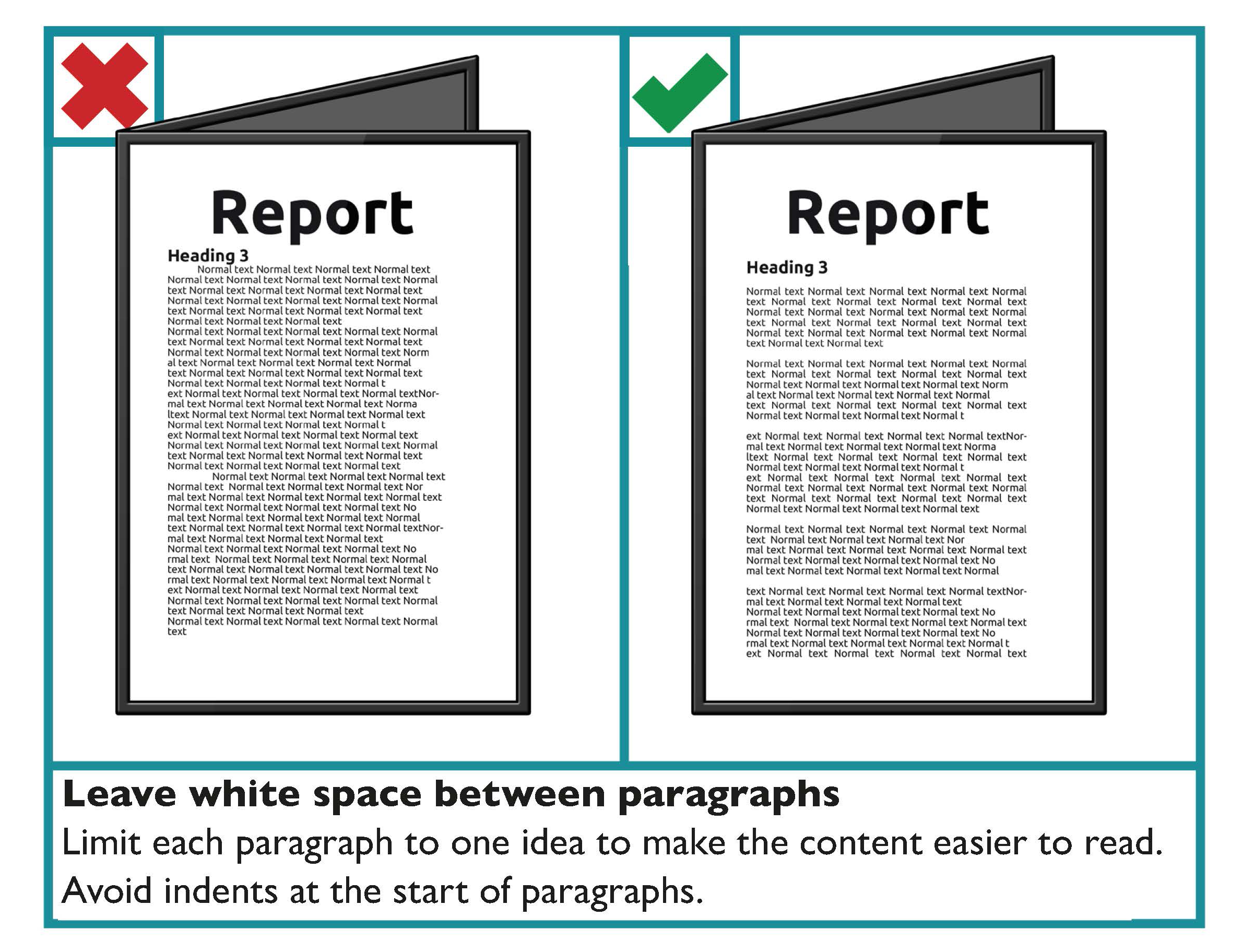
Limit each paragraph to one idea
It is important that you do not overload readers with information. Therefore, it is recommended that each paragraph is limited to one idea.
The following considerations are recommended for paragraph formatting:
- Leave a white space between paragraphs.
- Avoid indents at the start of paragraphs.
- Avoid continuing a paragraph over the page.
Use images and graphs that are relevant to the text
An image should either support the main body of text or be accompanied by a text caption explaining its significance. Images are particularly useful for readers who have literacy, numeracy or learning difficulties or where English is not their first language.
Some key guidance when using images includes:
- Make sure the graphs or images clarify or add something to your content.
- Avoid using background images behind text. This makes text harder to read. However, where the image is even in tone, for example a blue sky, text can then be placed on the image. The key deciding factor is whether it is appropriate for your readers. Ensure good contrast between the image and the text in this scenario.
- Use images and graphs with clear edges and good colour contrast.
- Do not overlay one image over another.
- Avoid images or graphs with too much detail.
- Remember that some people may not be familiar with bar or pie charts and how they work.
- Emphasise the important facts and figures in graphs.
- Place explanatory text close by but separate to the image.
Use spacing to make your text easier to read
Good use of white space instead of a cluttered page makes your text much easier to read.
Ensure your paragraphs have enough space between them. This measurement is controlled by the “Spacing - After” option in the “Paragraph” feature in Microsoft Word. 12-point spacing between paragraphs is generally a good choice.
Ensure that lines of text within a paragraph also have sufficient spacing. This measurement is controlled by the “Line spacing” option in the “Paragraph” feature in Microsoft Word. Single line spacing between one line and the next should be the minimum in the body of your text. However, avoid line spacing of one and a half lines or more, as it is harder to read successive lines as a coherent text when they are too far apart.
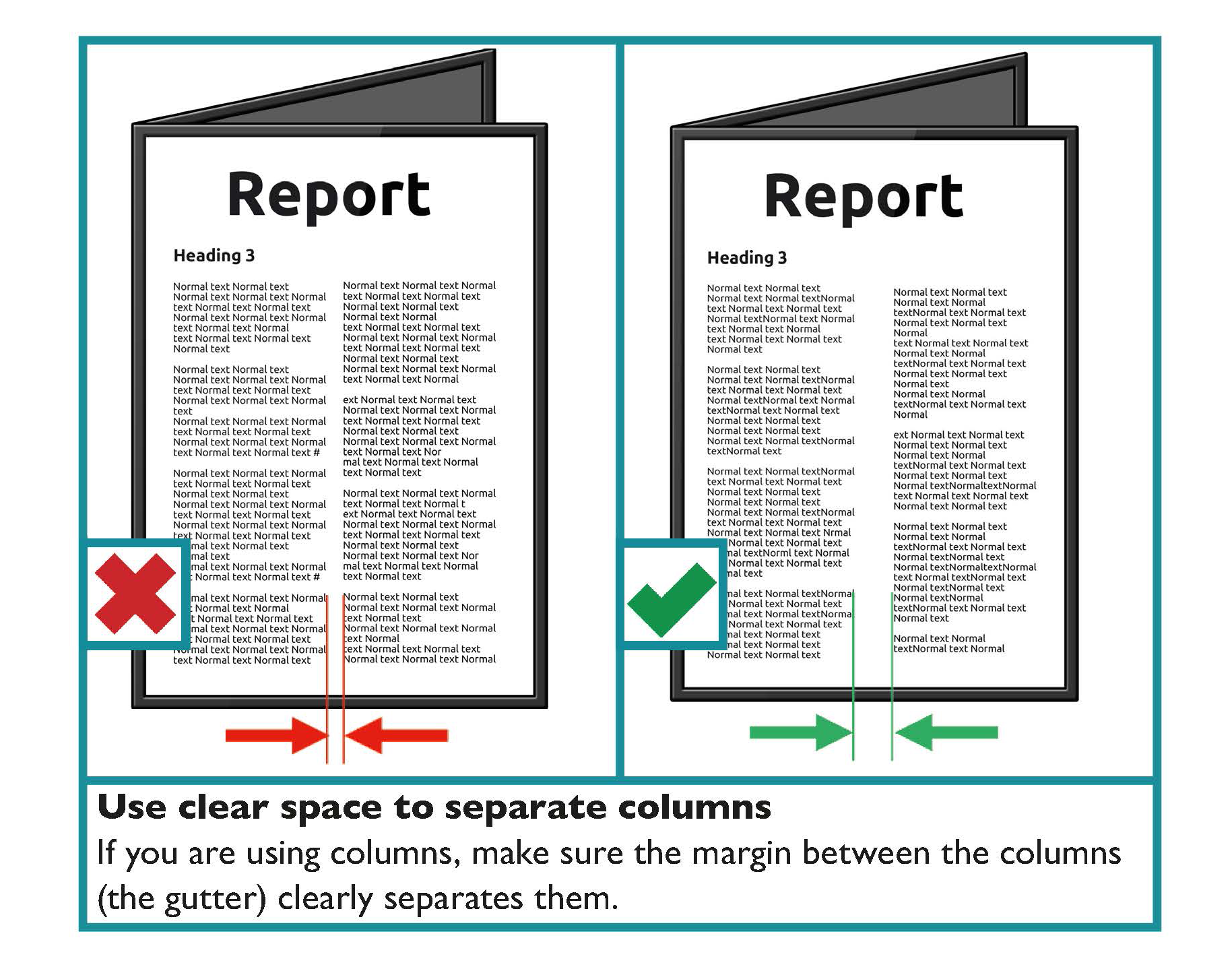
Single column and double column layout
Single column layout is the preferred layout for text in a document.
Two column layout should be used sparingly. Two column text can mean there is more text on a page. It is often justified and the lines are shorter with more hyphens. This makes text harder to read.
If two columns are used, they can pose a problem for screen readers because the document’s reading order is not often clear and the content is then read in an undesirable sequence.
Two column layout should only be used when it would benefit the reader. For example, when the two columns are presenting a comparison.
If two column layout is used, check the format to ensure the correct reading order.
If you are using columns make sure the space between the columns (the gutter) clearly separates them. Where the gutter is too narrow between columns, a person with a visual impairment may read straight across from one column to the adjacent one.
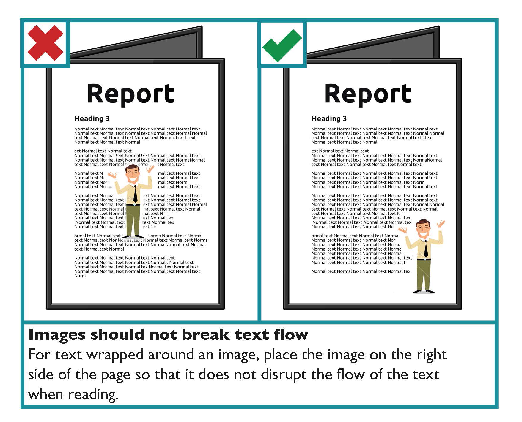
Images should not break text flow
For text wrapped around an image, you should place the image on the right side of the page rather than the left. By placing the image at the right side of the page, it does not disrupt the flow of the text when the person is reading.
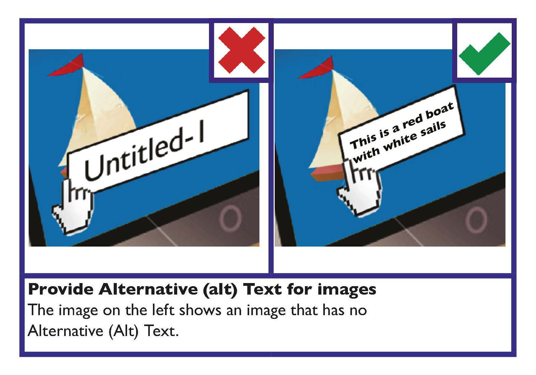
Do not convey information just through images
All images should support the main body of text and should be accompanied by alternative (Alt) text in the alt attribute.
Learn more
In the Digital communications part of this Toolkit find guidance on alternative (Alt) text under the heading: Use Alternative (Alt) Text to make images and media accessible.
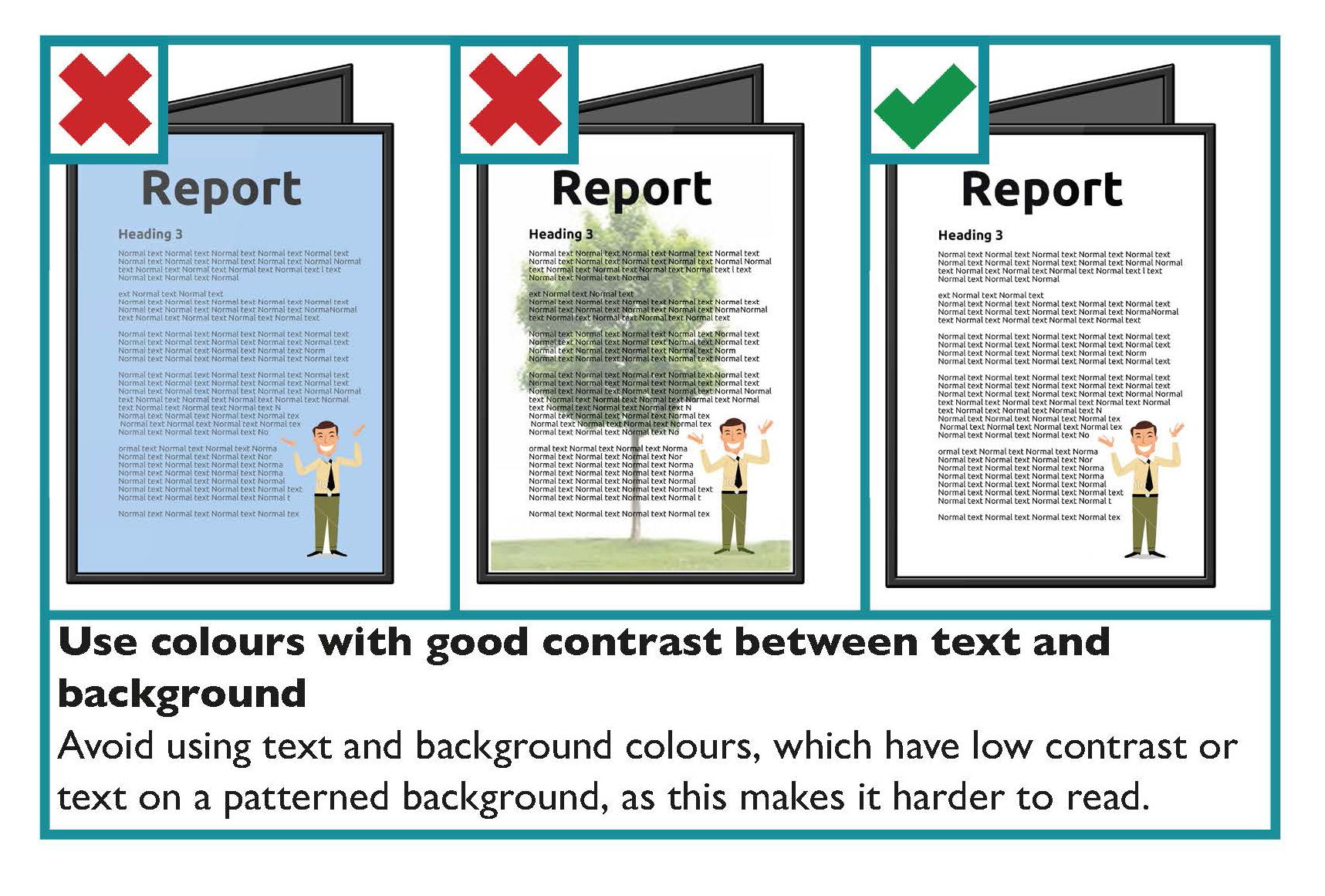
Use colours with good contrast between text and background
For all documents, from letters and statements to brochures and reports, it is important that you consider the colours used, specifically the colour of the text and the background. The selected colours affect how easy it is to read the information being communicated. Colour should not be used as the only visual means of conveying information, indicating an action, prompting a response, or distinguishing a visual element.
Choose colour schemes that can be easily identified by people with all types of colour vision.
Use a combination of different shapes, positions, line types and colouring patterns to ensure that information you are conveying is accessible by users who cannot distinguish differences in colour.
State the colour names where users are expected to use colour names in communication. Consider how colours and displays can be significantly affected by lighting conditions and the environment they are being used in.
Key guidance on colour contrast is as follows:
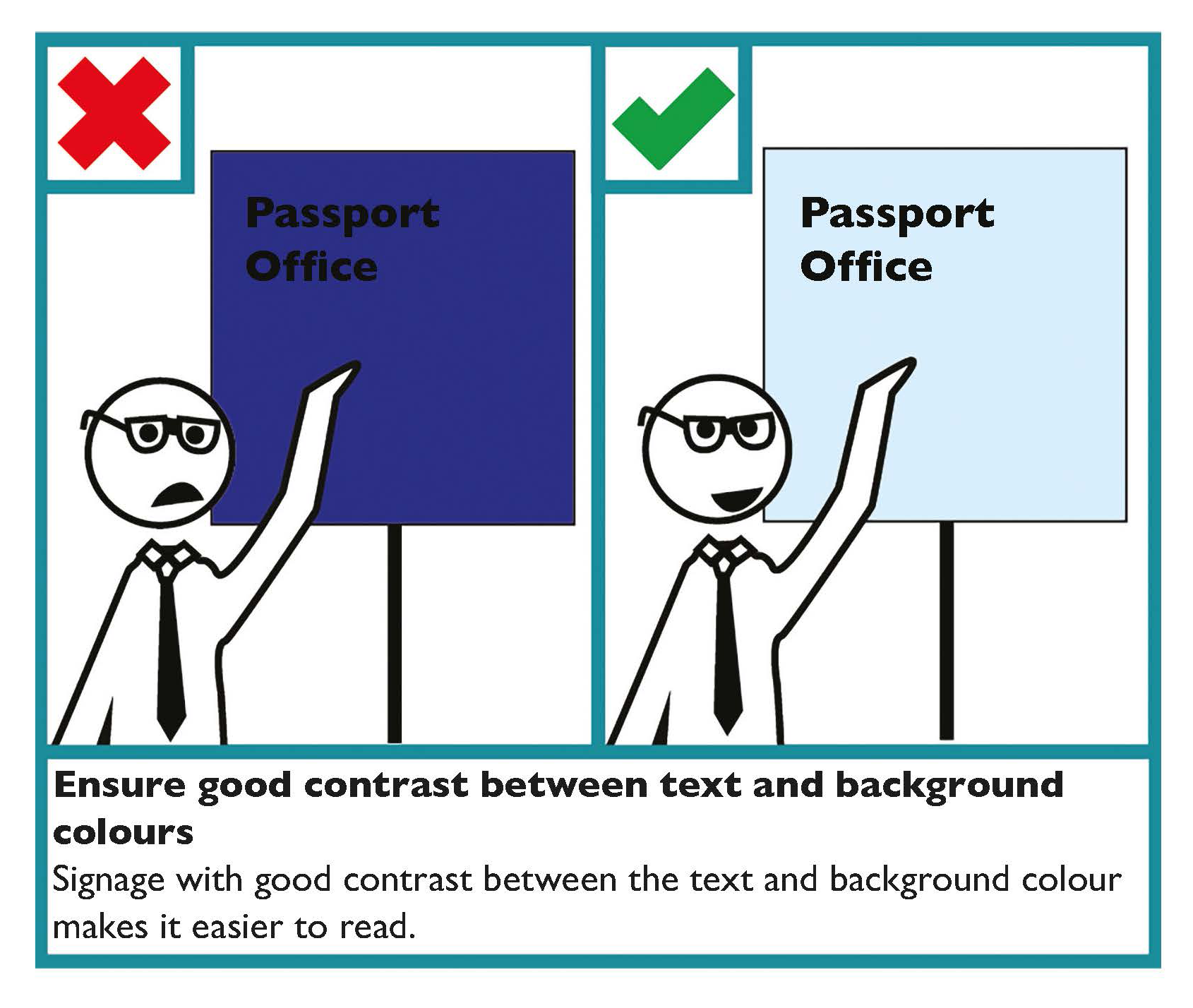
- Make sure there is strong contrast between the text and the background colour.
- If using white text, make sure the background colour is dark enough to provide sufficient contrast. Contrast is best when using very dark colours together with very pale colours.
- White or cream paper makes text easier to read.
- Use a light coloured paper or a solid background colour to make a document more colourful.
- Avoid combining yellow and blue, and green and red, as these are difficult for people with colour blindness to distinguish.
- White text on a black background typically makes text look smaller, so you may need to increase the size and weight of the text.
- Avoid placing text in front of an image or patterned background, as this makes it more difficult to read.
Tools
Use a contrast analyser to ensure there is enough contrast between the foreground and background colours. WebAim provides an online colour contrast analyser which also gives guidance on the contrast ratio for normal and for large text. According to WCAG 2.1 standards, 4.5:1 is the minimum contrast ratio required for most text.
Learn More
Voice of Vision Impairment (VVI) works to represent the interests and defend the human rights of blind and partially sighted people in Ireland.
The National Council for the Blind Ireland (NCBI) has a technology department, NCBI LABS, that offers a number of services to people with sight loss.
Printing
Use good quality, uncoated paper
There are many types of paper used for printing and each one reacts differently to ink. One consideration when choosing paper is how much light the paper reflects (glare).
The best quality paper is uncoated or matt, as it is the best way to avoid glare. Additionally, the surface takes ink well, which improves legibility.
Avoid shadowing by using heavier paper
Make sure your paper is heavy enough to avoid ‘shadowing’. Shadowing is where text and images printed on one side of a page can be seen through the other side of the paper. Ask your printer or supplier for advice when choosing paper, as some paper is more transparent than others.
Bind documents so they can be opened out flat
Use binding that allows the document to open out flat for ease of reading. This will make the document easier to hold while reading and easier to set flat on a surface. This is particularly useful for members of the public with dexterity difficulties or those using text-to-speech reading devices.
Tip
Half Canadian binding is an example of binding that allows the document to open out flat and also allows for lettering on the spine for the title of the document so it can be identified when shelved.
Font and Paragraphs Checklist
- Use at least 12-point font size and a clear font.
- Use bold or bigger size font to make important points stand out.
- Avoid using features such as underlining, italics and BLOCK CAPITALS.
- Use left aligned text only, do not justify text.
- Avoid splitting a word between two lines.
- Limit each paragraph to one idea.
Formatting and Layout Checklist
- Use clear and accessible formatting to make information easy to find.
- Use a consistent layout for recurring features (such as page numbers and headings).
- Make good use of white space so your message stands out.
- Use clear spacing:
- Text should be a minimum of single-spaced.
- White space should separate paragraphs.
- There should be a wide, clear space separating text columns.
Document Design Checklist
Colours, Images, Graphs and Visuals
- Use images, visuals and graphs that are relevant to the text
- Image should not break text flow.
- Use images to support the main body of text and ensure they are accompanied by alternative (Alt) text in the alt attribute.
- Use colours with good contrast between text and background.
Printing
- Use good quality, uncoated or matt paper.
- Avoid shadowing by using heavier paper. Use paper that weighs at least 90 grams per square metre (GSM).
- Bind documents so they can be opened out flat.
Form Design
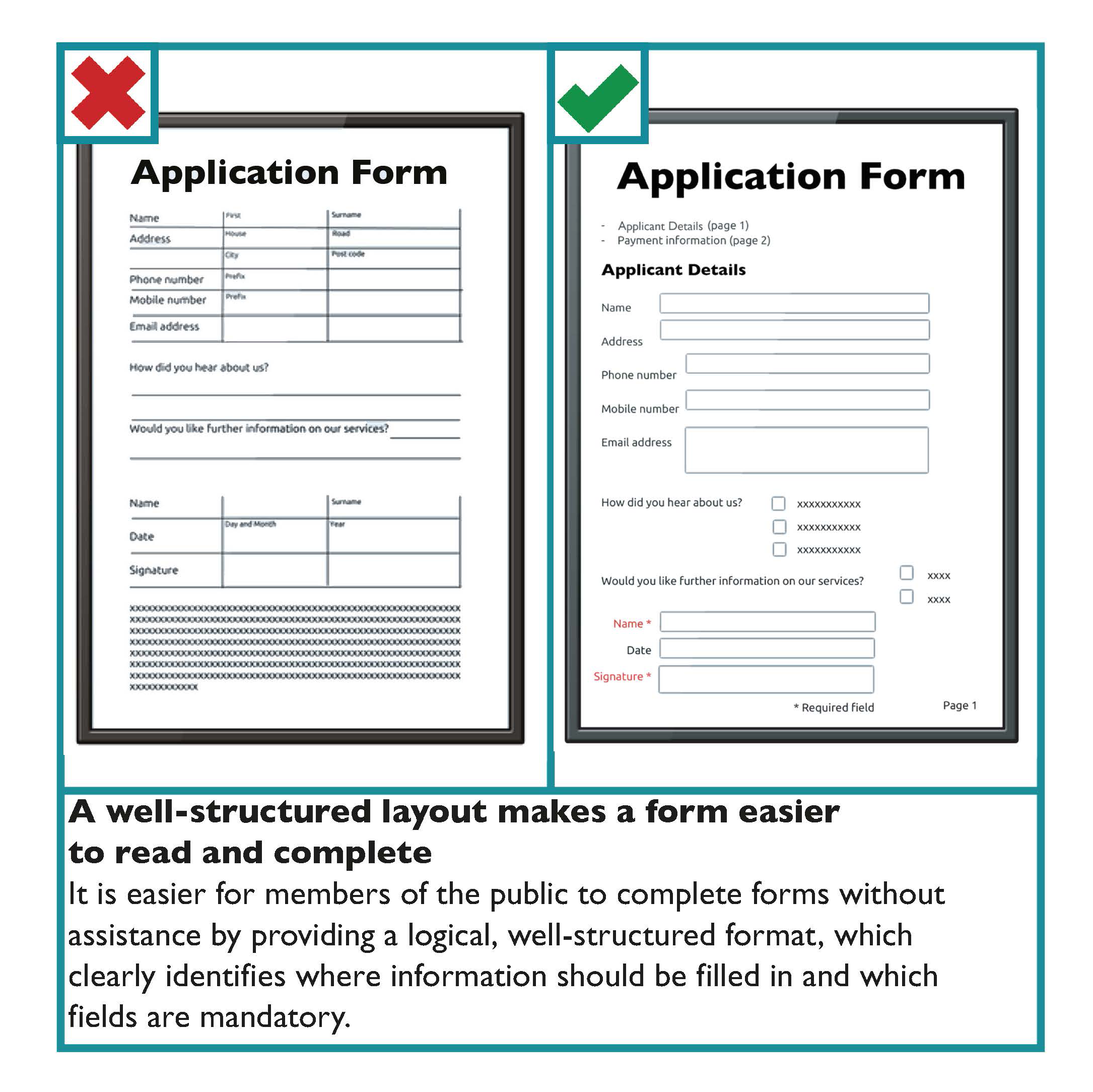
In the public sector, forms are used as part of the customer engagement process. This ranges from enquiry forms to contracts. Increasingly members of the public are asked to complete online forms. The Universal Design guidance for both print and online forms is similar.
People should be able to complete forms without assistance. It is important to consider that members of the public have different needs and skills related to visual or literacy difficulties. Therefore, by better designing forms to meet the needs of people with specific difficulties, you will be better meeting the needs of all members of the public.
Guidelines for the design of forms are as follows:
- Give the form a clear title.
- Identify whom the form is for and its purpose.
- Give instructions in bullet points on the first page.
- If users need reference numbers or documentation to complete the form, ensure that they know this before starting. Awareness can be raised with an obvious “Before you begin, you will need...” message at the top of the form.
- Divide the form into clear and logical sections each with an informative heading and a clear number.
- Use a larger font for section headings.
- Place, if needed, “Official use only” sections near the end of the form.
- Avoid unnecessary or repeated questions.
- Position questions directly across from the space for giving answers.
- Make sure users have enough space for providing answers.
- Where possible, use boxes rather than lines for answers.
- Use as many ‘tick-box’ questions as possible.
- Make sure ‘tick-boxes’ are clearly linked to the answer.
- Ensure that ‘tick-box’ borders and answer lines are solid and at least one point wide.
- Make it clear which fields are mandatory and must be completed.
Scannable Forms
Scannable forms, which allow one character per square, are increasingly being used. Where these forms are used, provide boxes that are large enough and leave adequate space between the squares.
For example,

Learn more
For guidance on designing online forms see Online Forms in section 3: Digital and Web Based Communication Systems.
Form Design Checklist
- The form should have a clear title. It should also identify whom it is for and what its purpose is at the start of the form.
- Provide clear instructions at the start.
- Place, if needed, “Official use only” sections near the end of the form.
- Group similar questions under useful headings.
- Use informative headings and clear numbering.
- Avoid unnecessary or repeated questions.
- Make sure people have enough space for providing answers.
- Where possible, use boxes rather than lines for answers.
- Make sure ‘tick boxes’ are clearly linked to the answer and that the borders and answer lines are solid and at least one point wide.
- Clearly identify mandatory fields that must be answered.
Signage Design
All public sector buildings will typically have signage inside and outside of their establishments. This may range from signs for the toilets to health and safety signs. The following signage design guidance is based on the Building for Everyone: A Universal Design Approach publication from the Centre for Excellence in Universal Design (CEUD).
Under the Official Languages Acts 2003 and 2021, a public body has a duty to ensure that signs placed by it or on its behalf within or outside the state are in Irish or bilingual. If bilingual text is chosen, instead of text in Irish only, there are specific regulations that must be adhered to.
The guidance below is provided for sign design in indoor and outdoor areas.
Text on signs
- Make sure the text on your sign uses fonts that work for your reader. Avoid fonts that are highly decorative, very bold, condensed or in italics, as these can be difficult to understand and may make the sign more difficult to read. Examples of good fonts are sans serif fonts for signage include, Helvetica, Tahoma and Futura.
- Wording on signs should be as simple as possible.
- Avoid the use of unfamiliar abbreviations.
- Information on signs should be listed alphabetically or grouped logically. For example, by floor level.
- Use Arabic numbers (1, 2, 3), not Roman numerals (i, ii, iii).
- A mixture of upper and lower case letters should be used. Avoid using BLOCK CAPITALS.
- Align wording to the left.
- Wording, font and images should be consistent throughout the building.
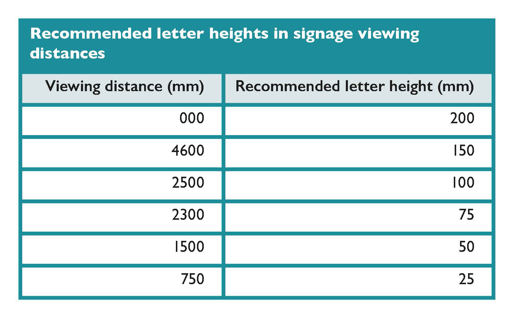
- The size of letters on signs should be related to the type of sign and viewing distance.
The table below provides recommended letter height for a range of viewing distances.
Symbols and arrows on signage
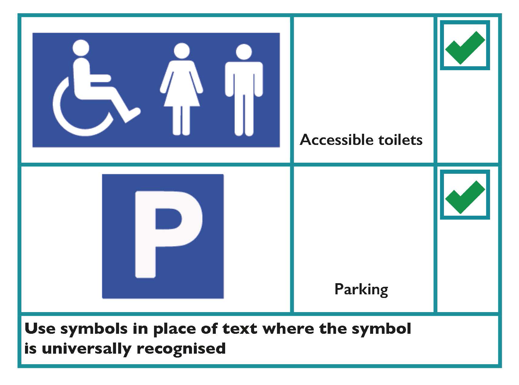
- Use symbols in place of text where the symbol is universally recognised. For example, public information symbols.
- Use symbols to accompany text where possible. This is particularly relevant for dual-language signs, as they help people to recognise quickly the information being provided.
- Use arrows to indicate directions.
Design
- There should be good contrast between the signboard and any mounting or background surface. This helps draw attention to the sign itself.
- There should be good contrast between the text/symbols and background sign colour. This helps draw attention to the content of the sign.
- Where colour coding is used, use colours that are easy to differentiate.
- Signs should have a matt or satin finish. Avoid shiny and reflective surfaces to prevent glare.
- Signs should be evenly illuminated, with a lighting level of 200 lux.
Tactile signs
Embossed signs enable people with visual impairments to read by touch. When designing tactile signs consider that:
- Embossed letters should be raised above the surface of the sign by 1 — 1.5mm, and have a stroke width of 1.5 — 2mm.
- Embossed letters should be between 16mm and 50mm in height.
- Where Braille is provided, it should be positioned below the related text.
- Engraved and indented letters and symbols should be avoided, as they are difficult to read by touch.
Positioning of signage
- Signs should be positioned at important points along a route, wherever routes intersect or diverge.
- Tactile and Braille signage should be positioned within easy reach.
- Position signs where people reading them will not cause an obstruction.
- Make sure that directional signs help people to retrace their steps and identify alternative locations within a building, without having to return to the main entrance.
Learn more
Further guidance on the Official Languages Acts is available on the website of An Coimisinéir Teanga.
The Centre for Excellence in Universal Design’s (CEUD) Building for Everyone: A Universal Design Approach provides guidance on designing signs.
The International Organization for Standardization provides guidance on graphical symbols for the purpose of public information in ISO 7001:2023 — Graphical symbols — Registered public information symbols.
Signage Design Checklist
- Use a clear font.
- Wording on signs should be as simple as possible.
- The use of unfamiliar abbreviations should be avoided.
- Use Arabic numbers (1,2,3) not Roman numerals (i, ii, iii).
- Capitalise the first letter of names and messages with all other letters lower case.
- List names and messages alphabetically or group them logically, for example, by floor level.
- Align wording to the left.
- Wording and font should be used consistently in signs throughout a building.
- Select a letter size to suit viewing distance.
- Ensure the signage complies with the Official Languages Acts 2003 and 2021.
Signage Symbols, Contrast, Colour, Positioning Checklist
- Use symbols in place of text or to supplement text where possible.
- Use arrows to indicate direction.
- There should be good contrast between the signboard and any mounting or background surface. There should also be good contrast between the text and background colour of the sign itself.
- Use colour to differentiate where colour coding is used.
- The surface of the sign should not be reflective.
- Embossed lettering should be raised 1 — 1.5mm above the surface of the sign. Avoid engraved lettering.
- Embossed letters should be between 16mm and 50mm in height.
- Position tactile and Braille signs within reach.
- Position signs where people reading them will not cause an obstruction.
Spoken and Signed Communication
Spoken and Signed Guidance
Key design considerations to enhance communication engagement with all members of the public are provided below. While this guidance is focused on face-to-face, telephone and video communication, it equally applies to speeches, conversations and presentations. Parts of this guidance should also be considered in the design of audio outputs from systems such as machine voice recordings and public announcements.
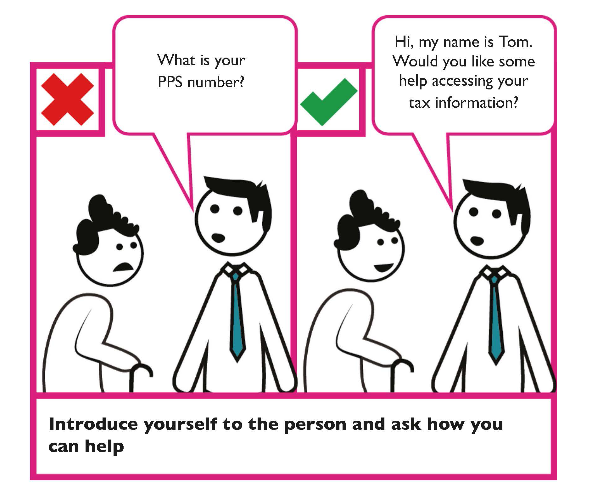
Introduce yourself to the person
Identify yourself when you approach a person and speak directly to them.
Consider alternative means of communication
Consider whether the person may want to communicate using alternative means and ask them; for example, a person may wish to communicate using notes.
Use plain English
Always use the simplest and clearest language possible. Avoid using technical words that may not be used by a member of the public. If you must use technical language, clearly explain what it means.
Keep your message simple
State one piece of information at a time. Provide the information in a logical order.
Speak clearly
Speak in a clear voice, clearly pronouncing your words.
Speak slowly
Take your time and speak slowly to the person. Tailor what you are saying to meet the person’s needs.
State the purpose of your conversation
At the start of your conversation, state the purpose of it.
Listen and respond to the person
Be aware of the language the person uses and their literacy level. In Ireland 18% of adults have literacy and numeracy difficulties.
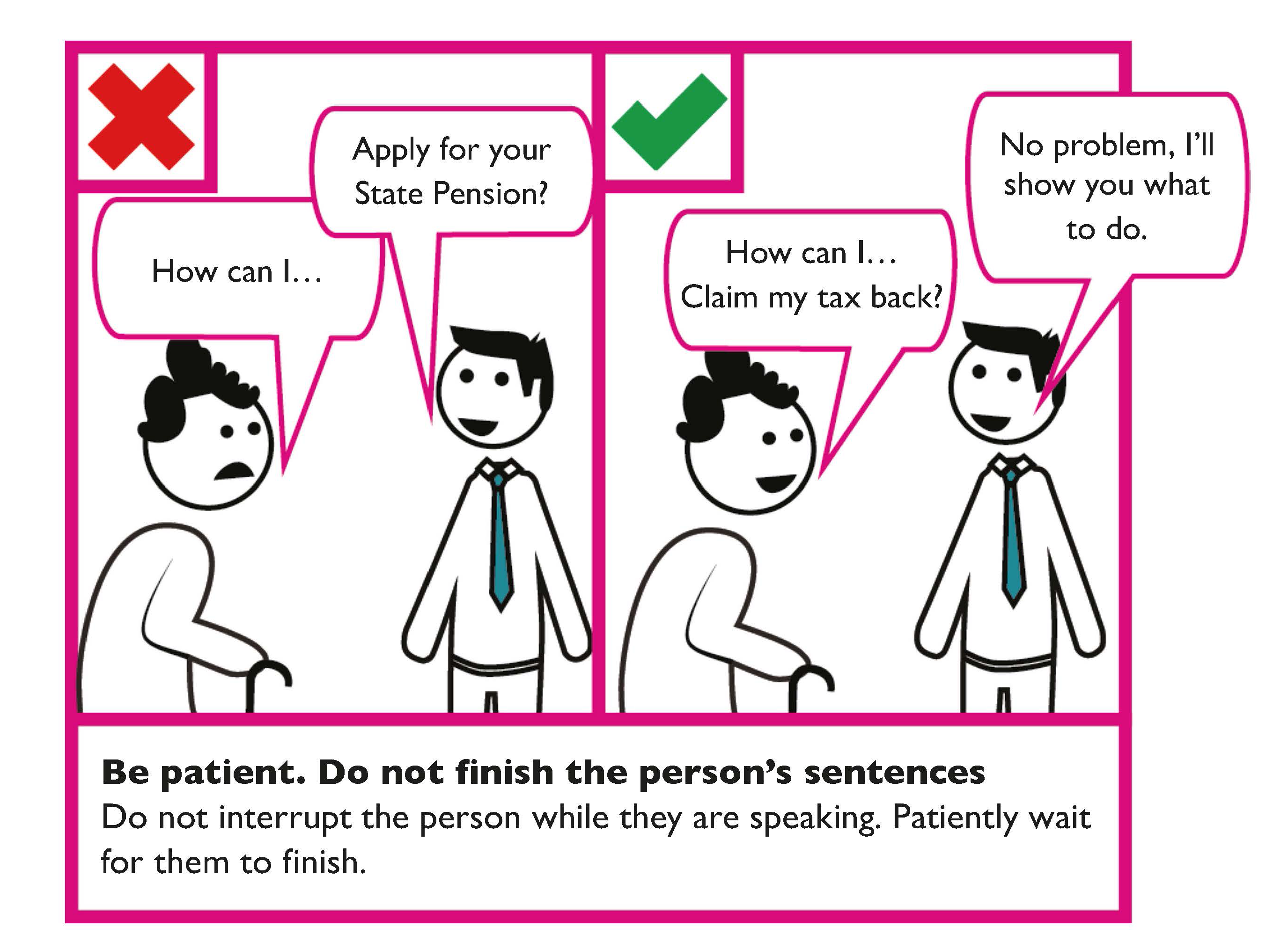
Don’t finish a person’s sentences
Do not interrupt a person while they are speaking. Patiently wait for them to finish. Customers with some disabilities may take a little longer to understand and respond.
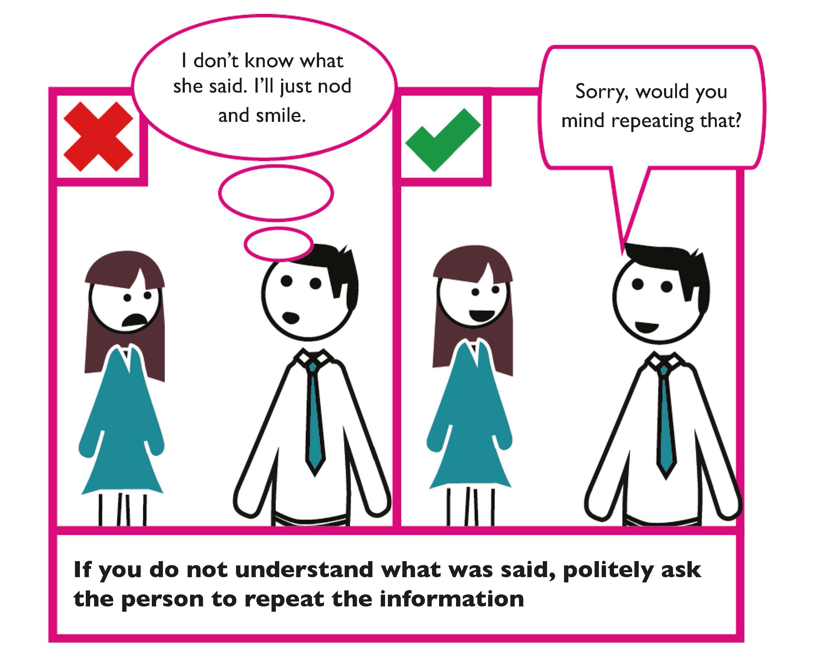
If you’re not sure what was said, politely ask the person to repeat the information
Alternatively, summarise the information back to the person to check you have correctly understood the request.
Think about what you are saying
Are you answering the person’s questions?
Are members of the public familiar with the technical terms your organisation uses?
Open-ended and closed questions
Use open-ended questions to gain more information. Open-ended questions typically provide more informative answers. For example, “What questions do you have?”
Closed questions generally only provide yes or no answers. For example, “Is that your answer?”
Provide dedicated employees to help
Where possible, and if appropriate, have specifically trained employees to deal with members of the public who require extra time.
Questions and answers can provide a good way of finding out if a person has understood the information.
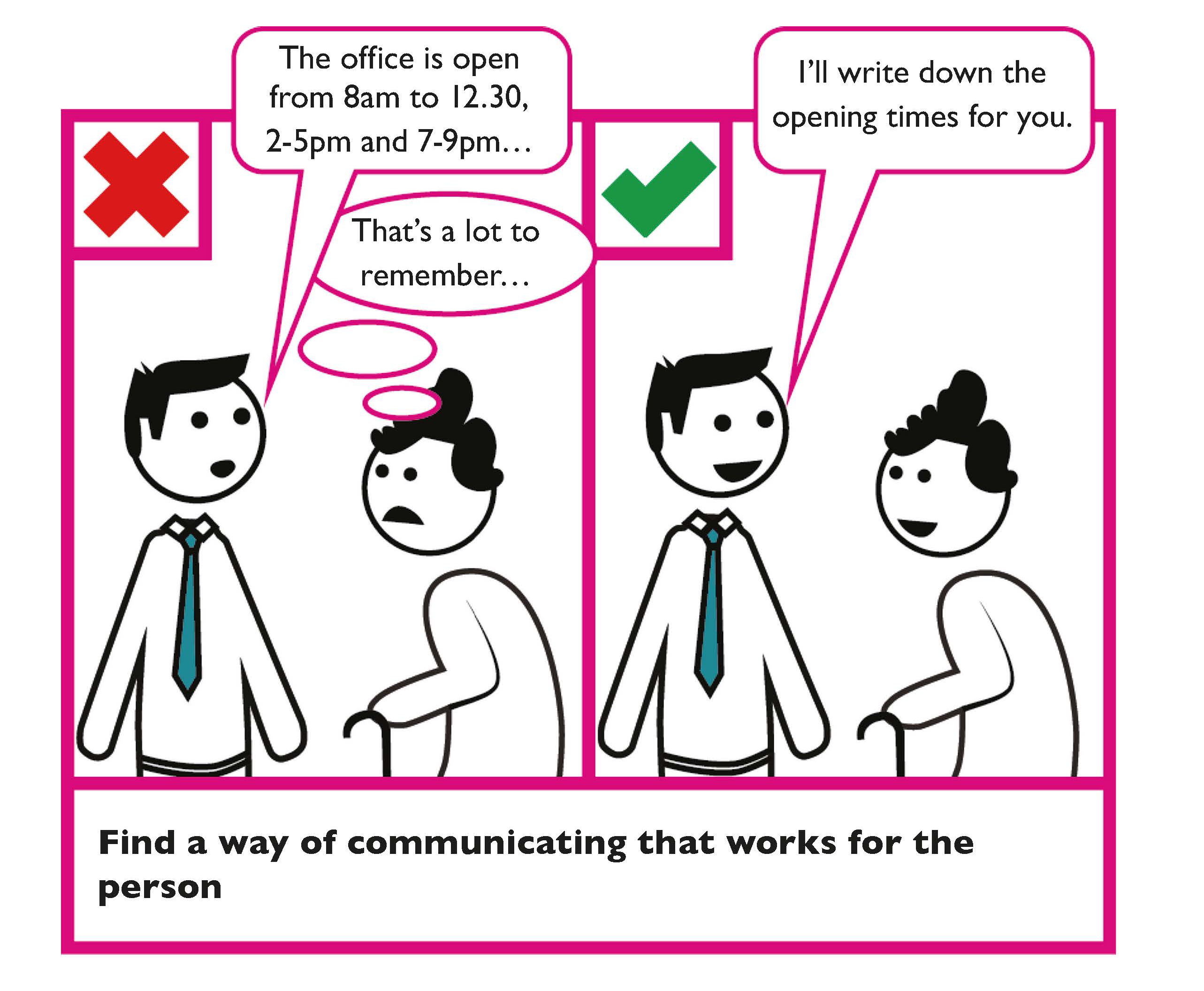
Find a way of communicating that works for the person
For example, keep a pen and paper handy to write information down if necessary. Alternatively, provide images that may help get your message across.
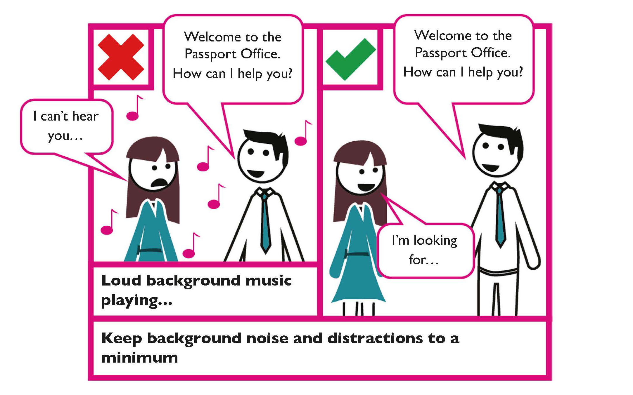
Keep background noise to a minimum
Try to speak in an area with few competing sounds. This is particularly important for persons with autism and for the one in seven members of the public who has some level of hearing loss.
Use alternative ways to communicate
To accommodate different languages, where appropriate, offer information using non-spoken forms of communication; such as sign language, universal symbols, translation software or phrase books.
Finish the conversation by saying thank you and good-bye
Tips
Consider the following guidance on communicating with persons with disabilities.
- Some disabilities are not visible. Take the time to get to know the customer’s needs.
- Be patient. Persons with some kinds of disabilities may take a little longer to understand and respond.
- Identify yourself if you approach a customer with a visual impairment. Don’t walk away without saying goodbye.
- Do not touch service animals such as assistance dogs. They are working and have to pay attention at all times.
- If the customer has an intellectual disability, give one piece of information at a time. Use plain words and short sentences.
Spoken and Signed Communication Checklist
- At the start of a conversation, introduce yourself.
- Consider alternative means of presentation.
- Use plain English.
- Keep your message simple.
- Speak clearly and slowly.
- Listen first and then respond to the person.
- Do not finish the person’s sentences.
- If you do not understand what a person has said, politely ask the person to repeat the information.
- Make sure the person understands what you have said.
- Keep background noise to a minimum.
- Finish the conversation by saying thank you and good-bye.
Face-to-Face Communication
Over 90% of your message is communicated non-verbally. This is influenced vocally (38%) by factors such as volume, pitch and rhythm, and by body movements (55%), specifically facial expressions.
The guidance below should be considered when communicating with a person face-to-face.
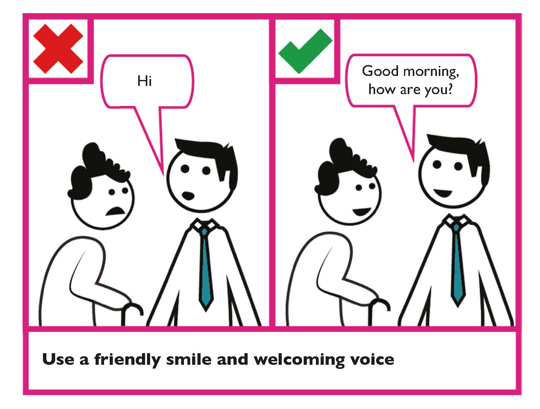
Use a friendly smile and welcoming voice
It puts customers at ease. All members of the public would like a good customer experience.
Wear a badge
When communicating with a person face-to-face, where possible, wear a name badge. This will make it easier for the person to identify who you are.
Consider the distance you are standing from the person
Do not stand too close but also make sure you do not stand too far away.
Face the person when speaking
Make eye contact and face the person when speaking to them.
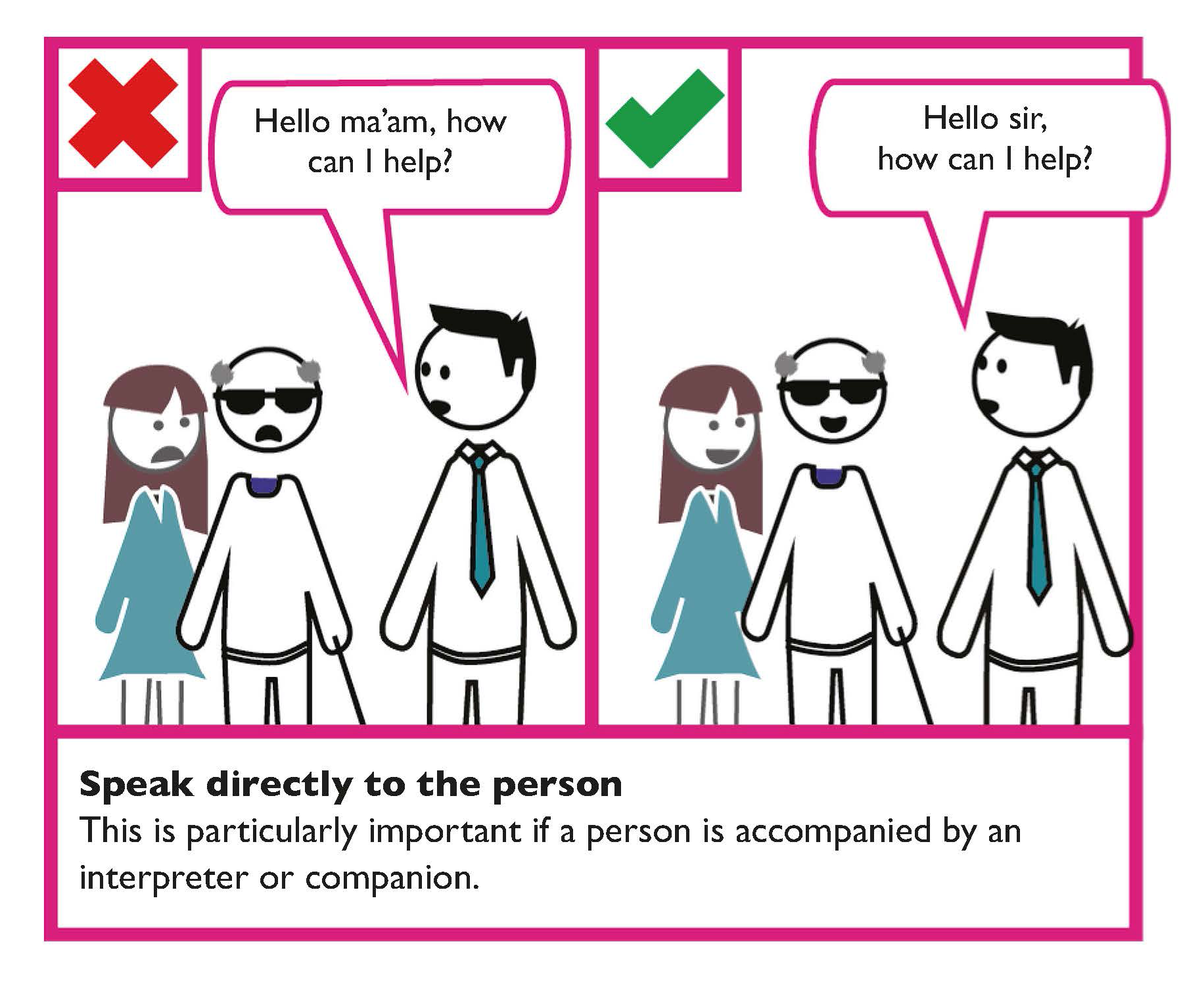
Speak directly to people
For face-to-face communication, you should always speak directly to the person. This is particularly important if a person is accompanied by an interpreter (for people who have a speech difficulty or whose first language is not English) or companion (who provides assistance to the person).
Ask the person “How can I help?”
Depending on the context of your communication if you are not sure what to do, ask how you can help. Do not just jump in. The person will know if they need help and how you can provide it. Always ask the person how they want to communicate.
Listen to the person
Your body language is an important part of your listening behaviour; be aware of your posture, eye contact and facial expressions.
Be patient
Be aware that some persons may take a little longer to understand and respond.
If you offer assistance, wait until you receive permission
Never touch a person, service animal (for example a guide dog) or their assistive products (for example wheelchairs) without permission.
Consider the provision of quiet times or spaces
Consider the provision of quiet times or quiet spaces to accommodate people who may experience sensory overload, including persons with autism.
Learn more
The Irish Human Rights and Equality Commission provides For Service For All: a practical guide for Credit Unions to improve accessibility for their members.
The Irish Human Rights and Equality Commission provides Accessibility for Members of the public with Disabilities in Community Pharmacies.
The National Adult Literacy Agency (NALA) provides Writing and Design Tips.
Communicating with persons who are d/Deaf or those who are hard of hearing
Some persons who are hard of hearing may have minor difficulties with hearing normal speech or particular sound frequencies; others may be profoundly d/Deaf.
In this document you will see the term ‘deaf’ used with an uppercase ‘D’, a lower case ‘d’ and with the upper and lower case combined ‘d/D’.
Deaf — with the uppercase ‘D’ is used in this document when referring to those who identify culturally and linguistically as part of the Deaf community and who use Irish Sign Language (ISL) as their preferred language.
deaf — with the lowercase ‘d’ is used to refer to those who are deaf or hard of hearing and who do not identify culturally and linguistically as a member of the Deaf community and they may not use ISL. They may communicate through English, by lip-reading or by writing.
d/Deaf — this term is used to refer to both those who do and do not identify as part of the Deaf community.
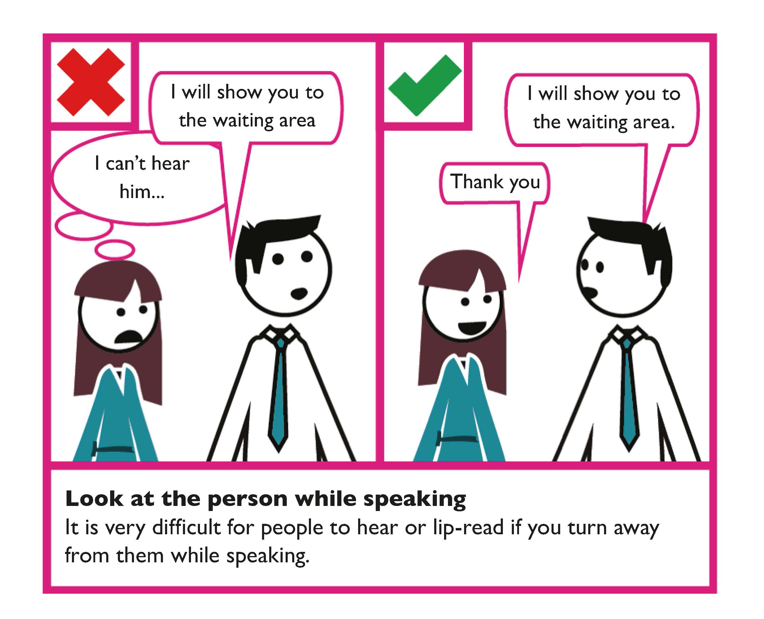
Face the person when speaking and do not cover your mouth
It is very difficult for persons who are hard of hearing to listen or lip-read if you have your hands in front of your mouth. This is equally true if you turn away from the person while speaking. Look directly at the person. Do not look away, down at your notes, cover your face, chew gum, or have a pen in your mouth while talking. Speak clearly and at a slightly slower pace, but do not shout or exaggerate mouth movements, as this will distort your lip patterns. During meetings, make sure that only one person speaks at a time.
Do not stand in a dark place or have your back to a light source
It is important that a person can see you clearly when you are speaking to them. The person needs to be able to see your face clearly to lip read and see facial expressions. The person may also need to be able to see your hand actions when using ISL.
To be seen clearly ensure sufficient lighting illuminates your face and hands. Try to avoid bright light sources being behind you, for example standing in front of a sunny window.
When to provide real-time captioning
When speaking while aided by visual display include real-time captioning. This is helpful during information sessions, presentations, speeches, meetings and conferences.
Learn more
W3C provide guidance on Making Events Accessible: Checklist for meetings, conferences, training and presentations that are remote/ virtual, in-person or hybrid.
Communicating with persons who use Irish Sign Language (ISL)
ISL is the sign language used by the majority of the Deaf community in the State. ISL is a full language with its own complex linguistic structure, rules and features. It is a visual and spatial language with its own distinct grammar and it is a language of the hands, face and body. ISL is different from all other sign languages such as British Sign Language and American Sign Language.
Public bodies are required to provide free ISL interpretation upon request. Ideally, a publication should also be accompanied by an ISL video that summarises the publication. Only accredited ISL interpreters should be used in line with Irish Sign Language Act 2017.
When you publicise a public event or make appointments, indicate that you can provide ISL interpreters or real-time captioning upon request. Indicate how much advance notice you need to make arrangements.
When working with an interpreter talk directly to the Deaf person, and not the interpreter. Do not ask the interpreter’s opinion. Make sure that the interpreter sits next to you and that the Deaf person can see both of you clearly.
Tips
Provide systems that do not only rely on a person’s ability to hear.
Provide induction loop systems in areas where public services are provided and test them regularly.
Provide systems that allow customers to use text messages and email for communications.
Provide a real-time captioning service during information sessions or conferences.
Provide live web chat on websites.
Learn more
Sign Language Interpreting Servicec (SLIS) provide a referral service for booking interpreters and the Irish Remote Interpreting Service (IRIS). IRIS provides a live video-link to an ISL interpreter.
The Broadcasting Authority of Ireland has a guidance document with a section about Irish Sign Language and interpreters.
The Irish Text Relay Service (ITRS) facilitates people who are deaf and people who are hard of hearing in making and receiving calls in the Republic of Ireland. ITRS translates text into voice and voice into text. Calls are relayed though ITRS agents.
Real-time captioning, also called communication access real-time translation (CART), is the stenography method used to convert speech to text. Real-time speech-to-text facilitates people who are hard of hearing and is useful for people whose first language is not English but who are comfortable reading English. There are companies in Ireland who can provide this service either onsite or remotely.
Live Web chat is a service that allows communication (or chat) by text in real time with visitors to their website. Live Web chat is commonly used to provide immediate customer support and information. The customer can be emailed a transcript of the chat. An example is Live Advisor from the Citizens Information Phone Service (CIPS).
Audio-frequency induction loop systems (AFILS) allow people with hearing aids to hear more clearly. The hearing aid allows them to pick up the wireless signal generated by the loop system.
The Irish Deaf Society (IDS) is a Deaf-led organisation that empower and enable Deaf people to participate in positive action to further their independence and full and equal participation in the community. IDS offers Deaf Awareness Training as well as accredited Irish Sign Language classes.
Chime is the National Charity for Deafness and Hearing Loss. Chime provide awareness training for employers and organisations and advice on the range of assistive technologies for the workplace.
Face-to-Face Communication Checklist
- Be aware of non-verbal communication when communicating face-to-face.
- Use a friendly smile and welcoming voice.
- Consider the distance you are standing from the person.
- Listen to the person.
- Speak directly to the person.
- Where appropriate ask the person “How can I help?”
- Find a way of communicating that works for the person.
- Be patient.
- If you offer assistance, wait until you receive permission.
- Consider the provision of quiet times or spaces.
- Do not sit or stand with the light behind you.
- Face the person when speaking. Do not put your hands in front of your mouth while speaking.
Dealing with difficult situations
The following guidance is provided for dealing with dissatisfied members of the public:
- Listen carefully and take the person’s concerns seriously.
- Reassure the person by letting them know you have heard what they have said and you have understood their feelings and concerns. Find some common ground you can agree on.
- Where the person may be aggressive, confrontational, or are repeating the same point unnecessarily, tell the person that you have understood and repeat their words back so it is clear you have heard them fully.
- The person may be unclear about what you can and cannot do. If you need to pass on the information to another organisation or agency, make sure the person understands why you are doing this and that you have their agreement to share their personal information with the other organisation or agency.
Try to pass on as much information as possible to the referral, so that the person does not need to explain their situation again.
Tips
To improve the person’s experience, look at how you can improve communication provided by your organisation. This could include:
- Providing training on communication techniques such as interviews, presentations, message taking, telephone dialogues and conversational skills.
- The National Disability Authority produced a free, short, interactive eLearning training course on disability equality awareness. This course will equip public sector staff with the necessary skills to provide an effective customer service to everyone and especially customers with disabilities.
- Providing training on computer-supported video communication techniques.
Digital Communication
Digital and Web Based Communication Guidance
Following are some key digital and web based communication design considerations on how to enhance customer communication with members of the public.
The guidance should be applied when designing ways to communicate with members of the public by telephone, email, enewsletter, websites or social media.
Tip
Live Web chat is a service that allows communication (or chat) by text in real time with visitors to their website. Live Web chat is commonly used to provide immediate customer support and information. A transcript of the chat can be emailed to the customer.
The EU Web Accessibility Directive requires that websites and mobile apps of public bodies are accessible to persons with disabilities. Public bodies must:
- ensure their website and mobile apps comply with the European standard EN 301 549.
- provide and maintain a detailed Accessibility Statement.
- provide an accessible means for making a complaint about the site’s/app’s accessibility.
- build capacity and awareness of web accessibility.
The accessibility requirements for websites and mobiles apps in EN 301 549 are equivalent, for the most part, to the Web Content Accessibility Guidelines 2.1.
Learn more
The NDA website has up-to-date information on the EU Web Accessibility Directive, including Ireland’s monitoring reports.
The Centre for Excellence in Universal Design (CEUD) provides detailed guidance on web accessibility techniques for developers, designers and content creators/editors as well as practical training webinars on the Directive.
Web Content Accessibility Guidelines (WCAG) 2.1
Public bodies should achieve AA level conformance with the latest WCAG guidelines.
Learn More
Find out more about the Code of Practice on Accessibility of Public Services and Information Provided by Public Bodies.
Find a four-part webinar series on Web Accessibility developed by the Irish Computer Society (ICS) in partnership with the Centre for Excellence in Universal Design (CEUD).
Tools
The World Wide Web Consortium (W3C) provides a list of web accessibility evaluation tools.
Writing for the Web
Make text easy to read and understand
Always use the simplest and clearest language possible. Avoid technical language that a member of the public may not understand. If you must use technical language, clearly explain what it means in plain English.
Where applicable, provide important information in other languages
If a large percentage of your customers do not speak English as a first language, where applicable, provide content in other languages or offer a translate button.
Help members of the public to scan text
Break text into chunks using short paragraphs, lists and sub-headings in order to help members of the public quickly understand and absorb information.
Keep content clear and concise
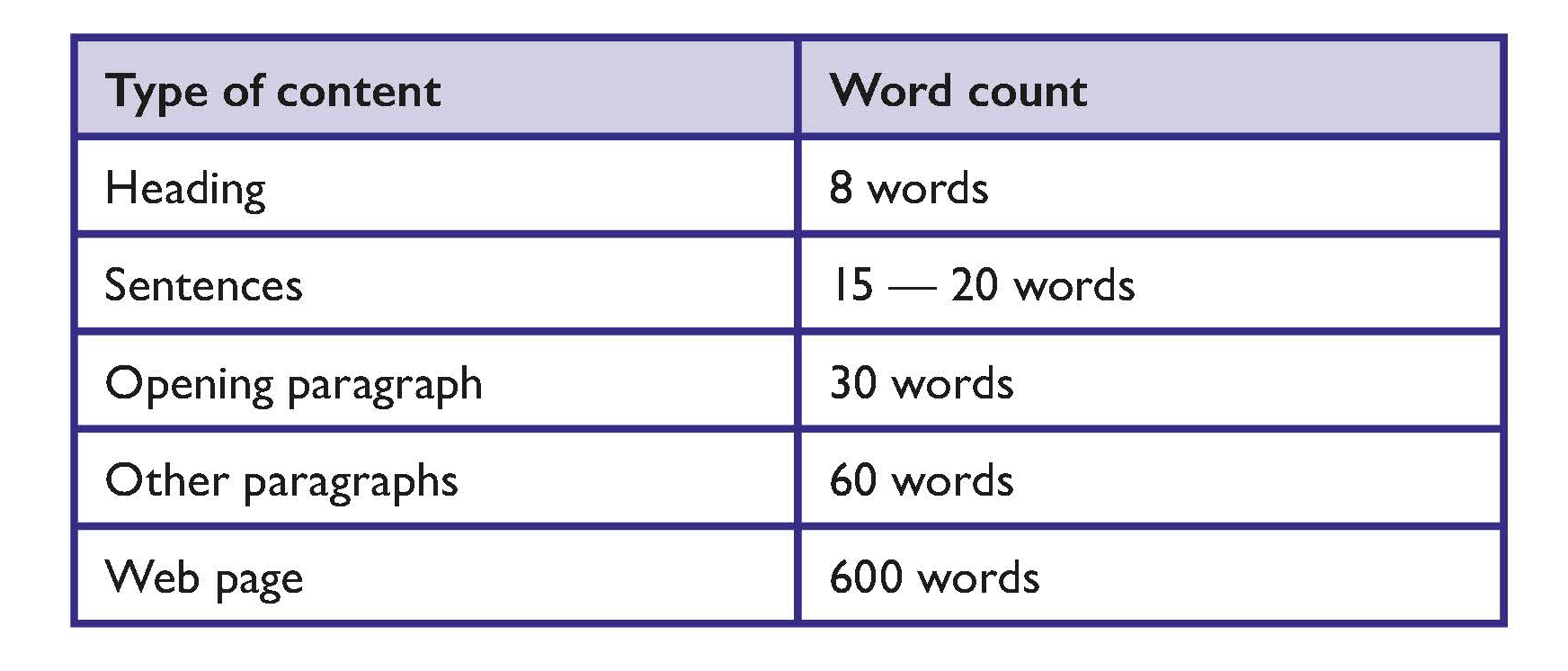
Adopt word-count targets that are appropriate for members of the public and your content.
Suggested word counts are as follows:
Write for members of the public
People interact with text differently online than they do in print. Most people are more inclined to scan text on a website. Therefore, content should be presented in a way that members of the public can obtain key information quickly when they scan your website.
Steps to achieve this include:
- Present the key conclusion or facts at the start of the text.
- Present information in order of importance. Support the key conclusion with the most relevant information.
- Present supporting detail or background information.
- Provide links to background or related information if available.
Tip
The CEUD provides guidance on Web accessibility techniques for use by:
- Developers
- Designers
- Content providers and editors
Tools
Readability checkers can work well in conjunction with plain English guidelines and user testing.
The public sector website gov.ie has a readability checker as part of its content management system.
There is a readability checker in MS Word.
Some publicly available readability checker apps might not be secure.
Use a clear, readable font
Use a clear font that people are familiar with and recognise easily. For example, Verdana or Helvetica.
Use bold or bigger sized text to emphasise text
The general guidance in emphasising important information is to:
- Avoid using BLOCK CAPITALS
- Avoid using italics
- Avoid using underlining
Avoid unnecessary technical terms
If you must use technical words, clearly explain what they mean.
Define unfamiliar abbreviations or acronyms
Where a reader may be unfamiliar with an abbreviation or acronym, spell it out the first time it is used, followed by the abbreviation or acronym in brackets.
For example, the Personal Public Service (PPS) number.
Try to keep unfamiliar abbreviations or acronyms to a minimum.
Avoid Latin and French expressions
There can be confusion around words such as e.g., i.e. etc.
Try to use the full English equivalents such as: ‘for example’, ‘that is’ and ‘and so on’.
Use your full organisation name on each page
Spell out your organisation’s name in full on every page. This is particularly important for members of the public who land there from search engines.
Use a house style
Develop a house style (or adopt a third-party style guide) to ensure consistency. This can also be applied to writing and layout standards.
Use Alternative (Alt) Text to make images and media accessible
Alternative (Alt) text is text associated with images or media that conveys the same essential information as the image. Screen readers announce alternative (Alt) text in place of images.
Alternative (Alt) text can also be changed into other formats that some people may require, such as large print, Braille, speech, symbols or other languages.
Alternative (Alt) Text basics:
- Provide alternative (Alt) text in the alt attribute.
- Succinctly describe the main message of the image.
- Mark decorative images as decorative in the alt attribute.
- Add descriptive text within the body of text near the image when alternative (Alt) text can’t be provided in the alt attribute.
Learn more
Web accessibility guidance on CEUD’s website hosts a link to WebAIM’s guidance on alternative (Alt) text.
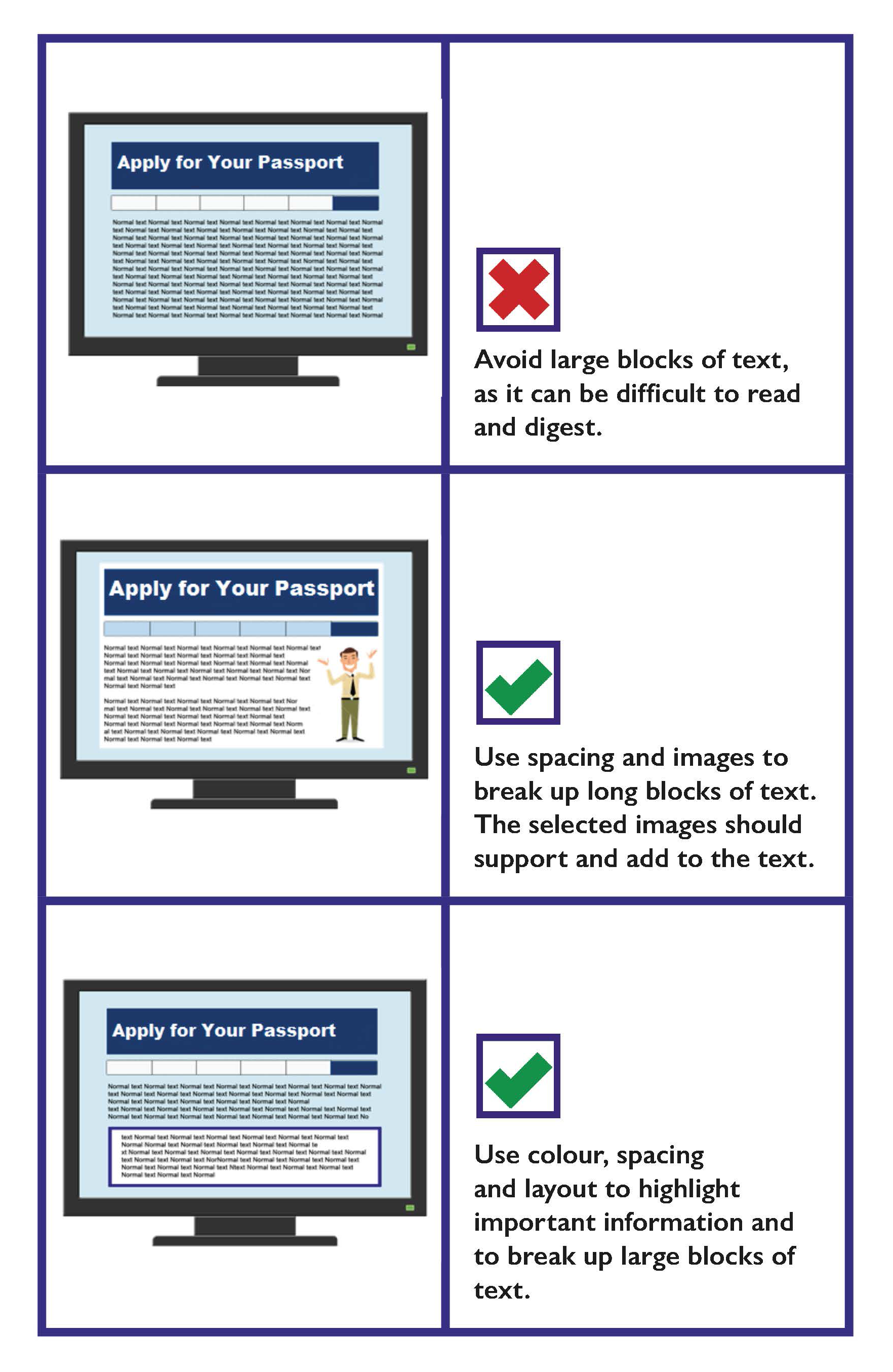
Use colour, spacing, images and layout to break up long blocks of text
- Use images to break up long blocks of text.
- Use images to support the information in text.
- Use white space to separate blocks of information.
- Use colour, spacing and layout to highlight the important information.
Use good quality, relevant images
Use good quality, relevant images that add to or support your text content. Avoid images that are low quality or images that are not relevant to the text content.
Writing for the Web Checklist
- Ensure you comply with Directive (EU) 2016/2102 on the accessibility of the websites and mobile applications of public sector bodies.
- Avoid technical language, Latin and French expressions and unfamiliar acronyms and abbreviations.
- Where applicable provide important information in other languages.
- Present content so that readers can absorb and understand the content quickly. Help readers to scan text by:
- Presenting key conclusions at the start.
- Presenting information in order of importance.
- Presenting detailed or background information.
- Providing links to related or background information.
- Keep content clear and concise.
- Use the full organisation name on each page.
- Use a house style.
- Use Alternative (Alt) Text to convey the same meaning as the images or media.
- Use good quality, relevant images that add to or support your text content.
Content Quality
If there are issues with the quality of the content on your website, members of the public will quickly identify it. The guidance below is provided to help develop good quality website content.
Make sure your content is up-to-date
Out-of-date content will undermine the quality of the surrounding content.
Use correct spelling and punctuation
This can impact on the credibility of your website, and additionally, your services.
Be consistent with terms and formats
Use the same terms and formats for the same concept throughout your website.
For example, don’t change writing the date as ‘7 July 2020’ to writing it as the ‘07/07/20’.
Learn more
For further information on writing dates, addresses and numbers, please see Writing Addresses, Section 1: Written Communication.
Content quality control process
The following steps can be put in place to manage the quality of your content:
Assign a designated manager
Have a manager take ownership of the content function and manage it actively.
Put in place a content review process
Establish an editorial process that involves at least one round of revision and sign-off on all content.
Provide training on developing web content
Content development should be included in relevant job descriptions. All content editors and authors should be trained so they know how to prepare web content and monitor content quality.
Develop a house style guide
The content authors and editors should be supported with a house style guide, or relevant standards and guidelines.
Tip
An example of a house style guide is available at: Gov.ie style guide
One of the most valuable processes to ensure content quality is to carry out regular reviews and to include customer feedback in these.
A review should look at each item in a body of text and assess it against the house style guide, standards and guidelines.
Links and Microcontent
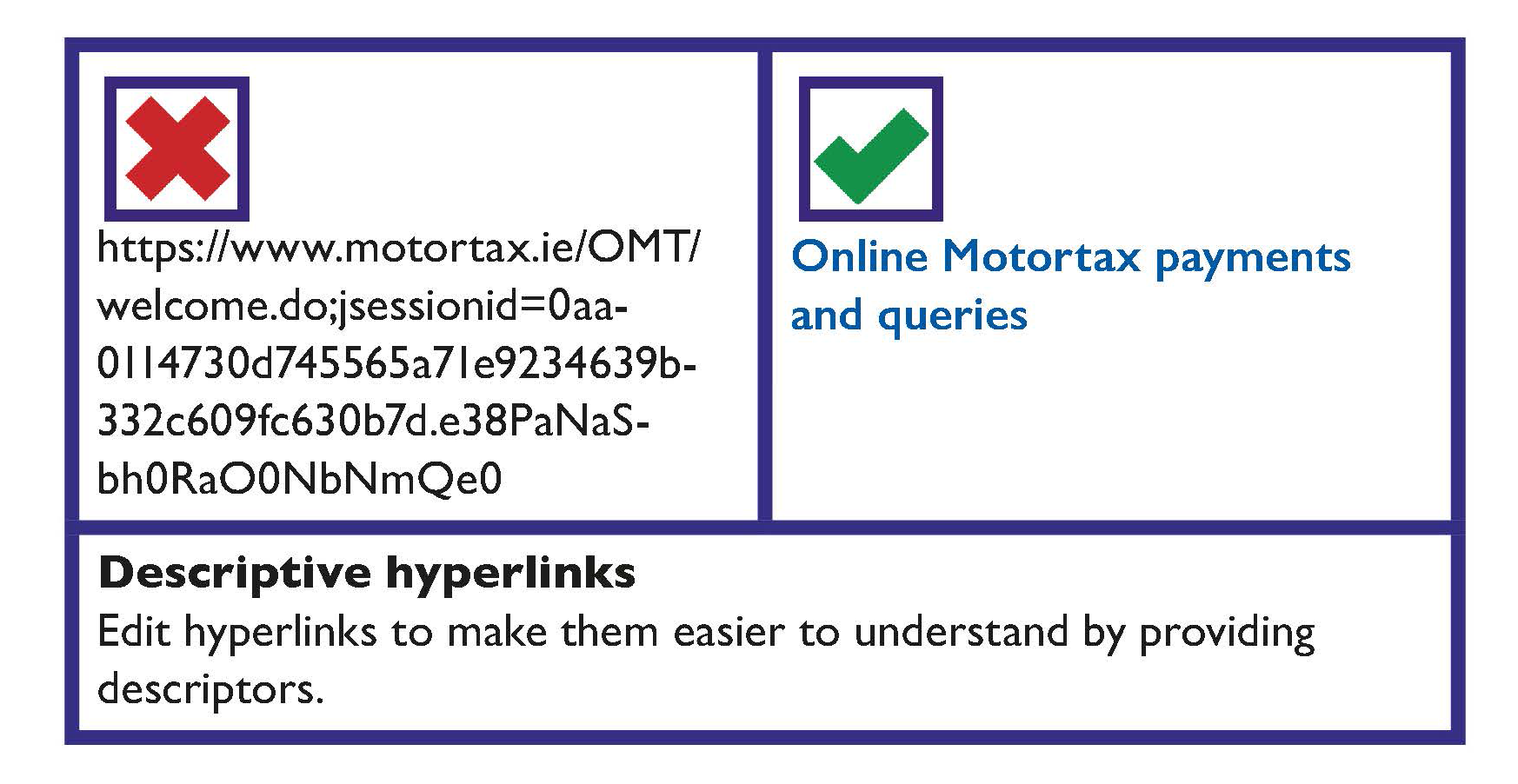
Write descriptive links to help your readers
Hyperlinks (links) are typically created by pasting in a URL and pressing the space button. Edit these links to make them easier to understand for your readers by providing descriptors.
Note: If a document or content is to be printed, you may wish to use the full URL and a description in the link text.
The following guidance is recommended when providing links:
- Link descriptions should be short but descriptive. It should typically be between two and five words long.
- Provide useful information about the link. For example, file size, and format.
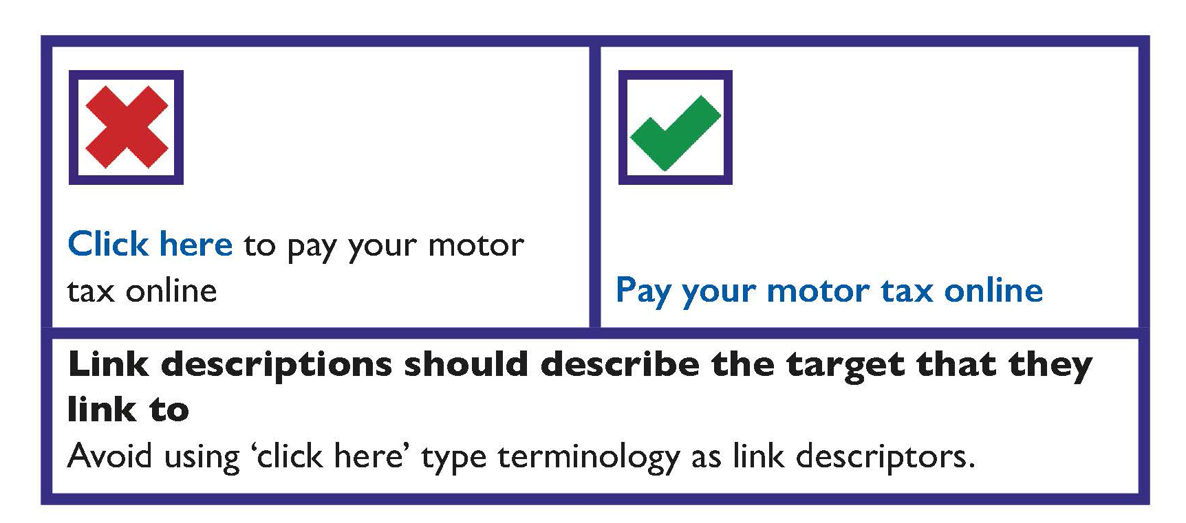
- Link descriptions should describe the target that they link to.
- Link descriptions should occur naturally in the sentence.
- Links can be presented in the text of a page or separately, such as at the end of the page.
Link descriptions should avoid ‘click here’ type terminology.
Learn more
The Centre for Excellence in Universal Design (CEUD) provides guidance on making links meaningful and guidance on writing good web content.
Find guidance on how to use gov.ie and create web content for gov.ie webpages.
Microcontent
Microcontent refers to small groups of words that can be scanned by the reader to get a clear idea of what is on a web page. Microcontent includes:
- Captions for images: These provide the information required to help the reader understand the image in the context of the rest of the page.
- Sub-headings: These are used to break up long passages of text and to provide signposts to readers who are scanning the page.
- Headings: Use heading styles correctly, so that it creates structure that can be read using screen reader software. Do not create text that just looks like headings; for example, do not just increase the font size and weight of the text to create a heading.
Learn more
For further information, see Section 1 Written Communication, Document Design.
Titles and Descriptions
Well-written titles and descriptions help members of the public find your pages using search engines and, once found, encourage them to visit your site.
To write good titles and descriptions:
- Pick out two or three key phrases that are the most distinctive and typical of your page.
- Use key phrases and terms that a member of the public is most likely to use.
- Select a key phrase for your title (fewer than 70 characters).
Descriptions should:
- Include key phrases, or variations of them, at the start.
- Be factual, and accurately reflect the content.
- Be less than 156 characters long, including spaces.
Content Quality Checklist
- Make sure your content is up to date.
- Use correct spelling and punctuation.
- Be consistent with terms and formats.
- Put a content quality process in place:
- Assign a designated manager with responsibility for content.
- Put in place a content review process before information is placed on your website.
Links Checklist
- Link descriptions should be short but descriptive.
- Link descriptions should describe the target that they link to.
- Link descriptions should avoid ‘click here’ type terminology.
Titles Checklist
- Use key phrases and terms that people are likely to use.
- Select a key phrase for your title (fewer than 70 characters).
Descriptions Checklist
- Descriptions should be factual and accurately reflect the content.
- Descriptions should be less than 156 characters long, including spaces.
Designing and Developing Usable Websites
Make your website easy to navigate
The public should be able to use your website no matter what device or operating system they use, or their level of experience in using the web. The following guidance aims to help make accessing and navigating your site easier for everyone.
All navigation should be possible through the keyboard only
A fully accessible site should have no applications that depend on a mouse or similar cursor control (joystick, trackball, and so on).
Be consistent with layout
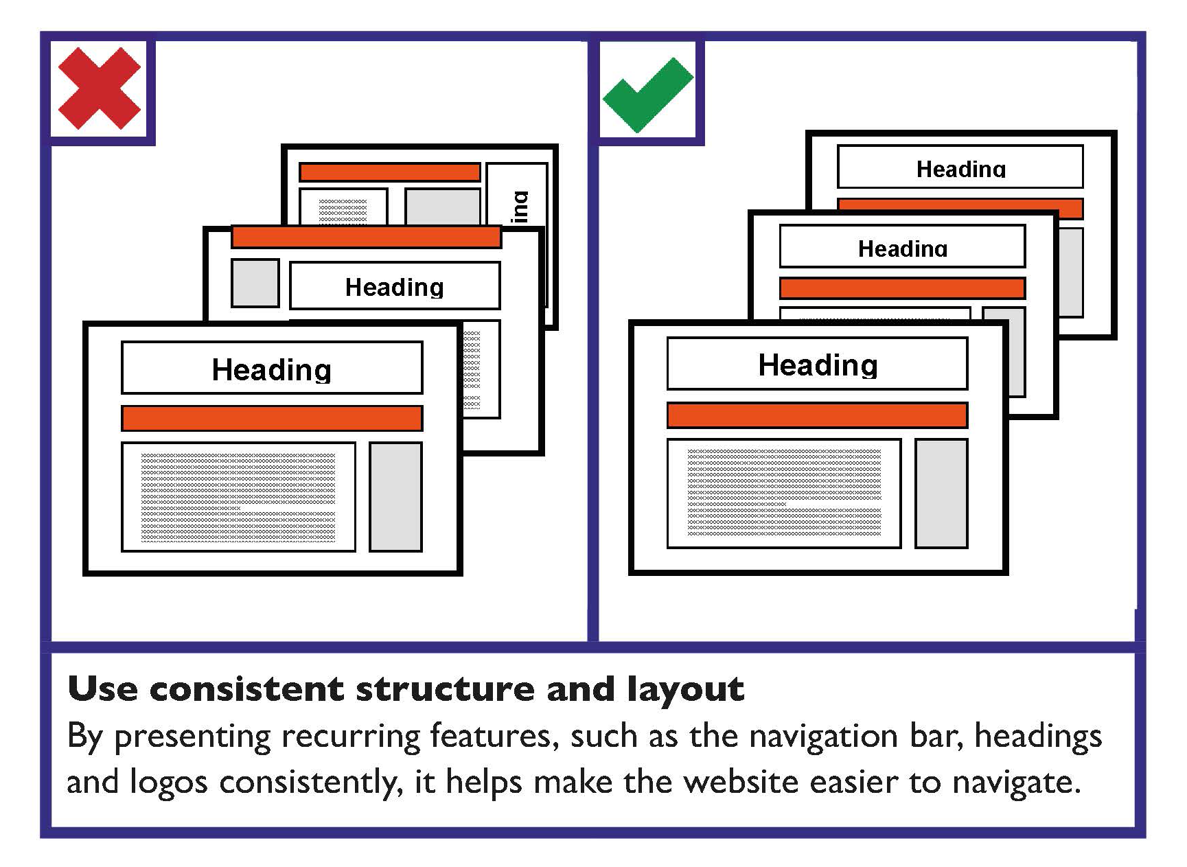
Well laid out content makes it easier for a person to navigate the site and find the content that they are looking for. Consistency is important.
The overall formatting and style of the content — the layout, structure, font, colour, and so on — should be consistent to make information easier to read.
The positioning and appearance of recurring items, such as the logo, navigation bar and headings, should be consistent.
The exception for consistent formatting and layout may be the homepage. Your homepage may have different formatting — it is similar in concept to the cover of a printed publication.
Always provide a link back to the homepage from every page of the site.
Learn more
The Centre for Excellence in Universal Design (CEUD) provides information on Web Accessibility Techniques.
Navigation bars should be easy to identify and distinguish
Use clear navigation bars that are distinguishable from the content.
Navigation bars should provide feedback
The navigation bar should clearly identify where the person is on the website. This can be done by highlighting the person’s current location on the navigation bar, and by disabling the link to the current page.
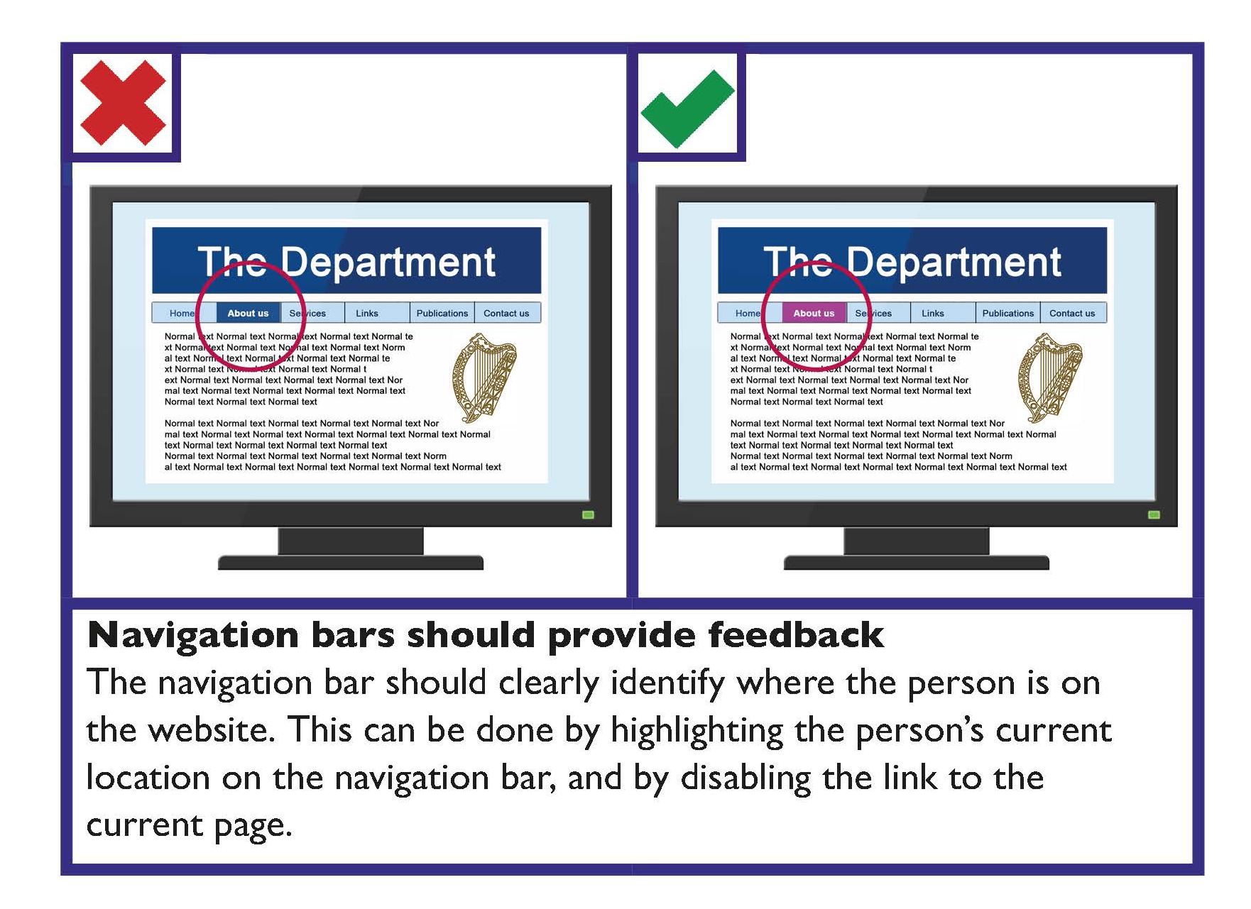
Make webpages appear and operate in predictable ways
Webpages, applications and online interfaces should be intuitive and predictable in how they operate. Websites typically have a set structure. This helps people to easily find information and navigate new websites.
Your website should be easy and intuitive to use for members of the public. Examples of established website features, which make navigation more intuitive to use, include:
- ‘Breadcrumb’ navigation: This provides information about where the current page is in the site structure and provides navigation to higher levels.
An example of this could be Home > About > Services.
- Within page ‘contents’ section: For long pages, a contents list for the page should be provided.
- Primary navigation bar: This is usually presented horizontally near the top of the page.
- A search box: This is usually in the top right area of the page. The search box should be visible on each page without scrolling.
If possible and appropriate web content should be usable on a variety of devices
Web content and applications should be usable by the widest variety of browsers, devices and assistive technologies by using fluid design and relative widths. (Note: Talk to your web designer about ‘responsive websites’.)
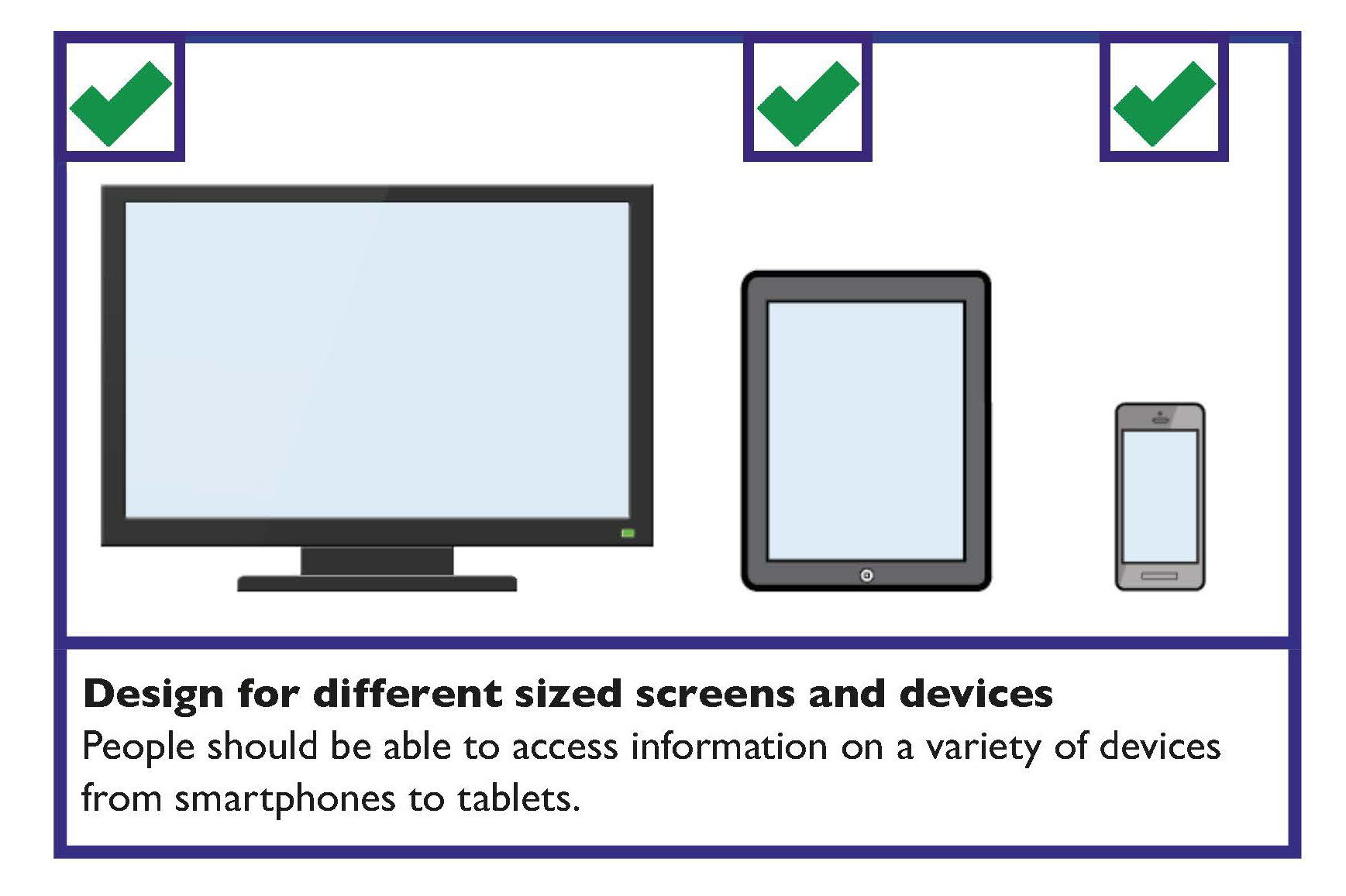
Learn more
The Centre for Excellence in Universal Design (CEUD) provides information on how to Design accessible navigation.
For further information on page structure, see section 2.2 in CEUD’s Universal Design Guidance for Online Public Services (2012).
Website Navigation Checklist
- All website navigation should be fully accessible through the keyboard.
- Be consistent with your navigation layout.
- The navigation bar should be easy to identify and distinguish from the rest of the content.
- Navigation bars should provide feedback to identify where the person is on the website.
- Provide enough time to allow the person to read, digest and respond to information.
- Make webpages appear and operate in predictable ways, which are intuitive to use.
- Web content and applications should be usable by the widest variety of browsers, devices and assistive technologies.
- Avoid the use of pop-ups.
Online Forms
Forms must be properly structured and optimised to support the person in completing the form without errors.
- Guidelines for the design of forms are as follows:
- Give the form a clear title. Identify whom the form is for and its purpose at the start.
- Give instructions in bullet points on the first page.
- Ensure all terms and conditions are clearly explained in plain English.
- Divide the form into clear and logical sections with informative headings and clear numbering.
- Avoid unnecessary or repeated questions.
- Make it clear which fields are mandatory and must be completed.
- Make sure people have enough space for providing answers.
- Where possible use boxes rather than lines for answers.
- Create a clear path through the form.
- Avoid multi-column forms unless necessary.
- Avoid creating a 'jagged' misaligned appearance.
- Make sure ‘tick boxes’ are clearly linked to the answer.
- Ensure that ‘tick box’ borders and answer lines are solid and at least one point wide.
- Many people move between form fields with the tab key. Use the form layout and if necessary use the tab index attribute in HTML to support this.
- Make the ‘next’ or ‘submit’ button obvious and distinctive. This is particularly important where it is provided near competing buttons such as ‘back’.
- Use the simplest way of presenting options for ease of use:
- It is recommended that for less than seven options, ’tick boxes’ should be provided.
- For more than seven options, a drop down menu is recommended
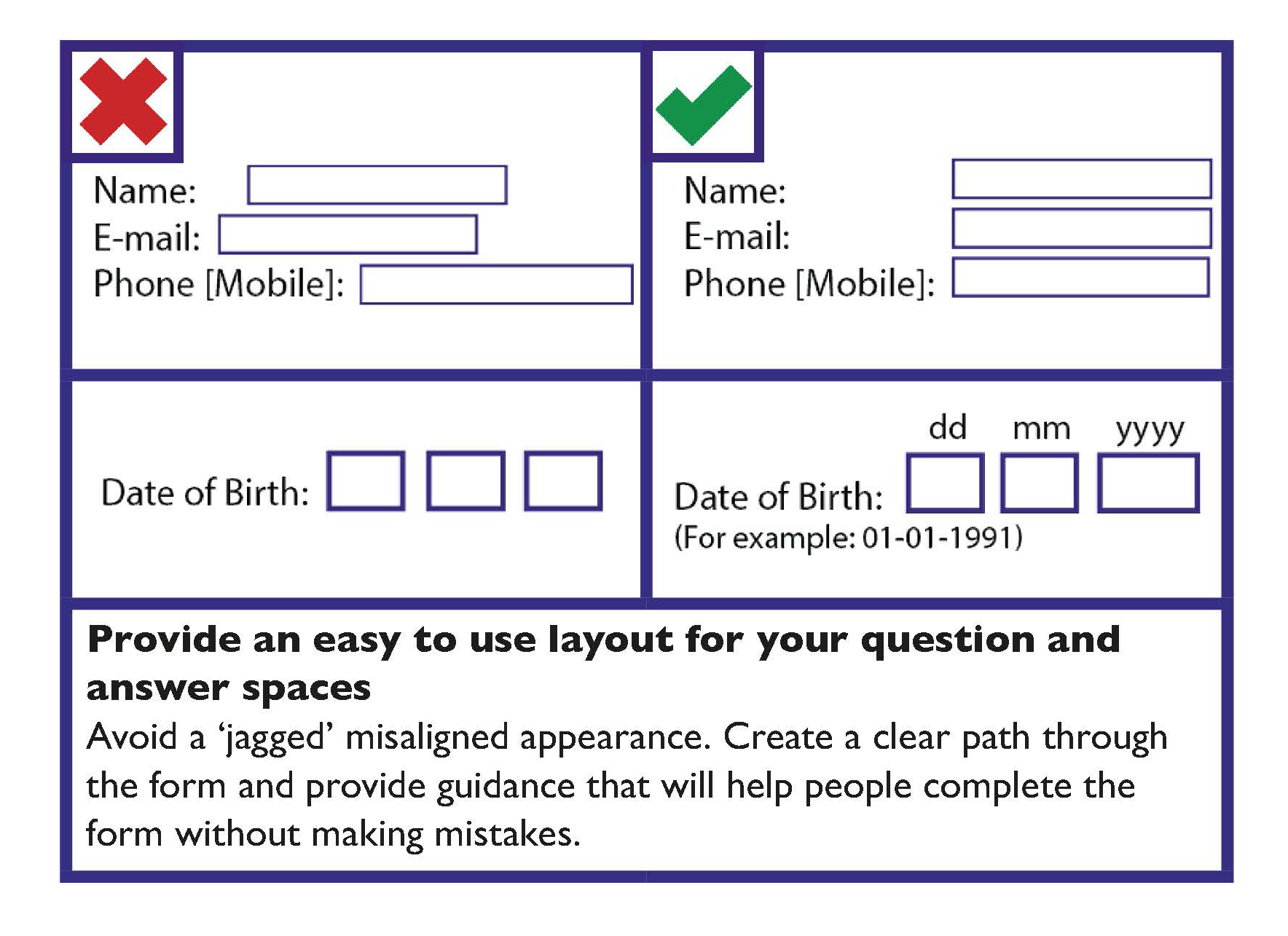
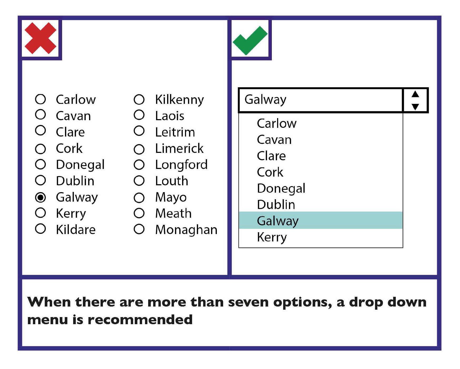
Online Forms Checklist
- Give the form a clear title.
- Provide clear instructions at the start of the form.
- Provide questions in a logical order.
- Group similar questions together under a useful heading.
- Avoid unnecessary or repeated questions.
- Make it clear which fields are mandatory.
- Make numbering as simple as possible.
- Make it clear where answers should be provided.
- Make it easy to navigate through the form.
- Make it easy for the person to select options.
- Make the ‘next’ or ‘submit’ button obvious and distinctive.
Error messages
If the person is required to complete a form online, the form should be validated when they have completed the form. This is to make sure that the correct information has been provided before it is submitted. If an error in the form is identified, then there is a three-step process to correct the error:
1. Make the person aware that there is an error in an obvious and easy to understand way
There are a number of ways that you can make the person aware of the error:
- Consider alternatives to pop-up windows to avoid the difficulties these can cause for users of screen readers and other assistive technologies.
- Provide the error message on the web page itself.
- Provide the error message as the first item on a new page or focus should be set directly to it.
- Highlight the error. This should be identified using both colour and a symbol (such as a ”*”). Errors should not be identified using colour alone.
2. Indicate the location of errors on the form itself
If only one error has occurred, it may be more helpful to display the message and set focus to a point immediately before the area on the form where the error was made.
If several errors have occurred, the incorrect information should typically be displayed together. It is helpful to inform the person about the number of errors that were found.
3. Allow the person to resubmit and revalidate the form
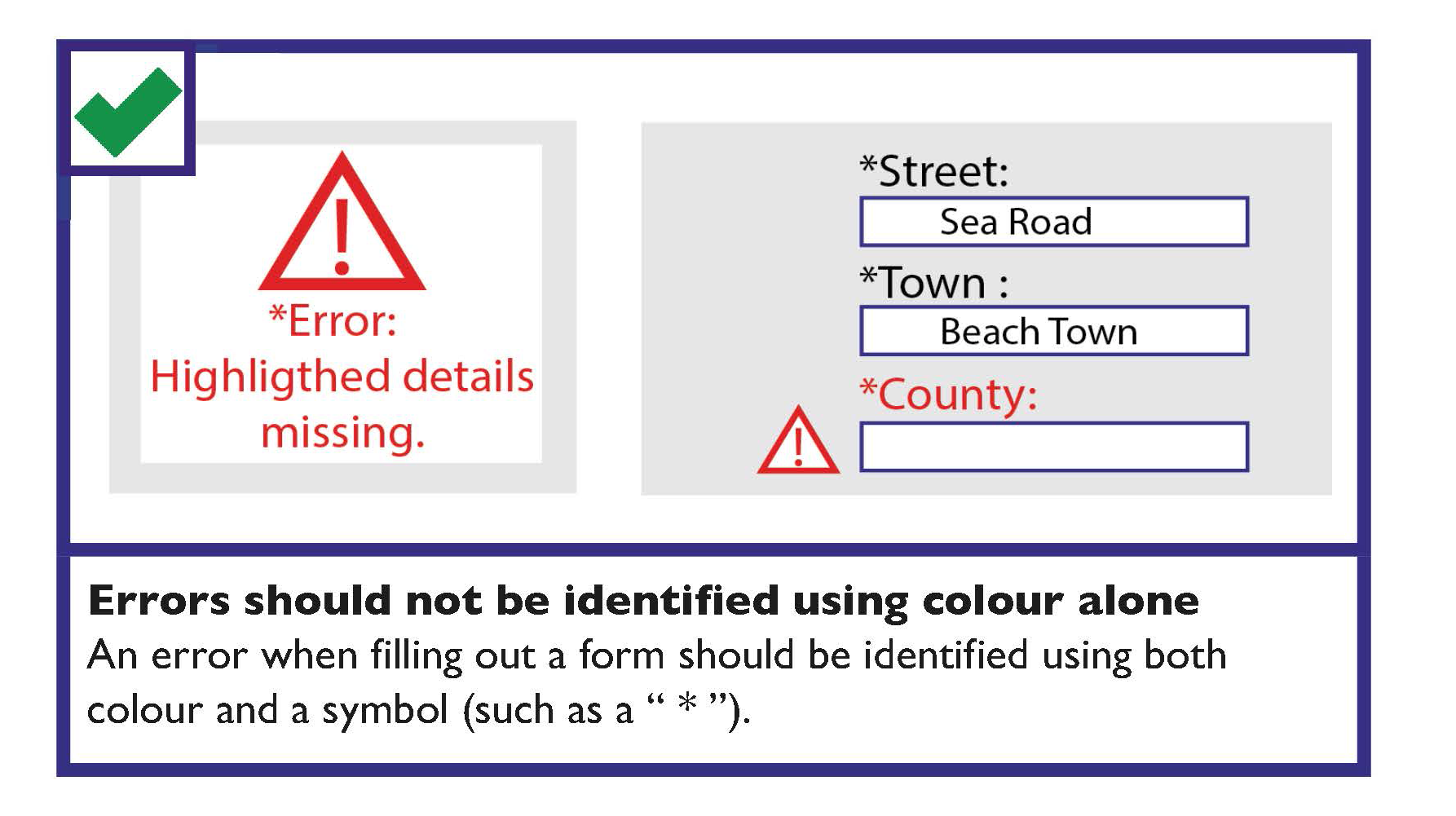
Password and Login Details
Guidance should be provided before the password input
For example, when a password is to be created a reminder should be provided that the password needs to be in lowercase and consist of a minimum six letters with no spaces. This guidance should be provided before the space to fill in the person’s login details.
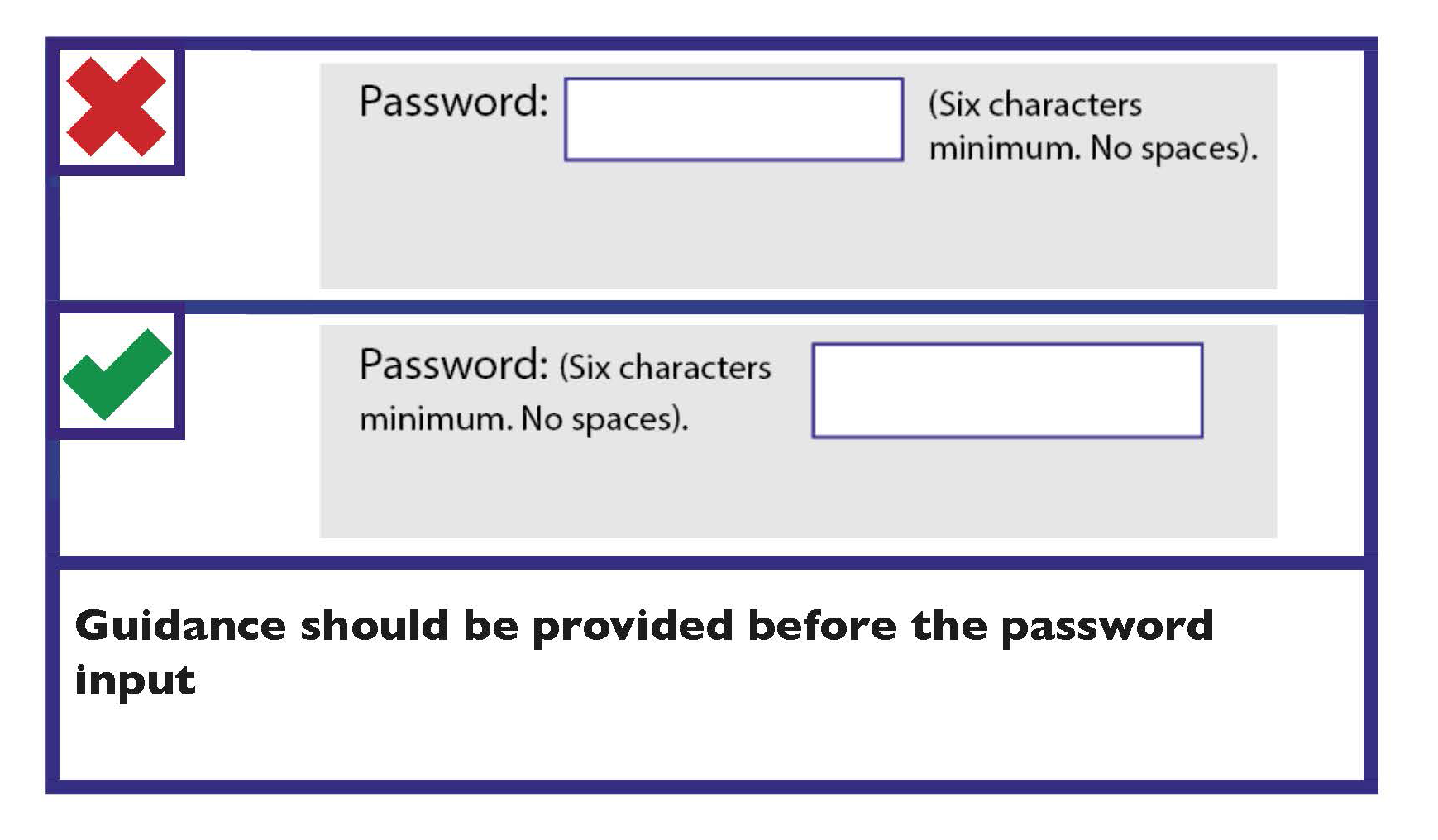
Time-out Messages
Provide enough time to allow the person to read, digest and respond to the information
You can account for this by identifying timed actions. For example, when completing a form, the person is informed, “you have 15 minutes to complete this form”. It is recommended that the option of additional time should be provided for timed actions.
Ideally avoid time-outs and time limitations
Where there are time limitations and time-outs ensure that it is possible to request more time. Consider if a person is likely to have to locate or prepare information to enter on a form.
If a time-out occurs, try to ensure that users can restart the process without losing the data they have entered.
CAPTCHAs
Where possible, avoid the use of CAPTCHAs
However, where anti-spam measures must be adopted in forms, use World Wide Web Consortium (W3C) techniques to allow CAPTCHAs to be accessible. This typically requires providing the CAPTCHA test in more than one format (for example, visual and auditory versions) and providing a text alternative that describe these formats.
Learn more
The World Wide Web Consortium (W3C) provides information on the inaccessibility of CAPTCHA: alternatives to visual turing tests on the web.
Search
Searching is one of the main ways people find content on the web. The majority of traffic to your site typically starts with a search on a web search engine (such as Google). Members of the public arriving on your site from a search engine are unlikely to have seen any other pages on your website; so it is important that they can quickly figure out where they are and where they can go next.
Your site should support people in finding their way to the most relevant content on your site by:
- Using webmaster tools to make sure the site is indexed by search engines. This is known as search engine optimisation (SEO).
- Checking web analytics and webmaster tools to see how you can improve your visibility for web searches.
- Making sure that metadata titles and descriptions are good.
Provide an easy to use on-site search
When people are trying to find particular content on your site (and if the location of this content is not easy to find), they will typically use your on-site search. The following guidance will help make on-site searches easier to use:
- The on-site search should look and work like the web search engines that members of the public are most familiar with (for example, Google).
- The search results should be ranked by relevance. There should be no duplicate results.
- The search results page should identify the term searched for and the number of matches found.
- The search should allow for misspelled words or variations in spellings, particularly for important search terms.
Provide a basic search option
Most people only use the basic search option and dislike having to choose between different search types. Therefore, it is recommended that the default search on your site should be a simple search. If you offer an advanced search option, ensure it does not complicate the basic search option.
Error Messages Checklist
Where an error occurs:
- Make the person aware that there is an error in an obvious and easy to understand way.
- Indicate the number and location of errors on the form.
- Allow the person to resubmit and revalidate the form.
Login Details Checklist
- Guidance/reminders should be provided before the login area.
Time Out Messages Checklist
- Ideally avoid time-out messages and time limitations.
CAPTCHAs Checklist
- Where possible, avoid the use of CAPTCHAs.
- Provide CAPTCHAs in more than one format (for example, visual and auditory versions).
Search Checklist
- Provide an easy to use on-site search.
- Provide helpful suggestions and alternative options in search results.
Multimedia, Images and Colour
Key guidance when using multimedia is as follows.
Use your design to enhance information, not distract from it
Use features such as animation and video to add to your content, rather than to distract from it.
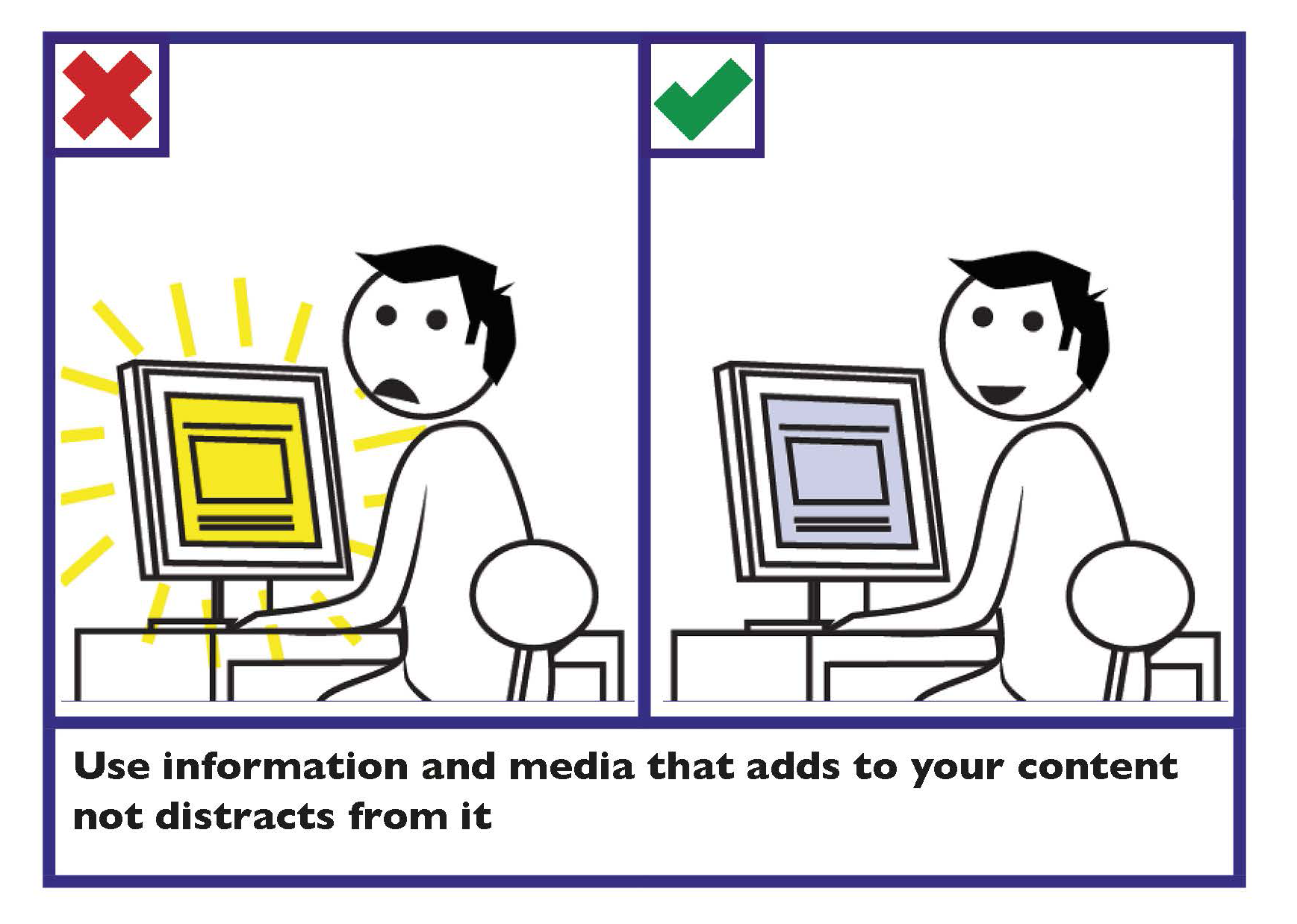
Ensure multimedia is inclusive
Ensure multimedia does not exclude information from those who cannot see, hear or play it.
- Avoid the use of video players to play multimedia. All video content should use HTML5 to play MP4 or OGG content.
- For embedded multimedia, supply a link to a standalone version.
- Provide controls to skip, pause or stop the presentation.
- Provide captions for multimedia, so that it can be understood by all members of the public regardless of the volume the multimedia is played at. This is an important consideration as one in seven of members of the public have hearing difficulties.
- Where captions are not provided, provide transcripts for the multimedia. This can be provided either on the same page or as a link to a transcript on a different page.
- If using a slideshow (also known as a ‘carousel’), ensure that it is accessible.
Learn more
Find more information in Section 2 Spoken and Signed Communication, Communicating with persons who are d/Deaf or those who are hard-of-hearing.
Find information on creating an accessible slideshow on the World Wide Web Consortium ‘Carousels’ webpage.
Information technology - User interface component accessibility - Part 23: Visual presentation of audio information (including captions and subtitles) outlines the requirements and recommendations on the production and design of the visual presentation of audio information (including captions and subtitles) that support users who cannot make use of the audio content.
Avoid content that flashes more than three times per second
High flash content may cause seizures among some people.
Images
Some key guidance when using images includes:
- Add Alternative (Alt) Text when using an image or graph.
- Avoid text within images.
Colour
Create good contrast between text and background
The contrast between the text and the background affects how easy it is to read information.
Key guidance on colour contrast is as follows:
- Make sure there is strong contrast between the text and the background colour.
- If using white text, make sure the background colour is dark enough to provide sufficient contrast. Contrast is best when using very dark colours together with very light colours.
- Avoid combining yellow and blue, and green and red, as these are difficult for people with colour blindness to distinguish.
- Pale text on a dark background typically makes text look smaller, so you may need to increase the size and weight of the text to make it easier to read.
- Avoid placing text in front of an image or patterned background, as this makes it more difficult to read.
Tip
Print your page in greyscale. This will help identify if you have sufficient contrast.
For further information see Section 1 Written Communication, Use colours with good contrast between text and background.
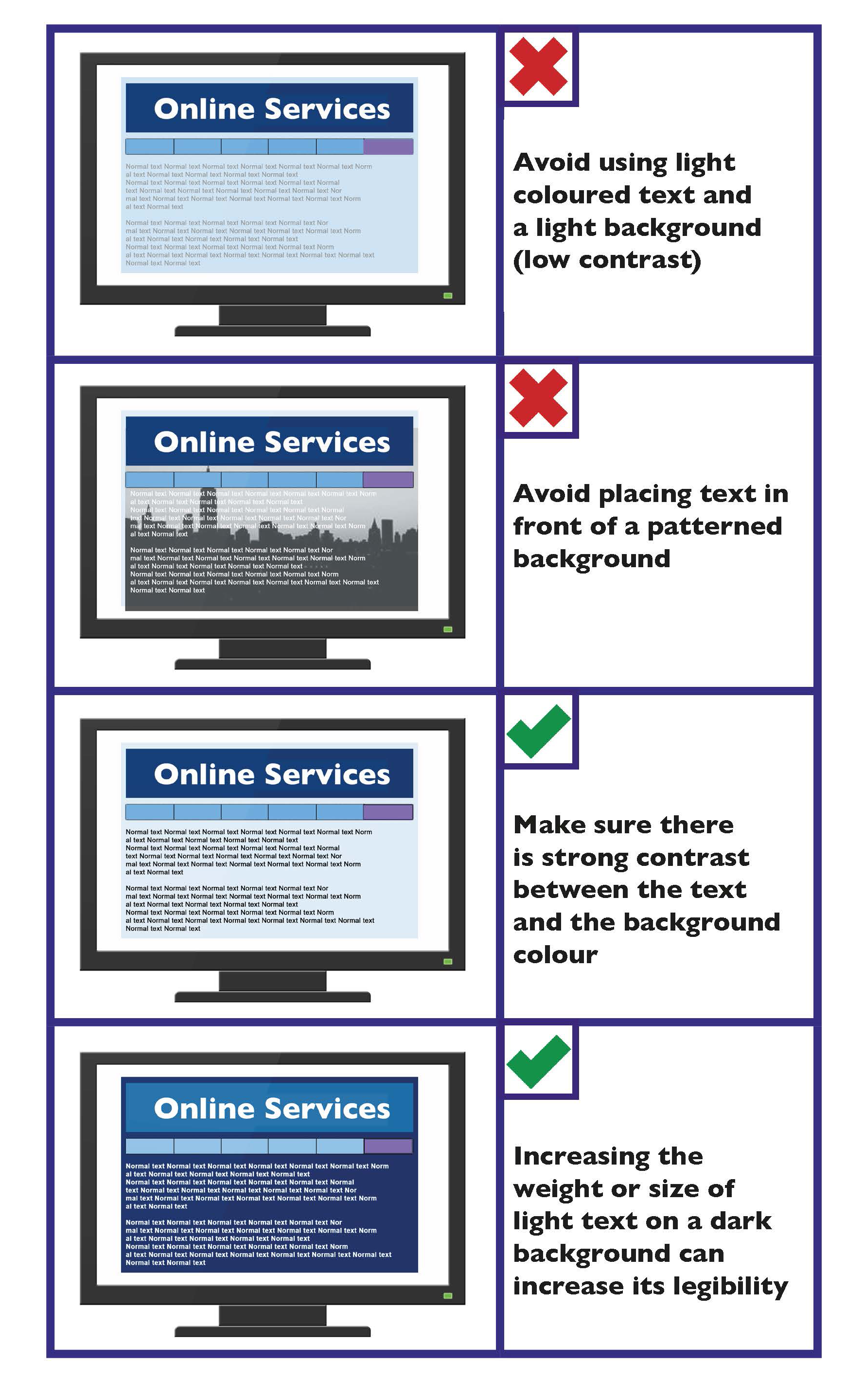
Multimedia Checklist
- Use your design to enhance information, not distract from it.
- Provide controls to skip, pause or stop the presentation.
- Offer different download sizes.
- Avoid flash content that flashes more than three times per second.
- Provide captions/subtitles for multimedia.
- Where captions/subtitles are not provided, provide transcripts.
Images Checklist
- Add Alternative (Alt) Text when using an image or graph.
- Avoid text within images.
Colour Checklist
- Create colour contrast between text and background.
- Carefully consider colour combinations.
- Increase the size or weight of a light coloured font on a dark background.
Accessibility based on WCAG 2.1
Web Content Accessibility Guidelines (WCAG) 2.1 covers a wide range of recommendations for making web content more accessible.
According to the W3C, content on a web page or web applications (including text, images, forms and sounds) should be:
- Perceivable: usable regardless of a person’s ability to see, hear or touch.
- Operable: usable forms, controls and navigation.
- Understandable: content and interface are clear and easy to understand.
- Robust: content can be used reliably by a wide range of devices.
It is important that accessibility is an on-going commitment. While a site may comply with WCAG 2.1 at its launch, those standards also need to be maintained as new content and features are added. Factors that help improve accessibility include:
- Using clear labels for navigation and important buttons.
- Using clear and simple language.
- Ensuring that information does not rely solely on colour.
- Providing accessible documents.
- Providing Alternative (Alt) Text, transcripts or captions for video and audio content. A good summary may be provided to identify what the video/audio is about.
- Provide information in alternate formats to make it more accessible to a diverse range of people. See Written Text Guidance, Alternate formats.
- Evaluating the accessibility of a website. When developing or redesigning a site, evaluating accessibility early and during the development process can identify accessibility problems when it is easier to address them.
Tools
The World Wide Web Consortium (W3C) provides a list of web accessibility evaluation tools.
Learn more
The World Wide Web Consortium (W3C) provides Web Content Accessibility Guidelines (WCAG) 2.1.
Find out more about the Code of Practice on Accessibility of Public Services and Information Provided by Public Bodies.
Mobile Web Content and Apps
This guidance is designed to improve the person’s experience when accessing web content from mobile devices. The following best practice guidelines have been developed by W3C to ensure web content is usable with mobile web devices:
- People should be able to access content on a range of devices, regardless of differences in presentation capabilities and methods of access.
- Only provide basic navigation at the top of the page.
- Make use of the mobile device’s features and strengths to provide a better customer experience. Assign access keys to the most commonly used functions.
- Divide pages into usable but limited sized sections.
- Make sure that the overall size of page is suitable to the memory capacity of the device.
- Make sure that information presented with colour is also available without colour.
- Ensure that text and background colour combinations provide good contrast.
- Send content in a format that is known to be supported by the majority of devices. Use style sheets to control layout and presentation, unless the device is known not to support them.
- Provide informative error messages and a means of navigating away from an error message back to useful information.
- Do not cause pop-ups or other windows to appear and do not change the current window without informing the person.
- Do not use images that cannot be displayed by some devices. Avoid large or high-resolution images except where important information would otherwise be lost.
- Do not use tables unless devices are known to support them. Tabular data can be challenging even for a skilled screen reader user. It is important that data presented in graphs and charts is also available in a text format. Keep tables as simple as possible, and ensure that they are properly marked up.
Accessibility Statements
Public sector bodies must prepare and regularly update a detailed, comprehensive and clear Accessibility Statement on the compliance of their websites and mobile applications with the European Union (Accessibility of Websites and Mobile Applications of Public Sector Bodies) Regulations 2020.
An accessibility statement should be displayed in a prominent position on all pages on a website and from within an application.
The accessibility statement should describe the website or mobile app’s compliance with the accessibility requirements and provide helpful information to anyone who may need it.
Learn more
The Centre for Excellence in Universal Design (CEUD) provides guidance on Accessibility Statements.
Examples of accessibility statements:
Revenue’s Accessibility Statement
Publicjobs Accessibility Statement
gov.ie Accessibility Statement
To learn about how to test mobile web content for accessibility, go to Mobile Accessibility Testing Methodology.
Apps for Smart Phones and Devices
All smart phones typically have built in accessibility features and functions, which provide a platform on which applications (apps) can be built.
If you develop an app for the public, the content and interface options provided should follow the best practice guidelines developed by World Wide Web Consortium (W3C). These include:
- Use cookies sparingly. Cookies are a common and effective means to store small amounts of information on the app user. These are typically used to personalise data and are commonly used to store a token representing a person’s identity in order to enable automatic sign in.
- Ensure the person is informed about use of personal and device information.
- Allow the person to control application behaviour that might not otherwise be apparent, such as access to the network and access to device data.
- Enable automatic sign-in.
- Minimise application and data size.
- Make telephone numbers ‘click-to-call’.
- Optimise the application’s start up time. Customer experience is strongly influenced by the initial start-up time of an application.
Learn more
For information on making iPhone applications accessible, see Accessibility Programming Guide for iOS.
For information on making Android applications accessible, see Make Apps More Accessible.
The TPG Mobile Accessibility Testing for Android and iOS (PDF, 2.6MB) is a free accessible PDF outlining how to test native apps and the web for accessibility on Android and iOS.
Mobile Web Content and Apps Checklist
- Members of the public should be able to access content on a range of devices, regardless of differences in presentation capabilities and methods of access.
- Assign access keys to the most commonly used functions.
- Do not cause pop-ups or other windows to appear.
- Divide pages into usable but limited sized sections.
- Make sure that the overall size of the page is suitable to the memory capacity of the device. For apps, minimise application and data size. Where possible avoid large or high-resolution images.
- Make sure that information presented with colour is also available without colour.
- Ensure there is good contrast between text and background colour combinations.
- Send content in a format that is known to be supported by the majority of devices.
- Provide informative error messages and a means of navigating away from an error message back to useful information.
Email and Newsletter Guidance
Key guidance for communicating with the public using email and newsletters is as follows.
Writing for the web
People interact with text differently online than they do in print.
Choose a font colour that will provide good contrast
Simple black and white emails are sufficient for most email conversations, though some people prefer to send replies in a different colour text. Where applicable, choose a font colour that will provide a good contrast, like dark blue or dark green.
Choose a format
You can choose to write your emails, automated email notifications or newsletters in plain text, rich text, or HTML. However, best practice is to provide an option to choose between plain text and HTML.
Plain text email is suitable for most simple, routine correspondence. The advantages of plain text are as follows:
- It is compatible with all email systems.
- It uses the least amount of processing power and storage space.
- It is compatible with all assistive technologies.
However, the limitation of plain text is that you cannot apply document structure and the links are limited to full URLs, which are not very user friendly.
Rich text allows you to add formatting to your text. You can make text bold, add underlines, and insert links. Rich text does not allow you to add ‘semantic structure,’ such as headings, which helps members of the public using screen readers in navigating through long, complicated documents.
HTML email is recommended as the most accessible email format, as it allows you to add formatting and structure to your message. Emails created in HTML can effectively include anything that may be included in a standard web page.
Provide Alternative (Alt) Text for images and graphics
When images are unavailable (for example, if the device is not capable of displaying the image or if the person has a visual impairment), equivalent information must be supplied. Alternative (Alt) Text should be provided to convey the same meaning as the image or graphic.
Use a clear and descriptive subject line on your email
This helps the person to understand quickly the content of the email.
Use clear and descriptive file names for any attachments
This makes it easier to identify the content of individual files.
Inform the person if a document is attached
The body text of an email should mention if a document is attached in different formats. All attachments should be accessible.
Inform the person of when they might expect a response
Providing members of the public with information on the expected response time will help improve their customer experience by providing better communication.
Newsletters
Digital newsletters are often a combination of a HTML email that a person receives in their inbox, which then links to a ‘microsite’ with further information.
Ensure that newsletters follow the guidance above for:
Email and Newsletter Checklist
- Choose a font colour that will provide good contrast.
- Choose a suitable email format. Best practice is to provide an option to choose between plain text and HTML.
- Provide Alternative (Alt) Text for images and graphics.
- All attachments should be accessible.
- Use a clear and descriptive subject line on your email.
- Use clear and descriptive file names for any attachments.
- Inform the person if a document is attached.
- Inform the person of when they might expect a response.
Accessible Documents
Accessibility of documents
Many organisations use their website as the main channel for publishing and sharing documents and information. It is important to ensure people know what they are downloading and that the content is usable and accessible. This similarly applies to documents emailed to members of the public.
When publishing documents to the web, consider the format which is the easiest to read. Documents such as Microsoft Word and PDFs can be made accessible. However, this does not happen automatically, and care should be taken to ensure that accessibility is considered in all stages of the documents development.
To start with, all downloadable documents should have a summary provided in HTML, as well as details on the document’s format and file size.
Tip
A PDF must meet the same accessibility standard as HTML pages, WGAG 2.1 AA.
Tools such as Adobe Acrobat Pro and PAC enable automated checking of many relevant Success Criteria.
How to make accessible documents
To make a document accessible does not require specific software. It simply requires you to take into account certain considerations (like font size and colour contrast) when developing your document. This will make documents easier to read and understand by the public — particularly members of the public who use assistive technologies like screen reader software.
The following guidance is provided to help make documents easier to access, understand and use.
Give documents a structure using heading styles
A good heading structure is probably the most important accessibility consideration in most Microsoft Word documents.
Many people do not use true heading styles in Microsoft Word. For example, when creating a heading, they simply change the font, increase the font size, and make it bold. The problem with this is that screen readers navigate through the headings function and do not recognise the body text as a heading. So essentially, it does not recognise any structure in the text. In Microsoft Word, the correct way to provide structure is to use ‘Word styles’ found under the ‘Home’ tab.
Use pre-set bullet points, numbering and tables
Use pre-set formats such as bullet points, numbering and tables to format and structure your document. This structure will then be carried over into other formats such as PDF, making it easier to navigate.
Note that alternate formats for the presentation of lists (bullets or numbered lists) may be required upon request by users of accessible technology.
Provide a table of contents for longer documents
For documents over 10 pages, provide a table of contents. This will make specific information easier to find. Additionally, by using the previously mentioned heading styles, it makes creating a table of contents far easier.
Provide Alternative (Alt) Text
When images are unavailable (for example, if the device is not capable of displaying the image or if the person has visual difficulties), equivalent information must be supplied. Alternative (Alt) Text should be provided to convey the same meaning as the image or graphic.
Fill out document properties
Fill out document properties (author, title, subject and keywords). A link should also be provided back to the website in the comments field if there is not a link in the body of the document.
Save or export to PDF
Save or export your document to PDF. Do this by using the ‘Save As’ option and selecting ‘PDF’ in the ‘Save as type’ drop down section. Do not use the print-to-PDF function.
Turn on accessibility features
Ensure accessibility features such as tagging are turned on when saving. This will allow screen readers to identify what is on the page. For example, images and headings.
Check accessibility
If possible, use PDF editing software that supports accessibility to check the accessibility of your PDF file.
Tools
Word processing applications may include an accessibility checker that allows you to check for accessibility problems. For example, to run the accessibility checker in Word 2016, select: File > Info > Check for Issues > Check Accessibility.
In long documents provide information in chapters or sections
For very long documents and reports, consider breaking the document into chapters or sections. This allows people to download and read only the relevant sections.
Accessible Documents Checklist
- Provide a summary in HTML of the document content, as well as information on the document format and file size.
- Give documents a heading structure.
- Use pre-set formats such as bullets, numbering and tables for formatting.
- Provide a table of contents for longer documents.
- Provide alternative (Alt) text for all images and graphics.
- Fill out document properties — author, title, subject and keywords.
- Save or export the document to PDF by using the ‘Save As’ option and selecting ‘PDF’ in the ‘Save as type’ drop down section.
- Ensure that accessibility features such as tagging are turned on when saving.
- If possible, check the accessibility of your document by using PDF editing software that supports accessibility.
- In long documents, break the document into chapters or sections.
Telephone Based Systems
If you use an Interactive Voice Response (IVR) System or call routing in your organisation, the following guidance should be applied:
Keep call routing systems simple
The call routing system should be kept as simple as possible. It should have no more than three levels, with no more than four options per level.
If your caller doesn’t make a choice, divert the call to a live agent
Where your caller fails to make a recognised choice, they should be automatically diverted to an employee. This should automatically be done once the options have been presented twice.
Avoid repetition or unnecessary gathering of information
If it is necessary to transfer the caller to a different section or organisation during a call, avoid gathering unnecessary information or repetition.
For example, where the caller has provided you with their name or contact details, you should pass this information onto the employee in the other section.
Only state important information
Information that is important to the caller should be presented at the beginning of the automated response options. This is to ensure that the caller is not provided with too much information, which would make instructions harder to follow.
Provide options in order of priority
Options should be presented in order of importance. This should be based on the types of calls that you most commonly receive.
Only provide frequently used options
The options provided should be those that are most frequently used by your callers. This is to avoid providing an exhaustive list.
Inform your caller upfront of the number of options
Make a statement at the start of the call identifying how many options the caller will be asked to choose from.
Music or a signal should be given to indicate that the caller is on hold
Where your caller is placed on hold by the system, music or an alternative signal should be given. This will let the caller know they are on hold.
Give an indication of the wait time
Where possible give the caller an indication of wait time or queue size.
Provide alternative ways to make contact
Provide an alternative channel for members of the public who are not able to use telephone based systems. For example, SMS messaging based communication.
Tip
Put details of call routing or IVR on your website and where required in print. This will help members of the public see what their options are and help them choose the option that is most suitable for their query.
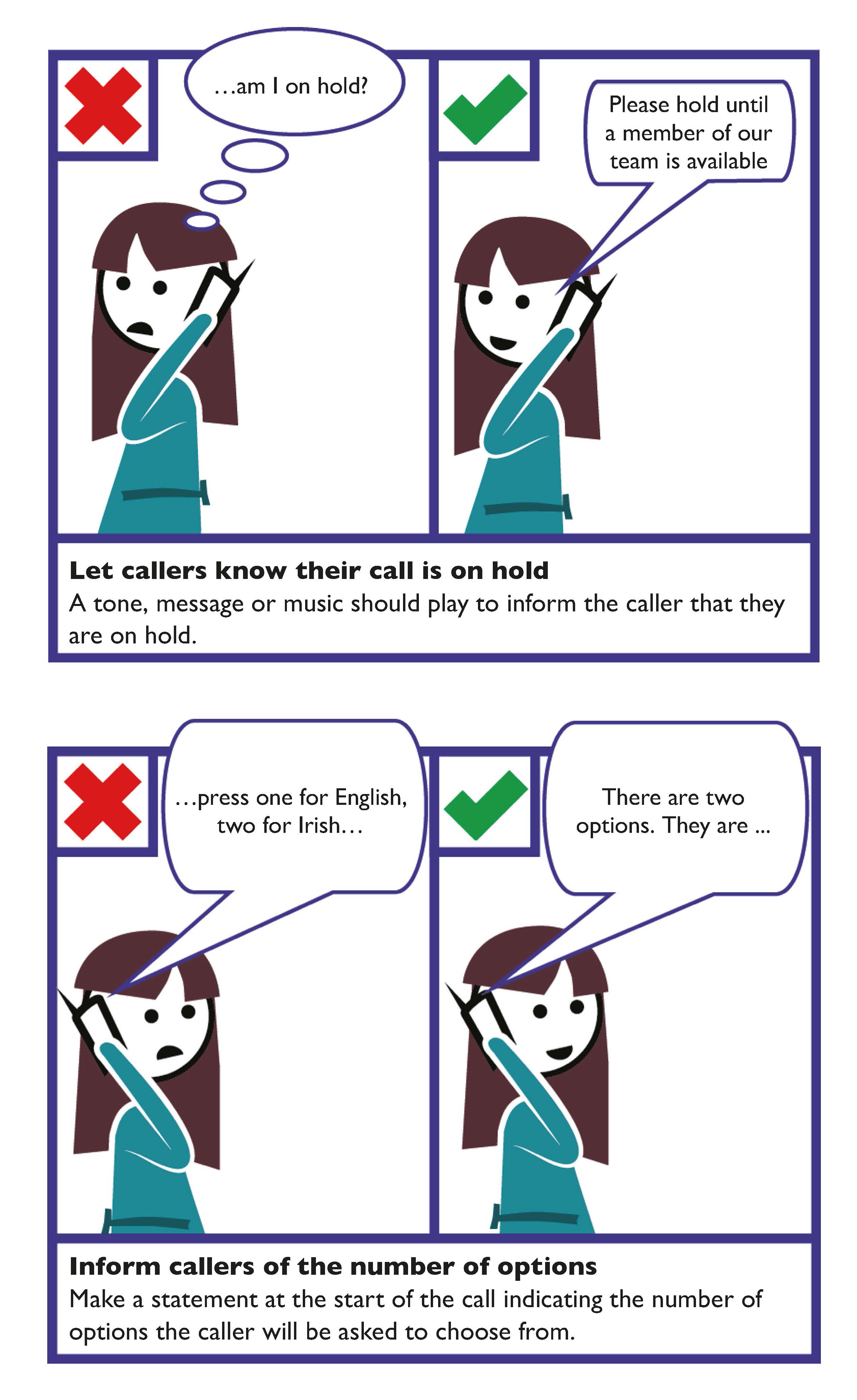
Telephone Based Call Routing and Message Service Checklist
- Inform the caller upfront of the number of options to choose from and provide the options in order of priority.
- Only provide frequently used options.
- If the caller does not make a choice, divert to an employee.
- Music or a signal should be given informing the caller that they are on hold.
- Avoid repetition or unnecessary gathering of information.
- Provide alternative ways for members of the public to make contact.
- Where possible give an indication of the waiting time.
- Confirm when the transaction has been completed successfully.
SMS Based Communication
There are two general types of SMS (text) services used by public bodies:
- General alerting service: where a public body sends out a general message to a predetermined group of members of the public.
- Direct text communication which involves direct contact between two people on a specific issue. For example, between customer support and a person.
General Guidelines for SMS (texting)
State times that SMS service is available. Where direct text communication is available, clearly state the times that this service is available; for example, between 9.00am and 6.00pm.
Do not use text speak language
Other than in specific contexts, ‘text speak’ language should not be used. Use plain English.
Limit all texts to 160 characters
Keep sentences short.
Use an identifier at the start of all SMS
This will assist members of the public in recognising the number.
Where applicable state whether a reply will cost money and if so how much
If appropriate, include whether a reply is expected or not
If a reply is expected, include a prompt in the SMS such as “Please reply”.
Where immediate response is not intended, send an automatic reply to each SMS received to acknowledge it and provide further information, for example, “Thank you for your enquiry. We will be in contact with you shortly”.
If the SMS received from a person is not clear, seek clarification
For example, “Do you wish to make an appointment for 2.00pm on the 12 July?”
Alternatively use options to obtain information. For example, “Sorry do you mean 1— you wish to make an appointment for 2.00pm on the 12 July? 2 — you wish to cancel your appointment or 3 — do you want to make a new appointment? Please reply with 1,2 or 3.”
If no reply is received after 30 minutes, contact the person again using the previous message and adding a time that you expect a reply by. For example, “Sorry Mrs Smith, do you mean 1— you wish to make an appointment for 2.00pm on the 12 July? 2 — you wish to cancel your appointment or 3 — you want to make a new appointment? Please reply with 1, 2 or 3 before 6.00pm”.
If no further response is received — close the conversation.
When over, finish the conversation
When you have finished the conversation, always end the SMS with a closing phrase. For example, “No need to reply”.
Do not put sensitive information in a SMS
SMS texts should not include or seek confidential information. For example, bank account numbers.
Inform the person of when they might expect a response
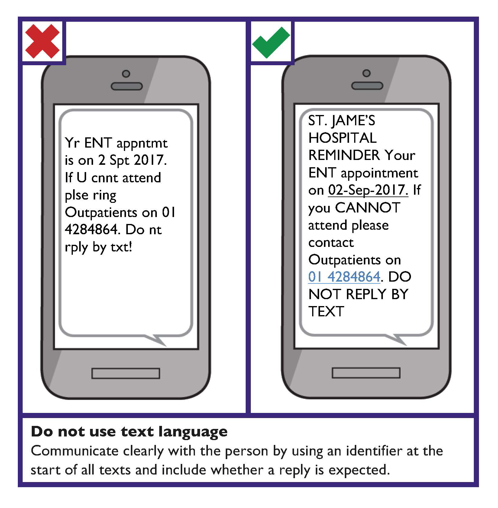
SMS Based Communication Checklist
- State the times that SMS service is available.
- Do not use text speak.
- Limit all texts to 160 characters.
- Use an identifier at the start of all SMS.
- Where applicable state whether a reply will cost money (and how much).
- If appropriate, include whether a reply is expected or not.
- If the SMS from a person is unclear, seek clarification.
- When over, finish the conversation.
- Do not put sensitive information in a SMS.
- Inform the person of when they might expect a response.
Social Media Guidance
Some key communication design considerations on how to enhance customer service with members of the public on social media are provided below. Ensure that your organisational activity on social media is in keeping with the organisation’s Social Media Guidelines or Policy.
Create a tone that is appropriate for your organisation
Make sure your content and tone are appropriate for your organisation and the audience.
Keep information concise
Provide all of the information you want included in your post in a clear and concise manner. Avoid using unnecessary content. Separate out vital details, for example location or time of an event, so they are easier to see.
Provide contact information
Provide the organisation’s contact information on its account page/‘profile’. Provide more than one method of contact, for example, a phone number and an email address or a ‘contact us’ form.
Hashtags (#)
A hashtag — written with a # symbol — is used to index keywords or topics on social media. This function was created on Twitter, and allows people to easily follow topics they are interested in.
Using hashtags to categorise posts by keyword:
- The hashtag symbol (#) is used before a relevant keyword or phrase in a post to categorise those posts, and ensures that the posts will show up in a keyword search.
- Clicking or tapping on a hashtagged word in any message shows other posts that include that hashtag.
Use “CamelCase” for multiple words for hashtags. That is, use capital letters for the first letters of compound words (two or more words joined). For example, use #LeadersQuestions, not #Leadersquestions.
The ‘at’ symbol @
A username identifies a user on social media and is always preceded immediately by the @ symbol. For example, the Department of Justice and Equality username is @DeptJusticeIRL.
The @ sign is used to connect usernames in social media posts. Users of social media can use the @username to connect in posts, send a message or link to a profile.
Composing Posts
Place #hashtags or @mentions at the beginning of the post.
If space allows, spell out any acronyms or use a different way to convey the information.
Do not include abbreviations or ‘text speak’ in status updates. There is plenty of space for status updates, so spell out acronyms. It is recommended that the full name is written, followed by the acronym in brackets, the first time the acronym is used. For example, the Citizens Information Board (CIB).
Emojis
Emojis can help to convey the tone of a message. However, Emojis can also cause meaning to be lost and can make text difficult to understand. Position Emojis at the end of a sentence and do not use the same Emoji repeatedly as text to speech software will read this Emoji repeatedly.
Learn more
To learn more about links in Social Media posts go to Links and Microcontent.
Insert prefixes before images, video and audio
Put prefixes before images, video and audio in posts.
This informs members of the public using screen readers what to expect before it is read aloud. For example,
- Images: [IMG]
- Videos: [VIDEO]
- Audio: [AUDIO]
Provide Alternative (Alt) Text
Provide Alternative (Alt) Text for an image if needed. Otherwise mark it as decorative. Provide a link back to the organisation’s webpage that hosts a copy of the image, video or audio where it provides a full caption or transcript.
Provide closed captioning (subtitles) for videos
All videos should have closed captioning. Closed captioning means that the captions are not visible until activated by the viewer.
YouTube has a feature that automatically captions videos in less than 10 minutes. Though YouTube has the ability to create captions based on an audio file, a written transcript should be used for better accuracy. After uploading a text transcript, set YouTube to sync it up. The transcript should then be reviewed and edited to ensure the caption timing matches the video. Once the YouTube video has captions, it is advisable to download the captions and use an editor to tidy them up.
Tools for creating or editing captions
If creating captions for a video, or editing existing YouTube captions, there are a number of free tools that can help:
- YouTube help: has online tutorials about captioning.
- MAGpie: a free Windows application from the National Centre for Accessible Media.
Provide the option of viewing videos with captions in social media posts
If your organisation has a YouTube channel, upload videos to the channel and make sure to enable closed-captions. Then post a link to the YouTube video as a status update, rather than uploading the video into social media. This ensures that people will be directed to the accessible version on YouTube.
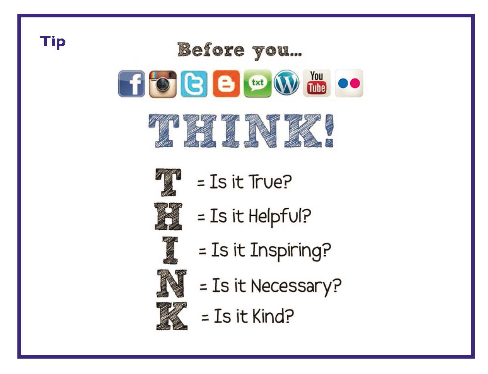
Learn more
YouTube provides a tutorial for creating subtitles and captions in YouTube.
Twitter provides information on adding captions to images on Twitter.
Instagram provides information on how to edit alternative (Alt) text for a photo on Instagram.
LinkedIn provides information on adding closed captioning to videos on LinkedIn.
Facebook provides information on its accessibility features.
Social Media Checklist
- Create a tone that is appropriate for your organisation.
- Provide contact information on the organisation’s account page/‘profile’.
- Capitalise the first letters of compound words for hashtags.
- Place any hashtags or @mentions at the beginning of posts.
- Spell out any acronyms.
- Put prefixes before images, video and audio.
- Provide Alternative (Alt) Text for images, video and audio.
- Provide access to the full caption or transcript for an image, video or audio.
- Provide closed captioning for videos.
Communication Design Question Sets
For some communication design decisions, it can be difficult to locate existing design guidance that is relevant.
In some cases, it will be necessary to use a Universal Design approach (process), which prioritises the diverse needs, characteristics, capabilities and preferences of people. An easy way to learn more about this is through the short animation Meet The Normals. This approach is detailed in the European standard IS EN 17161:2019.
The following sets of questions are also helpful for use when relevant communication design guidance is not available. The questions can also help to inform initial planning, purchase specifications (procurement) and user testing.
The Written Communication and Verbal Communication design question sets can also be used to inform Digital and Web Based design decisions where relevant.
For additional information, visit the website for the Centre for Excellence in Universal Design.
Tools
More information about designing for people is available in the International Organisation for Standardisation (ISO) Guide 71:2014 at a free Guide for addressing accessibility in standards. Annex B contains a tool about optional terminology based on the International Classification of Functioning, Disability and Health (ICF).
Learn More
The Centre for Excellence in Universal Design (CEUD) provides further information about Universal Design and Body Size.
CEUD provides information on Universal Design and the International Classification of Functioning, Disability and Health (ICF).
Written Communication Design Questions
The following questions are designed to support you in the development of new written communication for members of the public:
- Is important information presented in order of importance and in a logical order? For example, is similar information grouped together?
- Is important information structured in a way so that it is easy to find? (Using table of contents, headings, sub-headings and so on).
- Is the layout consistent? Are recurring features presented in the same location? (For example, page numbers and logos).
- Is important information clear, concise and easy to understand the first time it is read?
- Is the information written in plain English? Where you must use technical words, have you explained, in plain English, what it means?
- Where applicable is the information available in other languages?
- Have you avoided using terms, abbreviations or acronyms that may not be familiar to the reader?
- Are the symbols and words used familiar to the reader?
- Do you present important information in different ways? (For example, using audio, touch or images)
- Is the information accessible to people using assistive technologies (such as screen readers)?
Spoken and Signed Communication Design Questions
The following questions support you in the development of spoken and signed designs for customer communication:
- Do you provide the same information in different formats, such as through text or images?
- Do you provide spoken information in plain English?
- Do your services work with assistive technology products and services?
- Is information presented in order of importance?
- Are options presented in a clear and concise way?
- Is content presented in a way that is easy to understand and use?
- Is the person familiar with the words and symbols you are using?
- Where appropriate is the person offered information in different languages?
Customer engagement and outcomes can be enhanced through considerations such as:
- Have you directly involved members of the public in the process of design, development and testing (especially customers that might normally be excluded)?
- Have you used specialised resources to represent a wide range of customer abilities and preferences in the process?
- Has your organisation implemented a policy to promote Universal Design and conduct training to optimise customer communication?