
Techniques
Hide collapsed content visually and for screen reader users
- If content is visible but not hidden semantically, screen reader users will still be able to access it even when the section it belongs in is collapsed;
- The CSS style “display: none” will hide content on screen and prevent screen readers from being able accessing it.
Use descriptive headings for accordion panel headers
- It is important for all users not to have to open each section to work out what is in it. Provide sufficient description in the heading to inform users of the nature of the section’s content without them having to open it.
Use aria to denote expanded and collapsed panels
Use <button> elements for accordion section headings
- Avoid custom JavaScript solutions, where possible - use appropriate ARIA roles if required.
Examples of good practice
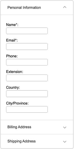
In this implementation, one panel of the accordion is always expanded, and only one panel may be expanded at a time.
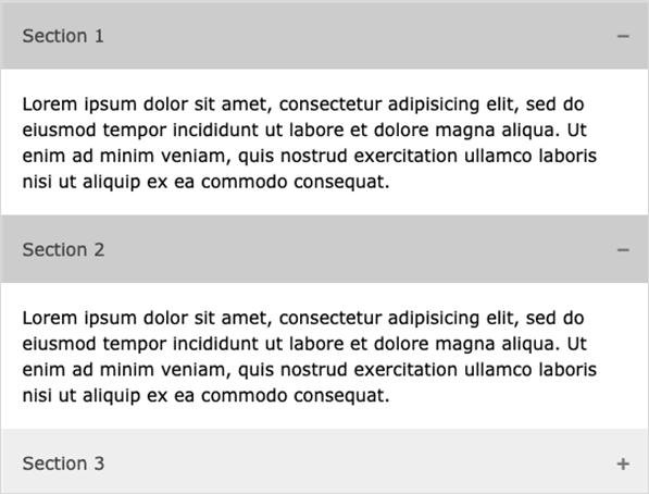
In this implementation, any number of panels of the accordion can be expanded at any one time.
References
WCAG 2.1
- 2.1.1 Keyboard (A)
- 2.4.6 Headings and Labels (AA)
- 2.4.7 Focus Visible (AA)
- 4.1.2 Name, Role, Value (A)
EN 301 549 v 2.1.2
- 9.2.1.1 Keyboard
- 9.2.4.6 Headings and Labels
- 9.2.4.7 Focus Visible
- 9.4.1.2 Name, Role, Value