Techniques
Help users understand how appropriate the content is for them
- Provide a short summary introduction - particularly for longer pages - 50 words or fewer, directly under the main heading;
- For long pages provide a 'table of contents' at the top of the page
- Link each item in the contents list to the heading to which it refers;
- Ensure the link text matches the text of the heading it links to;
- Ensure users are aware of in-page (anchor) links, from either a heading title such as ‘On this page’ above the list of links or within an ARIA label.
Use headings to convey an outline structure of your content
Descriptive headings that use correctly numbered heading levels allow screen reader users to navigate in a non-linear manner – they can jump straight to a section of content that interests them without having to read through the rest of the page.
- Always have a main (level one) heading which describes the nature of the page;
- For each main section use a level two heading;
- Any sub-sections should have a level three heading; further sub-sections should have a level four heading, and so on;
- Web pages support heading levels from one to six <h1> - <h6> and Word supports up to five heading levels, however some accessibility organisations advocate for restricting content depth to just four headings;
- Avoid skipping heading levels – do not jump from a level one to a level four heading;
- Provide styles to support headings in your templates and content management systems to allow content producers to implement them consistently.
- Always use the correct level heading.
- Ensure all headings are descriptive and concise.
- Never use headings for stylistic purposes. Use CSS to style headings if you want to change the font size (or colour, weight) rather than using an inappropriate level heading that happens to be the right size.
Prioritise the most important information
- Use the inverted pyramid approach to structuring content:
- Start with the conclusion;
- Then following with the detail;
- Add the background and any minor details towards the end.
- Place important items high in the page to minimise the need for scrolling:
- This will ensure that screen readers users will be presented with this information early on;
- This will minimise the amount of scrolling users on mobile devices have to do.
- Put the most important information first in links, titles and phrases:
- This will emphasise the uniqueness of the item and aid quick comprehension;
- Screen reader users, navigating by headings or links, will benefit from being able to identify the purpose of a section quickly.
Use short paragraphs and sentences
- If you are adapting existing content for digital use, break up larger paragraphs into smaller ones.
- Try to keep sentences below 21 words
- Try to keep paragraphs below 65 words
- Use lists instead of long, comma-separated sentences;
- Always use the available list functionality, rather than using hyphens or asterisks to simulate lists;
- Provide styles to support lists in your templates and content management systems to allow content producers to implement them consistently.
- If appropriate, add relevant tables and diagrams to break up large 'walls of text'.
Use the most appropriate list type – ordered, unordered or definition list
- Use <ul> for unordered lists – these are simple, non-hierarchical lists of items with a bullet point at the front of each line, like this text you are reading now;
- Use <ol> for ordered lists – these are lists with a hierarchy. By default they will have a number in front of them but these can use numbers, letters or roman numerals;
- Use <dl> for definitions. A <dl> has two elements which are used in pairs:
- <dt> is a definition term;
- <dd> is the definition of that term
Ensure menu options are easy to understand
- Make sure the words and phrases you use for navigation menus are easy to understand and representative of the content they link to;
- Make sure the menu labels match headings and titles of the pages they link to;
- Ensure that the use of symbols is kept to a minimum as some screen readers have difficulty parsing symbols.
- For example, ‘hyphens’ or ‘-‘ are ignored by screen readers.
- Symbols such as ‘&’ (ampersand) might not be recognised by everyone.
- Most common examples include, ‘#’, ‘%’, ‘&’, ‘-‘, ‘/’ (slash)
Do not assume that everyone is familiar with the subject area of your content
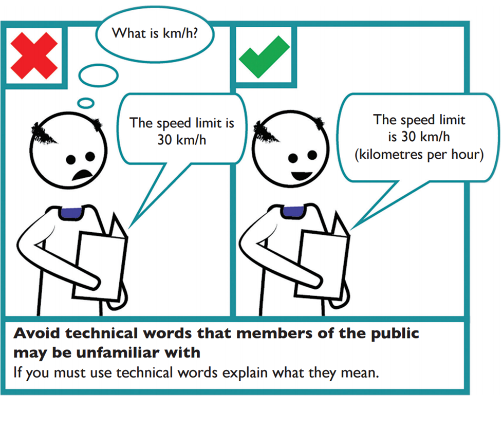
- Avoid technical jargon, colloquialisms, slang, organisation or department speak – change these terms into everyday language.
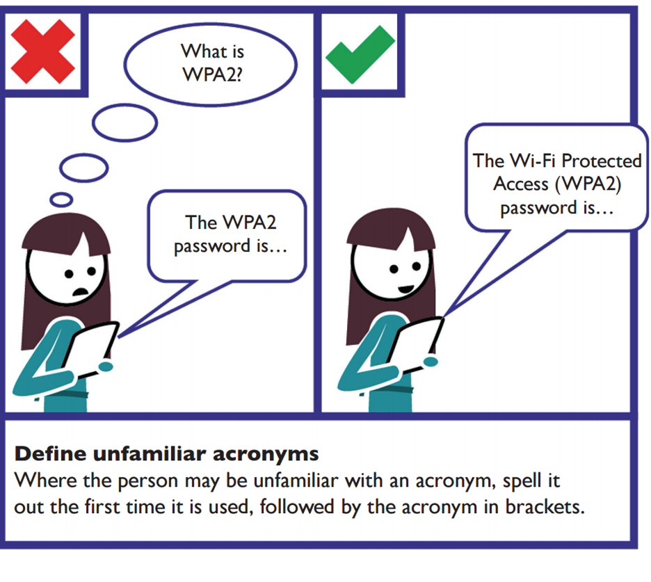
- Unless commonly recognised, provide the full word or phrase for any acronyms, initialisms and abbreviations, the first time that it is used in a web page or document, for example, “National Aeronautics and Space Administration (NASA)”
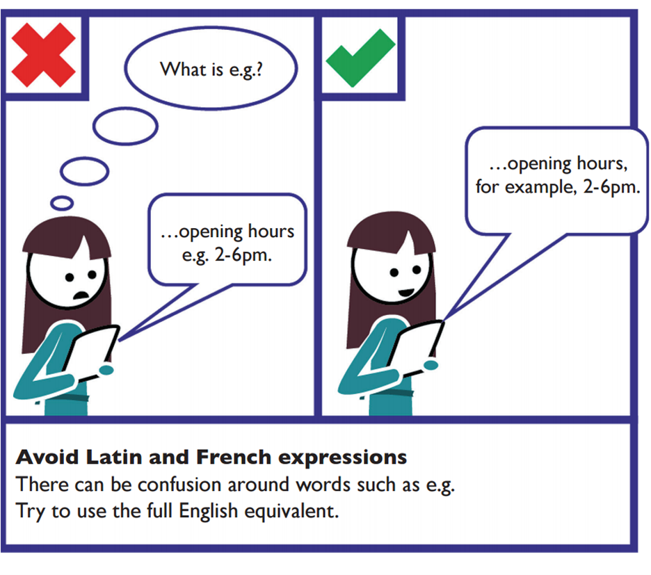
- Avoid Latin and French expressions. Abbreviations such as e.g., i.e. and etc. can be confusing - use the full English equivalents such as ‘for example’, ‘that is’ and ‘and so on’, instead. Include non-English terms for which there is an English term available, such as vis-à-vis (in relation to).


Examples
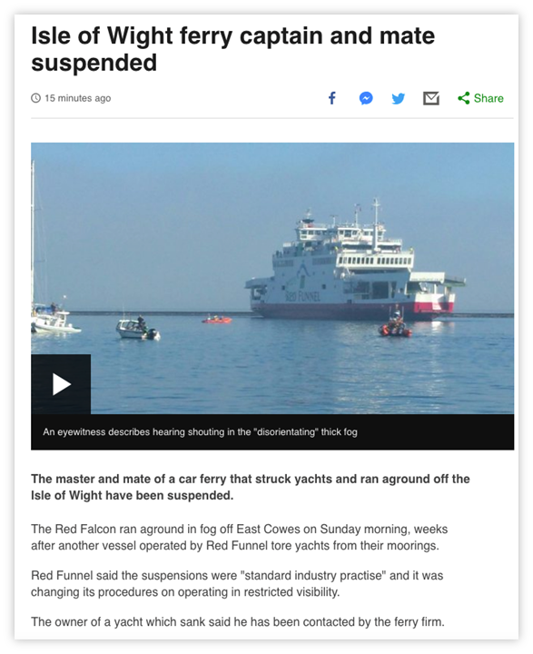
Use the inverted pyramid style of writing

The conclusion of the article is in the main heading of the page; the core detail is in the first sentence; the background follows after.
Break up content with lists
Table 1 - Use lists instead of long, comma-separated sentences
| Do not write… | Do write… |
| We provide the following services: window cleaning, rubbish removal, vacuuming, dog walking. | Our services:
|
Table 2 - Examples of what to and what not to say
| Do not say… | Do say… |
| “e.g.”; “i.e.”; “etc.” | “for example”; “that is”; “and so on” |
| Most operations are run by an organisation called NASA. Employees at NASA’s headquarters… | Most operations are run by an organisation called the National Aeronautics and Space Administration (NASA). Employees at NASA’s headquarters… |
References
WCAG 2.1
- 1.3.1 Info and Relationships (A)
- 3.1.4 Abbreviations (AAA)
EN 301 549 v 2.1.2
- 9.1.3.1 Info and Relationships
