
Techniques
Do not convey information using colour alone
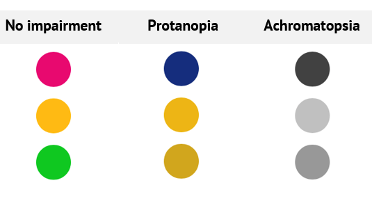
Not everyone is able to recognise different colours. If you use colour alone to convey information, users with impaired colour vision will be unable to understand what information you are trying to convey.
- Ensure colour is not being used as the only means of conveying or distinguishing information, action, or elements. For example, to indicate focus, state, non-text content such as charts and graphs.
- Use colour as a supporting mechanism when conveying information. For example, using red for error messages is fine, as long as the fact that an error has occurred is communicated in a way that everyone can perceive, such as including a prefix or a heading to the error message;
- If you are selecting background and foreground colour combinations, make sure they have sufficient contrast.
Table 1 - Examples of how colour is perceived by users with visual impairments
Do not rely solely on sensory characteristics to convey information
- Avoid instructions such as “Use the search on the left”, “Only enter the bold text”, or “Click the blue button” – these are not helpful to users who do not understand “left” or “bold”, or cannot perceive the colour blue;
- Use labels for elements that require instruction, so that you can say, for example, “Use the box labelled ‘Search’”;
- Avoid notifications and instructions that rely solely on sound – it is difficult to recognise what action triggered the noise and what it might mean, and users with hearing impairments may not hear it.
Use supporting images and graphics to aid explanation
Some users may rely on icons or symbols to understand content
- Providing commonly-recognised icons and symbols can help users understand information more easily;
- Always ensure icons are commonly used and easily identifiable – unfamiliar icons can be problematic to some users with cognitive impairments
- Some users rely on clear, literal text and may not understand metaphors. For example, instead of saying “Early bird price”, say “Price for booking early”.
- Always use a text label together with an icon, do not rely on iconography alone.
- Avoid using icon fonts, use images instead.
- Icon fonts are essentially text characters, screen readers can potentially try to read them out, and they will not make sense.
- Because icon fonts are already text, they cannot accommodate a non-text equivalent, unlike an image.
Examples
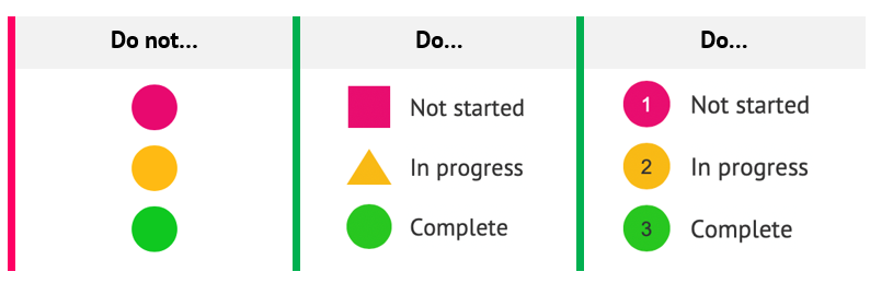
Do not use colour alone to convey information
Table 2 - How to and how not to convey information with colour
| Do not write… | Do write… |
Here are the items we sell - new items are shown in red:
| Here are the items we sell:
|
You can use shapes and colours as a means of support in conveying information
Table 3 – How to use text to describe the status and shapes and colour for support
References
WCAG 2.1
- 1.3.3 Sensory Characteristics (A)
- 1.4.1 Use of Colour (A)
EN 301 549 v 2.1.2
- 9.1.3.3 Sensory Characteristics
- 9.1.4.1 Use of Colour