
Techniques
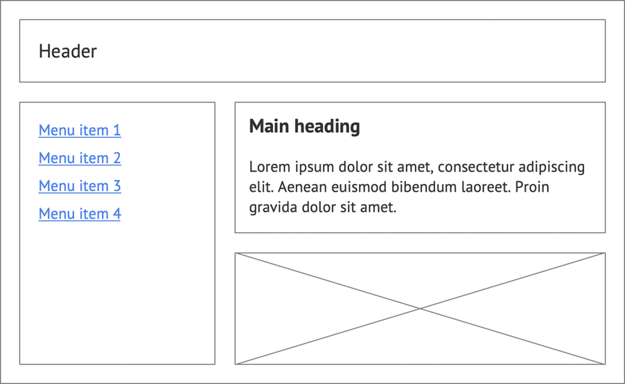
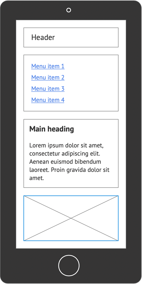
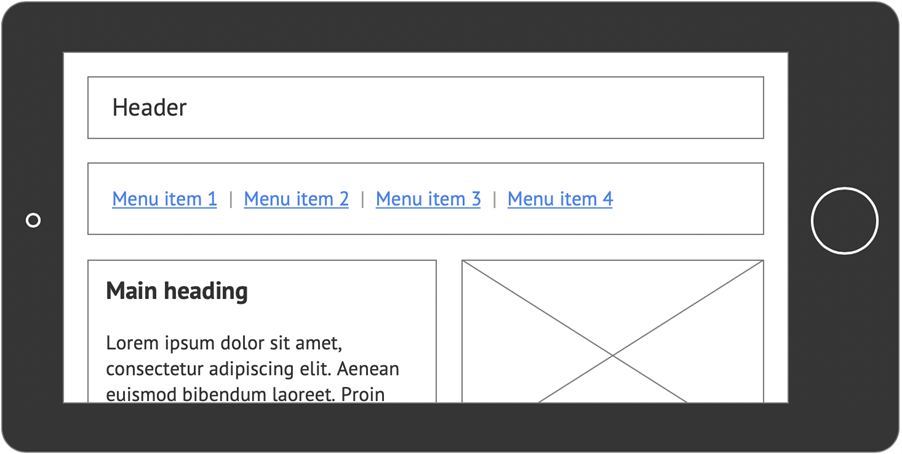
Design for different device types
Users will not all be using a laptop or desktop computer with a large, high-resolution screen. Many users may not have a dedicated computer and will rely on their smart phones for internet access.
- Design a flexible website that works across a wide range of devices
- You can create a single, flexible design that “stretches” and “contracts” depending on the size of the screen or you can create a number of different “breakpoints”. Breakpoints are different layouts, optimised for different screen widths. Breakpoints ensure that your website can use different menus, font-sizes, images, and so on, depending on whether it is viewed on a mobile or on a desktop monitor.
- Test your designs at a number of screen resolutions on a range of devices.
- If your design is based on percentages of screen width, ensure that line lengths do not get too long at higher resolutions.
Be aware of the effects of centre-aligned designs for screen magnification users
Some screen magnification users zoom in by 20 times or more. At those levels of magnification users often rely on relative positioning, for example by looking to the top-left corner of the browser window to orientate themselves, expecting to see a familiar element, like a logo. If there has been a change in page width or design (such as changing from a left-aligned to a centre-aligned design), that element may no longer appear in the same position, relative to the browser window.
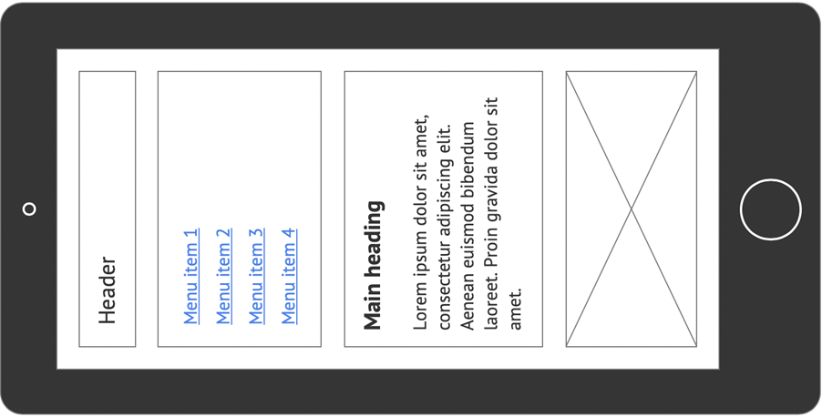
Do not force users to hold their devices in a specific orientation
Some users are unable to switch the orientation of their mobile devices, for example if they have a motor impairment that requires them to use their device in a stand or mount that cannot be rotated. Make sure your website looks and behaves as it should, regardless of portrait or landscape orientation.
Maintain consistency when users move between breakpoints
If users resize their browser windows or rotate their devices and the layout changes as a result, make sure they can still understand where they are on the page, and that they are able to navigate to other areas.
- Make sure the order of elements on the page is the same;
- Make sure text is readable and images are clear and legible;
- Make sure all touch targets are appropriately sized.
Examples of good practice
The layout adjusts to fill the available screen area and does not require users to hold their device in a specific orientation.
Example of bad practice
The layout requires users to hold their device in a specific orientation.
Further examples of good practice
- WCAG Technique C31: Using CSS Flexbox to reflow content
- WCAG Technique C32: Using media queries and grid CSS to reflow columns
Videos
References
WCAG 2.1
- 3.2.3 Consistent Navigation (AA)
- 3.2.4 Consistent Identification (AA)
- 1.3.4 Orientation (AA)
- 1.4.10 Reflow (AA)
EN 301 549 v 2.1.2
- 9.3.2.3 Consistent Navigation
- 9.2.4 Consistent Identification
- 9.1.3.4 Orientation
- 9.1.4.10 Reflow