
Techniques
Make sure users can navigate your website by keyboard alone
- This is fundamental to accessibility and a critical requirement. Many users navigate and interact with websites just using a keyboard, because they cannot or choose not to use a mouse. Make sure every single aspect of your website is navigable by keyboard alone. No excuses!
- Use HTML navigational elements and ARIA landmarks to define the main areas of your pages. Screen reader users can use landmark information to help them skip blocks of content.
Be consistent with navigation across each page of your site
- Make sure all navigational links are available on all pages – links must not appear and disappear;
- Keep links in the same order on every page;
- Make sure navigational elements are in the same position on every page;
- Keep the appearance of navigational elements the same across the site.
Code navigation menus as lists
Menus are, after all, lists of items. Coding navigation as lists allows screen reader users to navigate to them quickly (via a list of ‘lists’), and to be able to determine how many items are in the list, so they know whether or not they need to skip past it.
Use an unordered list <ul> for navigation menus, unless there is a hierarchy to the list items – for example, breadcrumb or checkout steps – in which case, use an ordered list <ol>
Provide a way for users to get to the homepage on every page
- For example, ensure the logo is in the top left; include a ‘Home’ link in the main navigation;
- Breadcrumb navigation can help users orientate themselves and discover other, related content in the same section.
Use a clear, distinct layout for navigational elements
- Make sure navigational elements are distinct and distinguishable from the rest of the content;
- Choose navigation labels carefully. Make sure they are clear, unambiguous, meaningful, understandable and accurate.
- Note: Static page elements such as containers, paragraphs or headings should not receive keyboard focus if the user cannot interact with them.
Identify the current page, if it is represented in the navigation
- Visually differentiate the current page in navigation menus;
- Programmatically identify the current page:
- Remove the link but keep the link text, or
- Give the link an attribute that indicates it is a link for the current page, such as ‘aria-current=”page”’ – see the WAI ARIA authoring practices on aria-current and the aria-current definition for a list of valid tokens
Make in-page links easily recognisable
- Make sure in-page links (links embedded in blocks of text) are styled so that they are clearly distinguishable from non-link text – blue, underlined styling is conventional for links but other styles are acceptable providing they meet link colour contrast requirements and they use an additional point of differentiation on hover or focus, for example, an underline;
- Limit the styles and colours for links, ideally to one, to help with quick identification.
Ensure flyout menus are accessible
- For mouse users and users on touch devices, ensure each link in the menu has a sufficiently large target area, and there is space between each link. Do not require users to be highly accurate as this can cause difficulties for users with motor impairments.
- For keyboard users, ensure that your pages have skip links to allow users to bypass blocks of navigation;
- Make sure they are defined as lists;
- Use headings inside the sections to reflect the items within it.
Flyout menu items with child items should operate as buttons, exposing that section’s content
- Providing a button for each ‘parent’ item allows keyboard users to choose a section of the navigation to explore;
- This also provides mouse users and those who use screen magnification with greater control over the menu’s behaviour;
- Crucially, it allows users of touch devices to interact with flyout menus;
- If the parent item does have its own page, include it as the first link in its flyout section.
Do not link parent items in flyout menus to their own pages
If parent items operate as links to their own pages then each flyout menu section will have to open and close on mouse hover or keyboard focus.
- Users on touch devices will not be able to open the flyout menu, as pressing the parent link will take them to another page;
- Screen magnification users may be unable to move around the screen without unintentionally showing or hiding the flyout navigation;
- Keyboard users, interested in the third top-level menu item, would have to tab through all of section one and two to get to item three;
- Mouse users who have motor impairments risk losing visibility of the flyout menu if they accidentally move their mouse outside of the flyout menu area.
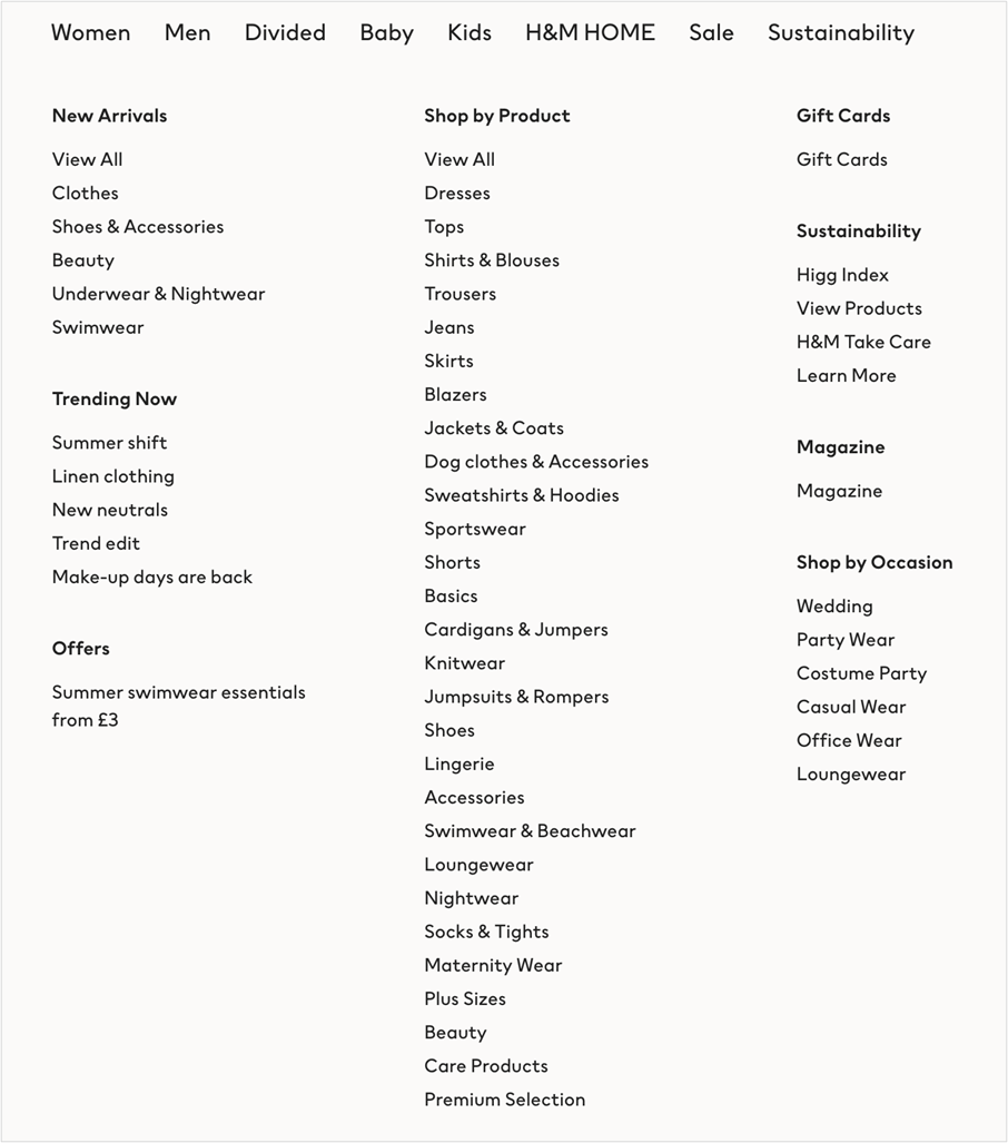
Explore alternatives to flyout and megamenu navigation
- Megamenus and flyout navigation can be difficult for mouse users to control, especially if they require fine dexterity;
- Long lists of menu items can be very time-consuming to use for keyboard-only users as they have to navigate them in a linear manner;
- If you must use megamenus then test them with users once you have a properly coded prototype:
- Include users with access needs in your test sessions;
- Ensure the megamenu can be used with just a keyboard;
- Ensure all levels within the megamenu structure have links.
- Note: GOV.UK is a very large site with a lot of content but they do not use a megamenu to provide access to that content.
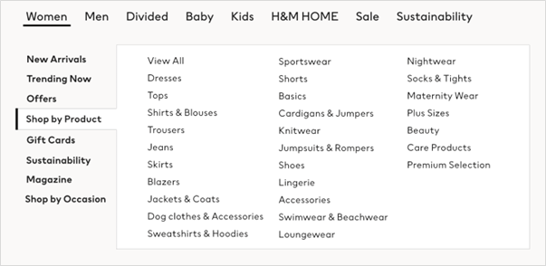
Consider implementing a two-parent menu
Whereas megamenus expose everything beneath the first level, two-parent menus operate a progressive disclosure model, exposing only one sub-section at a time.
Traditional megamenu
All items below the first level are exposed at the same time – this places a significant burden on the user to find the information they are looking for, especially if they have to navigate in a linear manner.
Alternative, two-parent menu
Only the selected second-level menu is exposed – this provides fewer distractions and results in a lower cognitive load. Parent-level navigation items act as buttons, revealing the next level, rather than links to pages. “View all” links are placed at the top of link lists to provide access to the parent page.
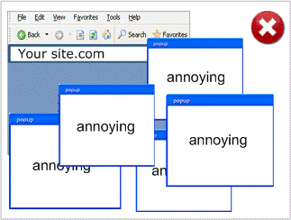
Avoid using popup windows
Popup windows are difficult to perceive and navigate for many users; they are excluded from site navigation so are very difficult to find, and are often blocked by browsers. They can also be very annoying!
If you need to refer to supporting information, there are better options than popups:
- Include the information on a separate page, available from the site navigation, and link to it;
- Include it in an expandable/contractable panel, on the page, near to the information it is supporting;
- Use a modal or non-modal dialogue to display the information – both of these need to be considered, designed and coded carefully:
- Modal dialogues require careful construction to ensure they can be navigated – see this example of how to create an accessible modal dialogue
- Non-modal dialogues require careful design and implementation so that users can control and interact with them without requiring a mouse, and so that the dialogues do not obscure content on the page.
Avoid making pages auto-refresh or auto-redirect
Auto-redirects can prove difficult for many users. Auto-refresh can be highly disruptive especially for users of adaptive technologies and users who need more time to read content.
Avoid auto-redirects
- Use server-side redirection instead, or
- Have a static page with a link to the new address.
Avoid auto-refresh - but if absolutely unavoidable
- Provide a warning that it will happen, first;
- Allow users to turn off the auto-refresh.
Examples of good and bad practice
Identify the current page, if it is represented in the navigation
Table 1 - How to and how not to indicate the current page in the navigation
| Do not… | Do… |
About Us We have been operating since 1877… |
Home About Us Contact Us About Us We have been operating since 1877… |
Make in-page links easily recognisable and include them in sensible places
Table 2 - How to and how not to style and position in-page links
| Do not… | Do… |
| For more information, contact us using the link in the footer menu | For more information, please contact us |
| For more information, please contact us | For more information, please contact us |
Inconsistency in navigation display
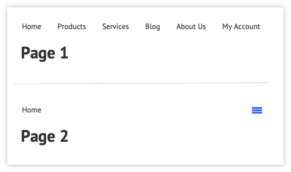
The presentation of the navigation is inconsistent across pages within a specific breakpoint. Users will have become used to seeing each navigation item on earlier pages and so may believe that other navigation options are not available on this page - not all users will understand what the “hamburger” icon represents.
Avoid multi-level navigation
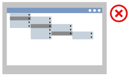
Avoid multi-levelled cascading menus, as they often require fine dexterity
Avoid page refreshes and redirects
Table 3 – Do not include these in your HTML head
| Do not include refreshes or redirects like the ones below in your pages |
| <meta http-equiv="refresh" content="70"> |
| <meta http-equiv="refresh" content="0; url=http://universaldesign.ie/"> |
References
WCAG 2.1
- 1.4.1 Use of Colour (A)
- 2.1.1 Keyboard (A)
- 3.2.3 Consistent Navigation (AA)
- 3.2.4 Consistent Identification (AA)
EN 301 549 v 2.1.2
- 9.1.4.1 Use of Colour
- 9.2.1.1 Keyboard
- 9.3.2.3 Consistent Navigation
- 9.3.2.4 Consistent Identification
Further reading
- Why Consistency is Important to Accessible Design
- Using a contrast ratio of 3:1 with surrounding text and providing additional visual cues on focus for links or controls where colour alone is used to identify them
- Link + Disclosure Widget Navigation
- Example Disclosure Navigation Menu with Top-Level Links