
In the public sector, forms are used as part of the customer engagement process. This ranges from enquiry forms to contracts. Increasingly members of the public are asked to complete online forms. The Universal Design guidance for both print and online forms is similar.
People should be able to complete forms without assistance. It is important to consider that members of the public have different needs and skills related to visual or literacy difficulties. Therefore, by better designing forms to meet the needs of people with specific difficulties, you will be better meeting the needs of all members of the public.
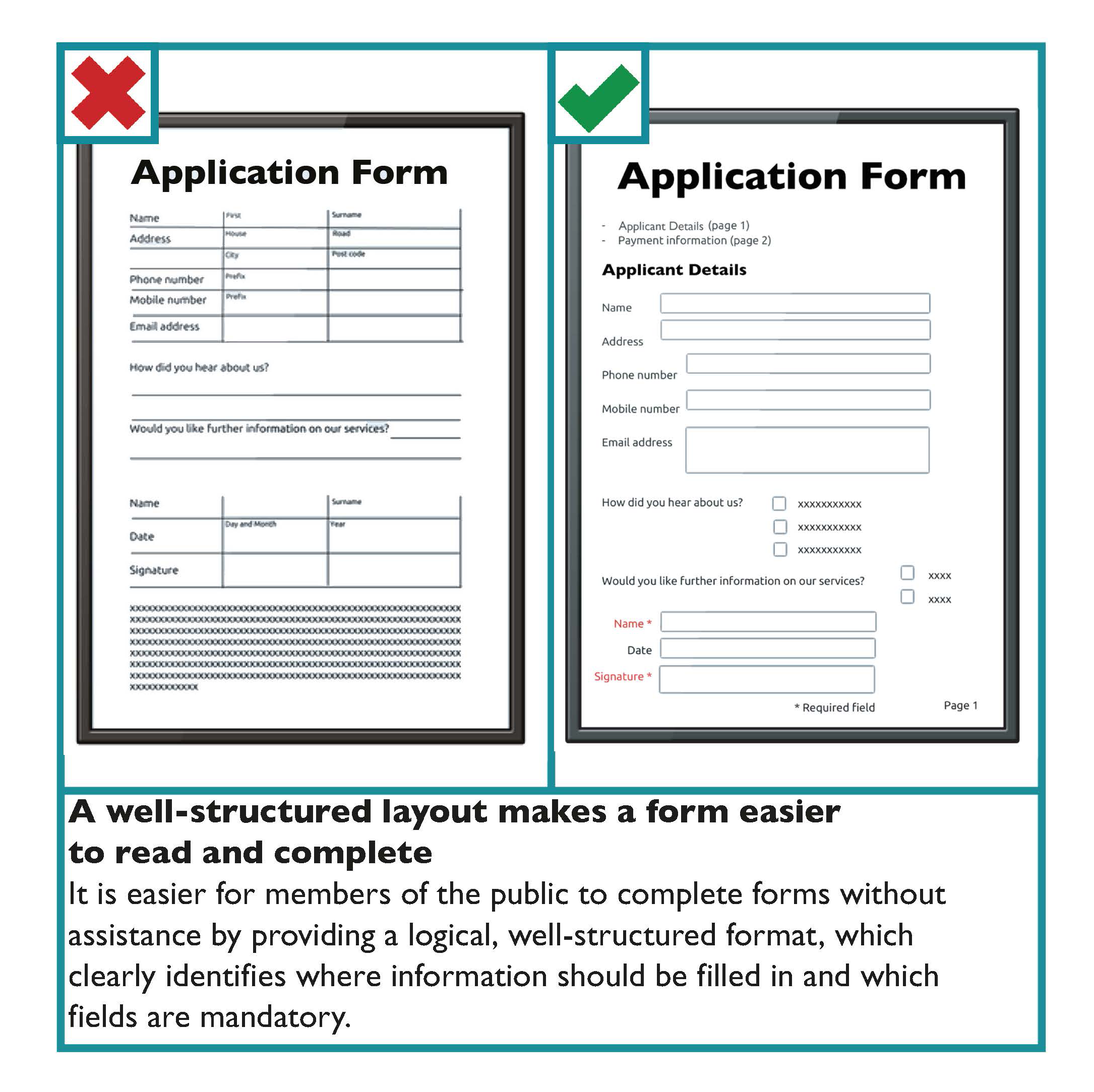
Guidelines for the design of forms are as follows:
- Give the form a clear title.
- Identify whom the form is for and its purpose.
- Give instructions in bullet points on the first page.
- If users need reference numbers or documentation to complete the form, ensure that they know this before starting. Awareness can be raised with an obvious “Before you begin, you will need...” message at the top of the form.
- Divide the form into clear and logical sections each with an informative heading and a clear number.
- Use a larger font for section headings.
- Place, if needed, “Official use only” sections near the end of the form.
- Avoid unnecessary or repeated questions.
- Position questions directly across from the space for giving answers.
- Make sure users have enough space for providing answers.
- Where possible, use boxes rather than lines for answers.
- Use as many ‘tick-box’ questions as possible.
- Make sure ‘tick-boxes’ are clearly linked to the answer.
- Ensure that ‘tick-box’ borders and answer lines are solid and at least one point wide.
- Make it clear which fields are mandatory and must be completed.
Scannable Forms
Scannable forms, which allow one character per square, are increasingly being used. Where these forms are used, provide boxes that are large enough and leave adequate space between the squares.
For example,
Learn more
For guidance on designing online forms see Online Forms in section 3: Digital and Web Based Communication Systems.
Form Design Checklist
- The form should have a clear title. It should also identify whom it is for and what its purpose is at the start of the form.
- Provide clear instructions at the start.
- Place, if needed, “Official use only” sections near the end of the form.
- Group similar questions under useful headings.
- Use informative headings and clear numbering.
- Avoid unnecessary or repeated questions.
- Make sure people have enough space for providing answers.
- Where possible, use boxes rather than lines for answers.
- Make sure ‘tick boxes’ are clearly linked to the answer and that the borders and answer lines are solid and at least one point wide.
- Clearly identify mandatory fields that must be answered.