
All public sector buildings will typically have signage inside and outside of their establishments. This may range from signs for the toilets to health and safety signs. The following signage design guidance is based on the Building for Everyone: A Universal Design Approach publication from the Centre for Excellence in Universal Design (CEUD).
Under the Official Languages Acts 2003 and 2021, a public body has a duty to ensure that signs placed by it or on its behalf within or outside the state are in Irish or bilingual. If bilingual text is chosen, instead of text in Irish only, there are specific regulations that must be adhered to.
The guidance below is provided for sign design in indoor and outdoor areas.
Text on signs
- Make sure the text on your sign uses fonts that work for your reader. Avoid fonts that are highly decorative, very bold, condensed or in italics, as these can be difficult to understand and may make the sign more difficult to read. Examples of good fonts are sans serif fonts for signage include, Helvetica, Tahoma and Futura.
- Wording on signs should be as simple as possible.
- Avoid the use of unfamiliar abbreviations.
- Information on signs should be listed alphabetically or grouped logically. For example, by floor level.
- Use Arabic numbers (1, 2, 3), not Roman numerals (i, ii, iii).
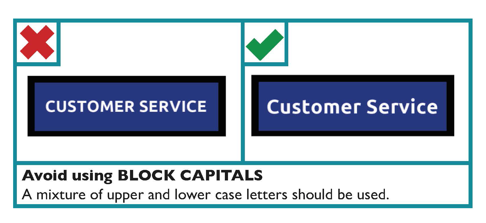
- A mixture of upper and lower case letters should be used. Avoid using BLOCK CAPITALS.
- Align wording to the left.
- Wording, font and images should be consistent throughout the building.
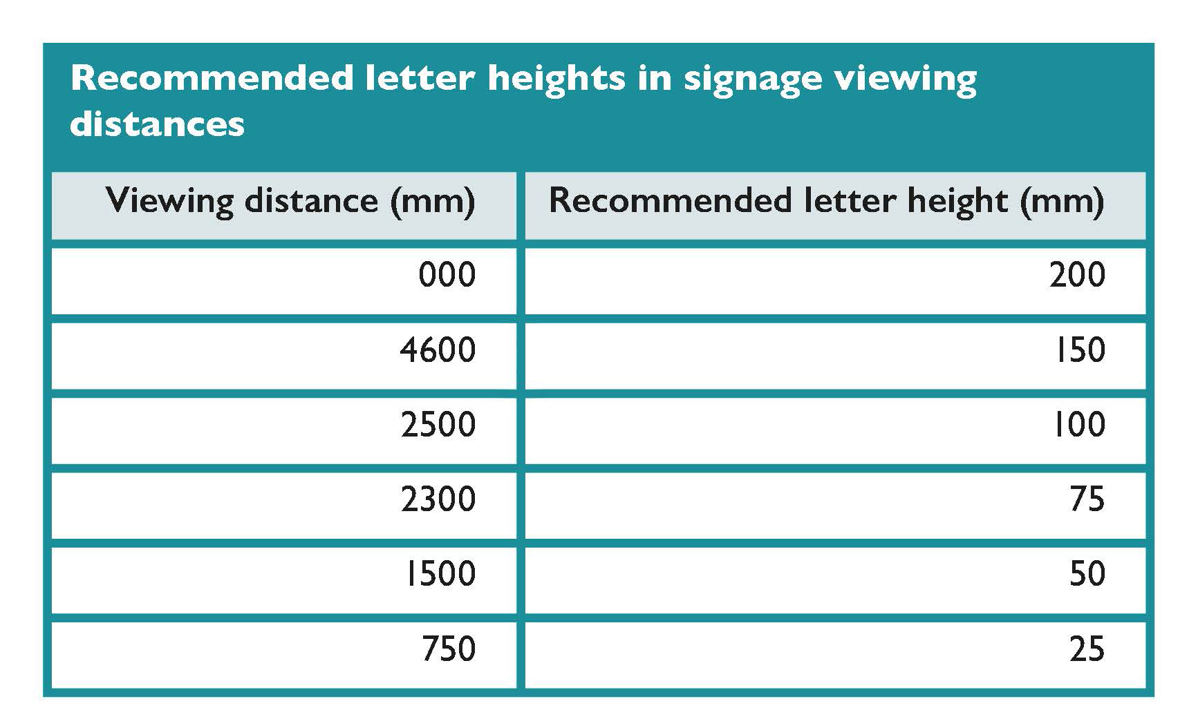
- The size of letters on signs should be related to the type of sign and viewing distance.
The table below provides recommended letter height for a range of viewing distances.
Symbols and arrows on signage
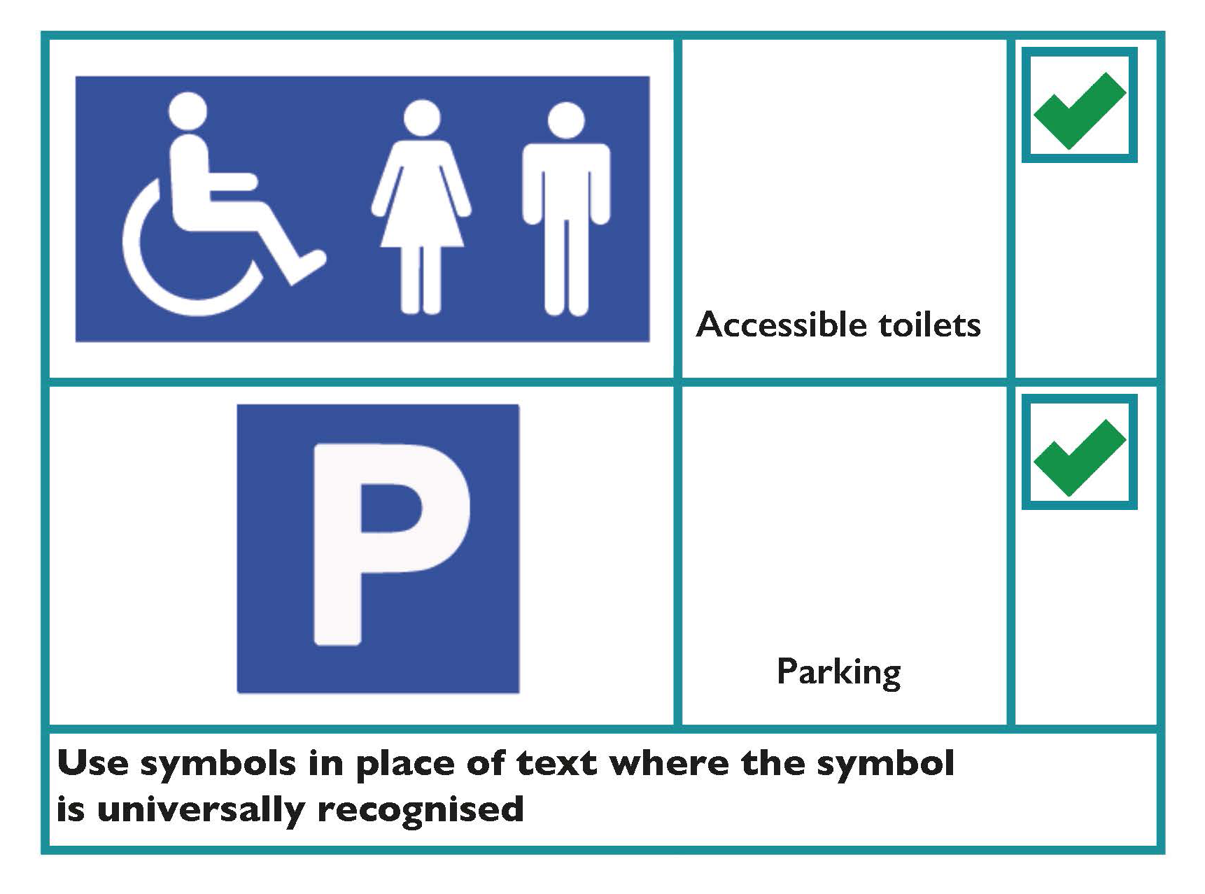
- Use symbols in place of text where the symbol is universally recognised. For example, public information symbols.
- Use symbols to accompany text where possible. This is particularly relevant for dual-language signs, as they help people to recognise quickly the information being provided.
- Use arrows to indicate directions.
Design
- There should be good contrast between the signboard and any mounting or background surface. This helps draw attention to the sign itself.
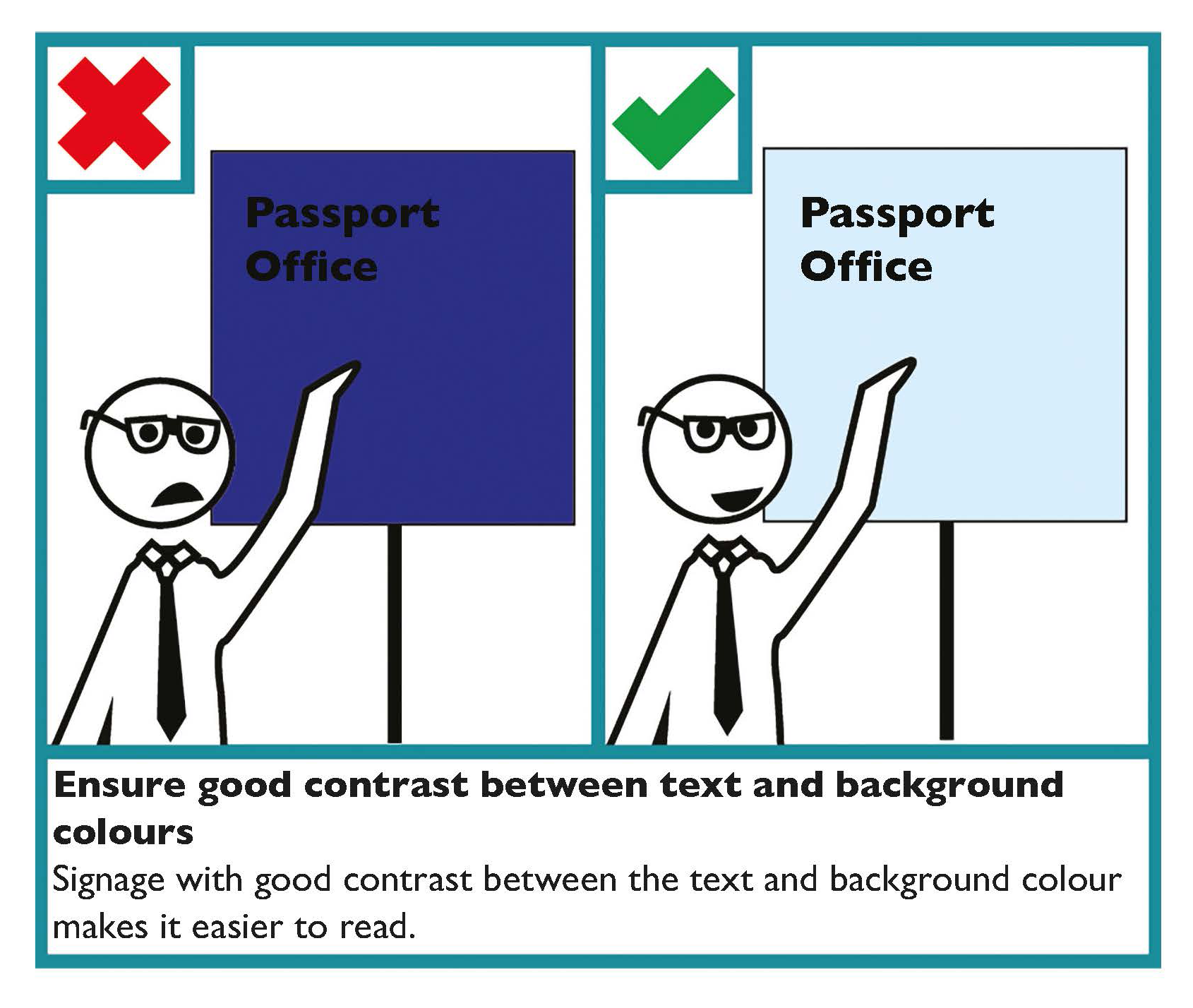
- There should be good contrast between the text/symbols and background sign colour. This helps draw attention to the content of the sign.
- Where colour coding is used, use colours that are easy to differentiate.
- Signs should have a matt or satin finish. Avoid shiny and reflective surfaces to prevent glare.
- Signs should be evenly illuminated, with a lighting level of 200 lux.
Tactile signs
Embossed signs enable people with visual impairments to read by touch. When designing tactile signs consider that:
- Embossed letters should be raised above the surface of the sign by 1 — 1.5mm, and have a stroke width of 1.5 — 2mm.
- Embossed letters should be between 16mm and 50mm in height.
- Where Braille is provided, it should be positioned below the related text.
- Engraved and indented letters and symbols should be avoided, as they are difficult to read by touch.
Positioning of signage
- Signs should be positioned at important points along a route, wherever routes intersect or diverge.
- Tactile and Braille signage should be positioned within easy reach.
- Position signs where people reading them will not cause an obstruction.
- Make sure that directional signs help people to retrace their steps and identify alternative locations within a building, without having to return to the main entrance.
Learn more
Further guidance on the Official Languages Acts is available on the website of An Coimisinéir Teanga.
The Centre for Excellence in Universal Design’s (CEUD) Building for Everyone: A Universal Design Approach provides guidance on designing signs.
The International Organization for Standardization provides guidance on graphical symbols for the purpose of public information in ISO 7001:2023 — Graphical symbols — Registered public information symbols.
Signage Symbols, Contrast, Colour, Positioning Checklist
- Use symbols in place of text or to supplement text where possible.
- Use arrows to indicate direction.
- There should be good contrast between the signboard and any mounting or background surface. There should also be good contrast between the text and background colour of the sign itself.
- Use colour to differentiate where colour coding is used.
- The surface of the sign should not be reflective.
- Embossed lettering should be raised 1 — 1.5mm above the surface of the sign. Avoid engraved lettering.
- Embossed letters should be between 16mm and 50mm in height.
- Position tactile and Braille signs within reach.
- Position signs where people reading them will not cause an obstruction.