
Techniques
Make sure the tab order follows the most logical visual order of page elements
- The default order is the order that elements appear in the underlying HTML that produces the page – left to right, top to bottom. If you are using CSS to position elements – especially if floating elements to the left and right – this may affect the tab order;
- While it is possible to specify a tab order, overriding the default, you would have to specify the tab order of everything that proceeds that element on the page. This could be very tricky to achieve, especially when some elements, like the header and footer, may appear on every page;
- A good way to ensure the tab order through your designs is logical, is to avoid using layout options that affect the position in the code, such as “float”, and use alternative CSS methods, such as “display: table” and “display: table-cell”.
Tab order follows the order in which elements appear in the HTML – left to right, top to bottom.
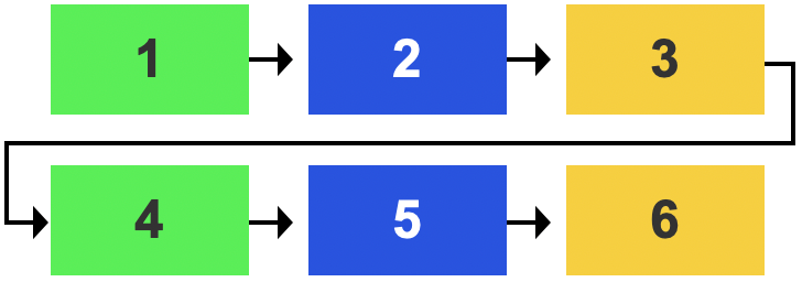
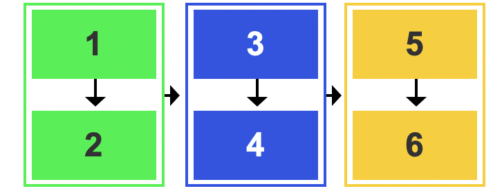
If a top to bottom, left to right order is more logical for your content, simply group your content, using a <div> – the tab order will follow the content in the first <div> before moving to the next, from left to right.
Make sure the focus indicator is visible
The focus indicator is a visual effect – usually a blue border or dotted ring – applied by default, by the browser to the interactive element – link, form field, button – that you are currently ‘on’, indicating that it is the current, active element.
It is not uncommon for designers to supress the focus indicator using CSS, for aesthetic reasons, without realising how detrimental that is to users who rely on it for navigation.
Never suppress the focus indicator without providing a better alternative.
If necessary – for example, if you have interactive elements against a background which is the same colour as your focus indicator – you can augment the focus indicator. Providing a border that works against both light and dark backgrounds is advisable.
Examples of good and bad practice

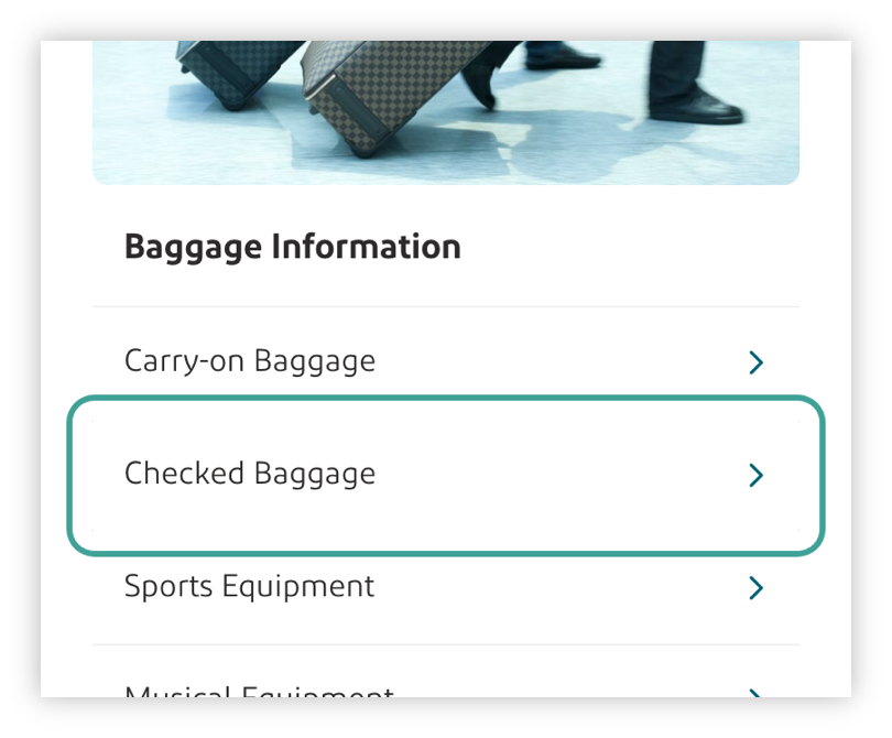
The focus indicator is clearly visible around the “I’ve taught 1,000 kids in India’s slums during Covid” link
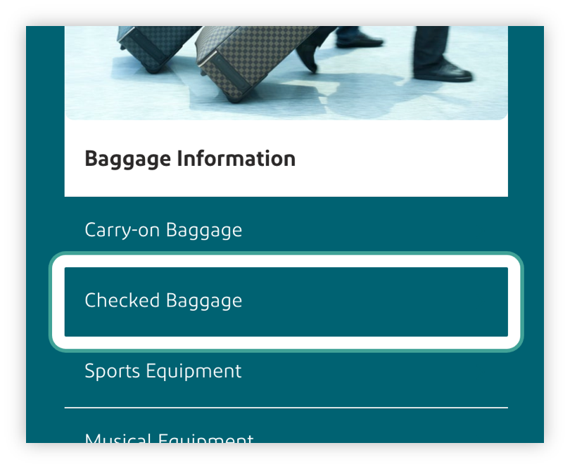
The focus indicator has been enhanced so that it works against both light and dark backgrounds
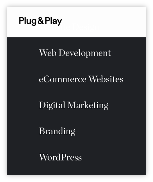
There is no focus indicator on the “eCommerce Websites” link – it is extremely difficult to determine which is the current, active element.
References
WCAG 2.1
- 1.3.2: Meaningful Sequence (A)
- 2.4.3 Focus Order (A)
- 2.4.7 Focus Visible (AA)
EN 301 549 v 2.1.2
- 9.1.3.2 Meaningful Sequence
- 9.2.4.3 Focus Order
- 9.2.4.7 Focus Visible