
Why is this important?
For many users, custom gestures can be a challenge to discover, perform and remember. Try to design your webpages and apps without requiring users to learn new methods of interaction.
Techniques
Use default system methods of interaction
Most smartphone operating systems have a number of built-in gestures that will be familiar to users, including tapping, double-tapping, swiping, press and hold, and pinch.
- Most webpages and applications should be usable without the need to create custom gestures, so try to build using default system gestures.
- If you cannot avoid creating custom gestures, you must include clear instructions on how to perform them.
Use the simplest gestures possible or provide accessible alternatives
Some users will struggle to use anything but the simplest gestures. Users with motor or dexterity impairment may struggle to be able to double-tap, swipe, pinch, or press and hold.
- If possible, restrict your use of gestures to single tap.
- If you add more complex gestures, such as swiping to delete, ensure users can also perform the same function by, for example, tapping to reveal a menu with a delete option in it.
Make sure touch target sizes are appropriate
Everyone benefits from good-sized touch targets. Young users, and users with motor or vision impairments may struggle with precision, so this is even more important for them.
- Touch targets in content must be large enough to read and have a large enough interactive target area to tap comfortably with one finger – this is another reason why choosing an appropriate text size is important.
- Apple recommends a touch target size of at least 44 x 44pt, or the equivalent in pixels; Android mandates a touch target size of 48 x 48dp; always check your webpage designs on mobile devices to ensure touch target sizes are appropriate.
- Guidelines are a good starting point but Steven Hoober (4ourth.com) has conducted some very interesting research on “Designing for touch”, which explores how aspects of interaction – such as the way users hold devices, the digits they use, the distance from the bottom and centre of the screen – affect the way users are able to interact with mobile devices. Read through this research as it may help inform your designs.
Do not prevent users zooming in to magnify pages on mobile screens
A common trend for mobile webpage design is to prevent users from enlarging content by zooming in.
This approach is frequently employed to mitigate the effects of clicking on form elements and having the page zoom in automatically, however, in preventing that unwanted behaviour, those pages are also preventing users from zooming in to read or input text that is too small for them to read.
Moreover, the “unwanted” behaviour of automatically zooming in to text boxes is caused by the form elements having a font size lower than 16px – increase the font size on the form elements and the automatic zooming problem disappears, allowing users to continue zooming in to see large text if they want to.
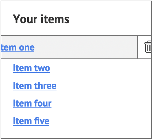
Examples of good practice
The design provides an alternative to the “swipe to delete” gesture
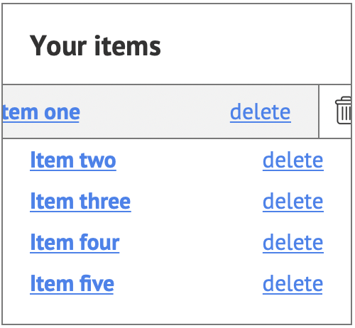
Touch targets are appropriately sized and well-spaced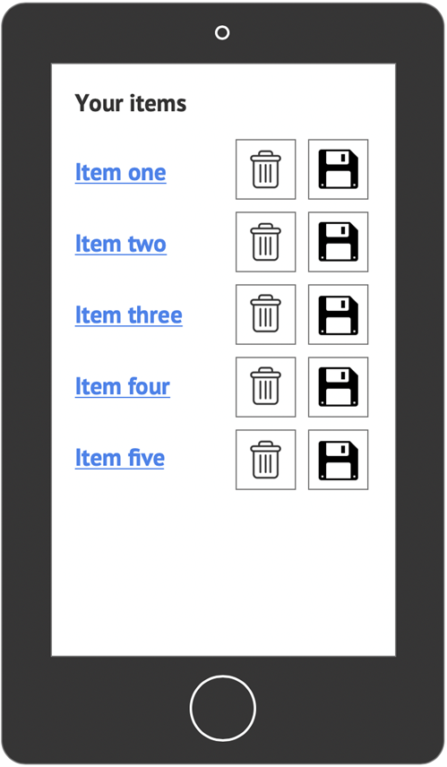
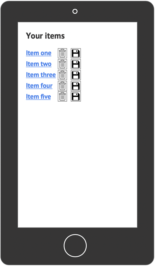
Examples of bad practice
The app relies on the “swipe to delete” gesture
Touch targets are too small and have insufficient space between them
References
WCAG 2.1
- 1.4.4 Resize Text (AA)
- 2.5.5 Target Size (AAA)
EN 301 549 v 2.1.2
- 9.1.4.4 Resize Text