
Make sure the tab order follows the most logical visual order of page elements
- The default order is the order that elements appear in the underlying HTML that produces the page – left to right, top to bottom. If CSS is being used to position elements – especially if floating elements to the left and right – this may affect the tab order;
- While it is possible to specify a tab order, overriding the default, you would have to specify the tab order of everything that proceeds that element on the page. This could be very tricky to achieve, especially when some elements, like the header and footer, may appear on every page;
- A good way to ensure the tab order through your designs is logical, is to avoid using layout options that affect the position in the code, such as “float” and use alternative CSS methods, such as “display: table” and “display: table-cell”.
Tab order follows the order in which elements appear in the HTML – left to right, top to bottom.
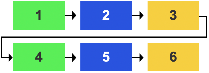
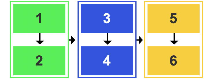
If a top to bottom, left to right order is more logical for your content, simply group your content, using a <div> – the tab order will follow the content in the first <div> before moving to the next, from left to right.
Make sure the focus indicator is visible
The focus indicator is a visual effect – usually a blue border or dotted ring – applied by default, by the browser to the interactive element – link, form field, button – that you are currently ‘on’, indicating that it is the current, active element.
It is not uncommon for designers to supress the focus indicator using CSS, for aesthetic reasons, without realising how detrimental that is to users who rely on it for navigation.
Never suppress the focus indicator without providing a better alternative.
If necessary – for example, if you have interactive elements against a background which is the same colour as your focus indicator – you can augment the focus indicator. Providing a border that works against both light and dark backgrounds is advisable.
Avoid using tabindex to alter the tab order on the page
The tabindex attribute allows you to specify the order in which elements receive focus on the page. In principle this sounds useful, however, users need to be able to predict the tab order – if you specify the tabindex of an element in the middle of the page, you will have to specify the tab order of everything that precedes it in the code, so that the tab order matches the visual order.
There may be occasions when you want to place focus on an element that does not normally receive focus, such as a heading in a modal dialogue that you want users’ focus to be moved to. In this instance you can use a negative tabindex (tabindex=”-1”) which will allow you to place focus on that element, using JavaScript, without it appearing in the navigational tab order for users.
Avoid specifying Access keys
Access keys are keyboard shortcuts that allow users to navigate to specific sections of a website with a single key press.
- There is no widely recognised convention for assigning keys to specific actions or pages, so users will have to find out what keys you have specified for which actions, and remember them.
- Access keys can conflict with browser, operating system and assistive technology settings and controls.
- If you provide single-key Access keys you must provide users with a mechanism to turn them off or remap them to use alt, shift or ctrl keys.
As it can be difficult for users to understand how Access keys work on your site, and a risk of causing conflicts with more helpful assistive technology, we recommend not using Access keys on your site.
Tips
Make sure to test the tab orders of your pages to ensure they make sense, especially after making changes to the tab order using tabindex
Examples of good and bad practice

The focus indicator is clearly visible around the “I’ve taught 1,000 kids in India’s slums during Covid” link
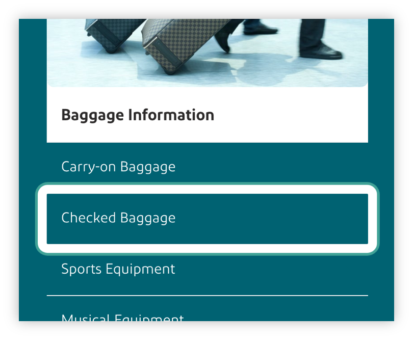
The focus indicator has been enhanced so that it works against both light and dark backgrounds
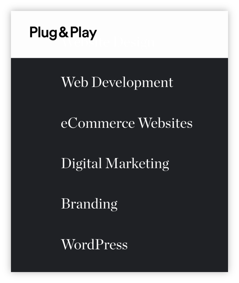
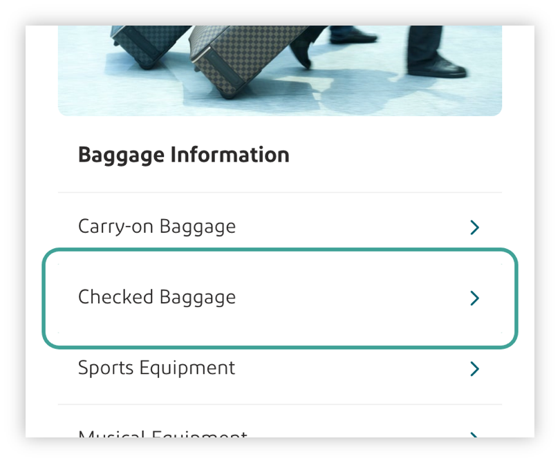
There is no focus indicator on the “eCommerce Websites” link – it is extremely difficult to determine which is the current, active element.
Examples of good practice
Examples of bad practice
Videos
- Tab Order Accessibility - University of Colorado Boulder Office of Information Technology
- What is Focus? - A11ycasts #03
References
WCAG 2.1
- 1.3.2: Meaningful Sequence (A)
- 2.1.4: Character Key Shortcuts (A)
- 2.4.3: Focus Order (A)
- 2.4.7 Focus Visible (AA)
EN 301 549 v 2.1.2
- 9.1.3.2: Meaningful Sequence
- 9.2.1.4: Character Key Shortcuts
- 9.2.4.3: Focus Order
- 9.2.4.7 Focus Visible