
Techniques
Code for different device types
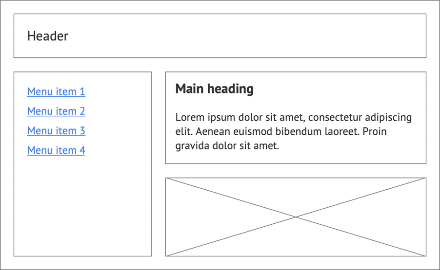
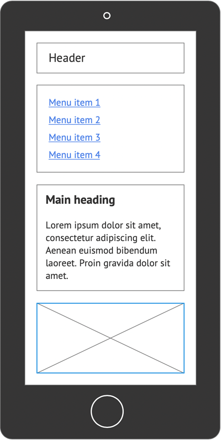
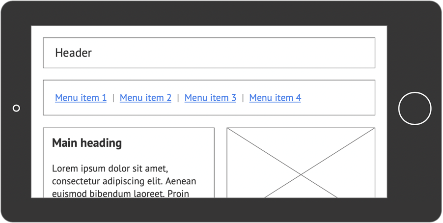
Users will not all be using a laptop or desktop computer with a large, high-resolution screen. Many users may not have a dedicated computer and will rely on their smart phones for internet access.
- Ensure your site’s layout is flexible and works across a wide range of devices
- If possible, test your site by viewing it on your mobile device; rotate your device, resize content, does everything appear as it should?
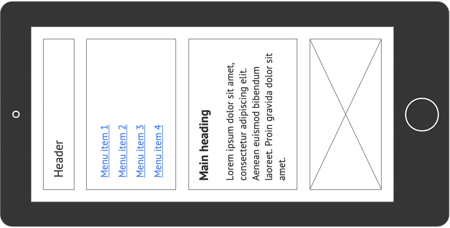
Do not restrict device orientation
A user in a wheelchair may have their tablet in an orientation that does not match the preferred orientation your website or app. The user may not be able to change orientation easily, to use the app.
Allow users to resize content without having to scroll in more than one direction
Your site must allow users to magnify the text, up to 400% of the default size, without requiring scrolling in two dimensions for:
- Vertical scrolling content at a width equivalent to 320 CSS px;
- Horizontal scrolling content at a height equivalent to 256 CSS px.
Whilst the layout and appearance of your site is the remit of the design team, you must ensure you implement their design accordingly. If this is not possible then you will have to liaise with the design team to redesign the layouts appropriately.
Do not prevent users zooming in to magnify pages on mobile screens
Users often need to magnify text and other page elements on mobile screens, to be able to read it comfortably. Users are able to temporarily magnify content by using the pinch-zoom gesture.
A common trend for mobile websites is to prevent users from enlarging content – either temporarily, by using pinch-zoom, or by default, using, for example, the magnification setting in the operating system – by specifying user-scalable=no and maximum-scale=1.0 in the metadata.
This approach is frequently used to mitigate the effects of clicking on form elements and having the page zoom in automatically. However, in preventing this unwanted behaviour, those pages are also preventing users from zooming in to read or input text that is too small for them to read.
Moreover, the “unwanted” behaviour of automatically zooming in to text boxes is caused by the form elements having a font size lower than 16px. Ensure the font size on the form elements is at least 16px and the automatic zooming problem disappears, allowing users to continue zooming in to see large text if they want to.
Do no set the user-scalable attribute or the maximum-scale attribute. You may set initial-scale to 1.0
Examples of good practice
Device orientation has not been restricted
The layout adjusts to fill the available screen area and does not require users to hold their device in a specific orientation.
Example of bad practice
Device orientation has been restricted
The layout requires users to hold their device in a specific orientation.
Further examples of good practice
- WCAG Technique C31: Using CSS Flexbox to reflow content
- WCAG Technique C32: Using media queries and grid CSS to reflow columns
References
WCAG 2.1
EN 301 549 v 2.1.2
- 9.1.4.4 Resize Text
- 9.1.4.4 Reflow