
Techniques
Support scanning by providing short and descriptive links
- Make sure your link text accurately represents its destination or function, without needing to read any text around it;
- Make links unique – if you were to read out just the links on your page, would each one make sense? If not, reword them.
- Avoid linking whole sentences;
- Do not link whole paragraphs;
- Avoid unnecessary prefixes, such as “link to…” or “click this to…” – links should be obvious by their appearance and the language you use in the link text;
- Avoid phrases such as “click here”, “more”, “for further information” – these do not give any indication of the nature of the content you are linking to – this is especially inconvenient when reading through a list of links on a page.
Provide useful supporting information in the link text
- If a link opens in a new window, include that information in the link text. Where possible, include this as text, rather than using a symbol as not all users will understand what a ‘new window’ symbol represents.
- Specifying links to other sites, that link to a different format document (for example, a PDF), or include information about a download size, is very useful information to convey to users, before they make a decision to select it;
Include this information in the link text, not just next to it, so it will be seen out of context.
Make interactive elements obvious
- Provide clear and unambiguous link styles, for example, underlined and blue; do not use those styles for non-linked text;
- Provide obvious buttons styles and reserve those styles for buttons and links.
Links or buttons?
Links should take users to other pages (for example, the next page in a sequence; a page on another site); buttons should perform operations on the same page (for example, ‘print’; open a modal dialogue) – make your links look like links and your buttons look like buttons, this will help users predict what will happen next.
A button which has been styled to look like a link
- <button>See dates</button>
Users will expect this to take them to another page. They may attempt to right-click it to open it in a new window. If this is the intended behaviour then this should be coded as a link; if this is not the intended behaviour then the button should not be styled to look like a link.
A button which has been styled to look like a button

- <button>See dates</button>
Users will expect this to show them the dates without taking them to another page. If this is not the intended behaviour then a link should be used instead.
Links which have been styled to look like buttons
There are occasions where links can be appropriately styled like buttons, this is generally when users will be able to accurately predict that they will take them to another page (for example, “Log in”, “Search”, submitting a form)
Note: although these may be styled as buttons they must be coded as links so that their nature can be correctly conveyed to screen reader users.

- <a href="...">Search</a>
Users will expect this link to perform a search and present them with a list of search results on a different page.
Ensure colour combinations have sufficient contrast
Ensure any colours have been chosen for text content and its background have sufficient contrast to allow users with visual impairments to be able to read the content.
- Ensure text has a contrast ratio of at least 4.5:1 with its background, or 3:1 is it is large text (18pt or larger, or bold and 14pt or larger);
- Ensure graphics that convey information and user interface components, such as input fields and buttons have a contrast ratio of at least 3:1 with their backgrounds;
- When you are using colour alone to differentiate links from text (such as when the links are not underlined) then you must ensure the link has:
- a contrast ratio of at least 4.5:1 with its background, and
- a contrast ratio of at least 3:1 with the surrounding text, and
- an additional change in appearance – such as an underline – when you hover over or focus on it.
You can check the contrast ratio of your text to background colours using WebAIM’s contrast checker
Make sure the focus indicator is visible
The focus indicator is a visual effect – usually a blue border or dotted ring – applied by default, by the browser to the interactive element – link, form field, button – that you are currently ‘on’, indicating that it is the current, active element.
It is not uncommon for designers to supress the focus indicator using CSS, for aesthetic reasons, without realising how detrimental that is to users who rely on it for navigation.
Never suppress the focus indicator without providing a better alternative.
If necessary – for example, if you have interactive elements against a background which is the same colour as your focus indicator – you can augment the focus indicator. Providing a border that works against both light and dark backgrounds is advisable.
Present lists of links as bullet-point or numbered lists
Rather than cram lots of links into your content, use a separate section at the end that lists those links.
- Using list functionality to present lists can avoid any confusion caused by links wrapping over multiple lines, which otherwise might look like several different links;
- Using list functionality will also tell screen reader users that this content is a list of links, without you having to specify that in text.
Do not use the “title” attribute on links
- The title attribute is not widely supported by screen readers;
- Only mouse users will be able to see the title text. Users who use a keyboard alone, and those with touch devices, cannot hover over links.
- Using the title text might override rather than augment link text in some instances.
Code links using <a> elements and always include an “href” attribute
- Avoid using onclick events on <a> or other elements as these act unpredictably with screen readers and for other keyboard-only users.
- If you are working on a legacy application where you cannot add HTML, and a non-standard element such as a <div> has been used as a link, you should use ARIA role=”link” – See Using the link role on MDN Web Docs
Ensure links are accessible through keyboard alone
- Users must be able to be navigate to and activate links using only the keyboard. If you are using an <a> element, you have an “href” attribute and there is some link text, you should easily pass this requirement.
Tips
Copy out just the links from your page. Can you distinguish between them? Can you predict the result of clicking on each of them? If not, change them.
Examples of good and bad practice
Descriptive link text and presentation
Table 1 - how to and how not to compose descriptive link text
| Do not write… | Do write… |
| |
| To visit the location map, click here | Visit the location map for directions |
| Link to our contact us form | Contact us |
| Flowers, plants, pots, spades, forks, fertiliser, seeds, watering cans. |
Including supporting information in link text
- Annual Report FY2021 (PDF)
- Annual Report Video Download (274Mb)
- Annual Report Video Transcript (opens in a new window)
Make sure the focus indicator is visible
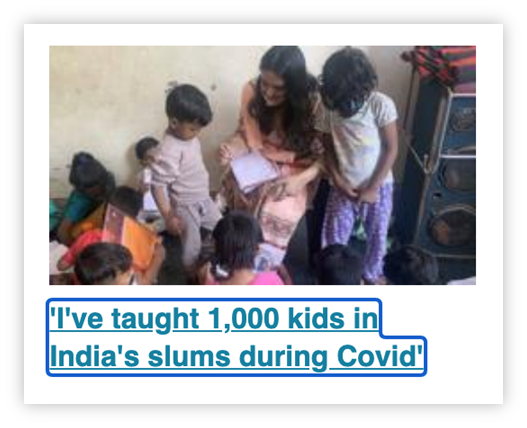
The focus indicator is clearly visible around the “I’ve taught 1,000 kids in India’s slums during Covid” link
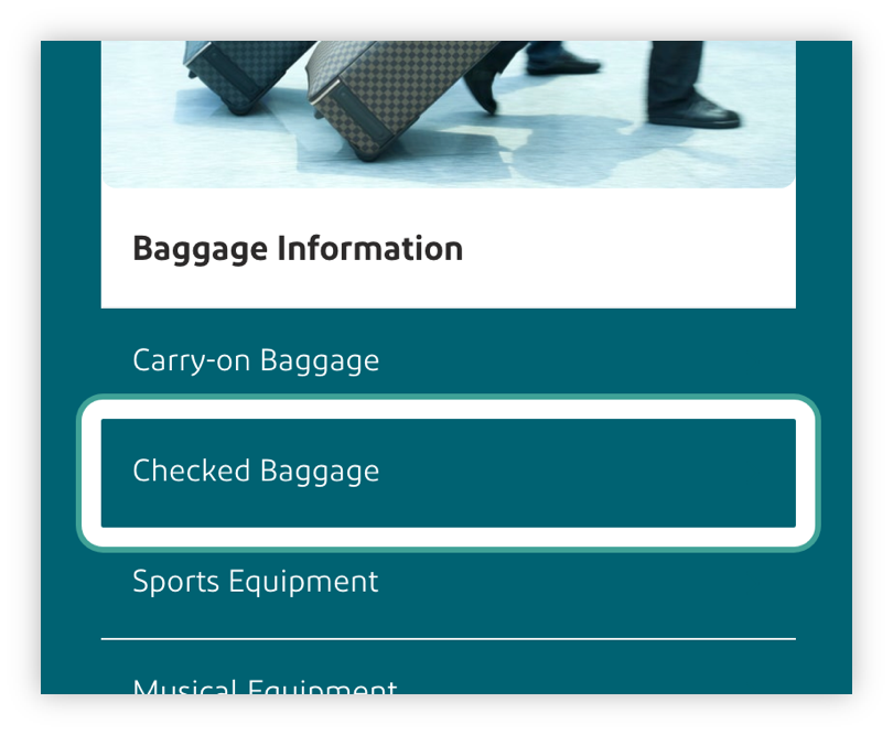
The focus indicator has been enhanced so that it works against both light and dark backgrounds
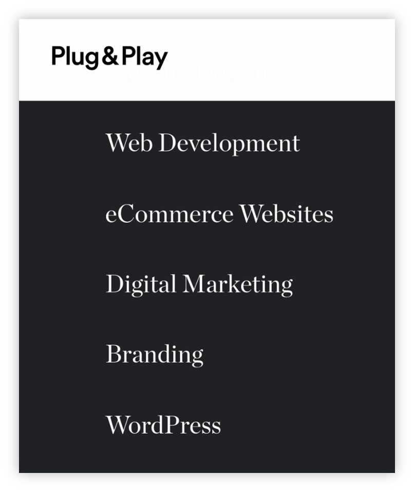
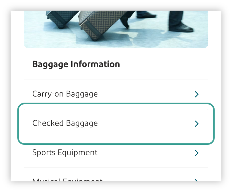
There is no focus indicator on the “eCommerce Websites” link – it is extremely difficult to determine which is the current, active element.
References
WCAG 2.1
- 1.3.1 Info and Relationships (A)
- 1.4.3 Contrast (Minimum) (AA)
- 2.1.1 Keyboard (A)
- 2.4.4 Link Purpose (In Context) (A)
- 2.4.9 Link Purpose (Link Only) (AAA)
- 2.4.7 Focus Visible (AA)
EN 301 549 v 2.1.2
- 9.1.3.1 Info and Relationships
- 9.1.4.3 Contrast (Minimum)
- 9.2.1.1 Keyboard
- 9.2.4.4 Link Purpose (In Context)
- 9.2.4.7 Focus Visible