
When designing and developing written communication, remember the importance of selecting a reasonable font size, good spacing and a clear font type. This will make your written communication easier to read by all members of the public.
Key guidance in the design of documents includes:
Use at least 12-point font size
This Toolkit recommends the use of sans serif fonts at a minimum of 12-point font size. It is recognised that some organisations use 11-point or other font sizes. Providers of written communications should be prepared to offer larger font size upon request.
Tip
Different fonts look bigger than others — the size of the ‘x’ is usually the best guide. If the size of the ‘x’ is small in the font you have chosen such as Times New Roman font, it is better to use a 14-point font.
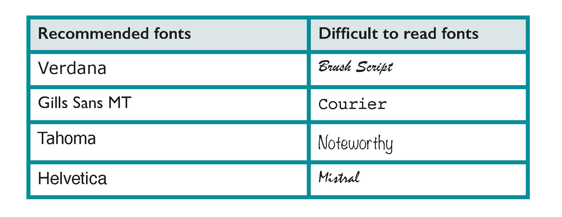
Use a clear familiar font
Use a clear font that people are familiar with and recognise easily. Sans serif fonts like Verdana or Helvetica work well. Font style and font size can make written communication, such as documents and logos, easier to read for members of the public.
Learn more
Easy to Read is shortened and simplified text that is supported by images. The images help to explain the text making it easier to read and understand. It is of specific benefit for people with intellectual difficulties. It may benefit younger readers and people with very low literacy levels. Inclusion Ireland provide Easy to Read publications, leaflets and guidance on how to make Easy to Read documents.
Information for all, European Standards for making information easy to read and understand.
For example,
- This is 12-point text in Tahoma.
- This is 12-point text in Verdana.
- This is 12-point text in Franklin Gothic Book.
- This is 14-point text in Times New Roman.
Use at least 12-point font size
This Toolkit recommends the use of sans serif fonts at a minimum of 12-point font size. It is recognised that some organisations use 11-point or other font sizes. Providers of written communications should be prepared to offer larger font size upon request.
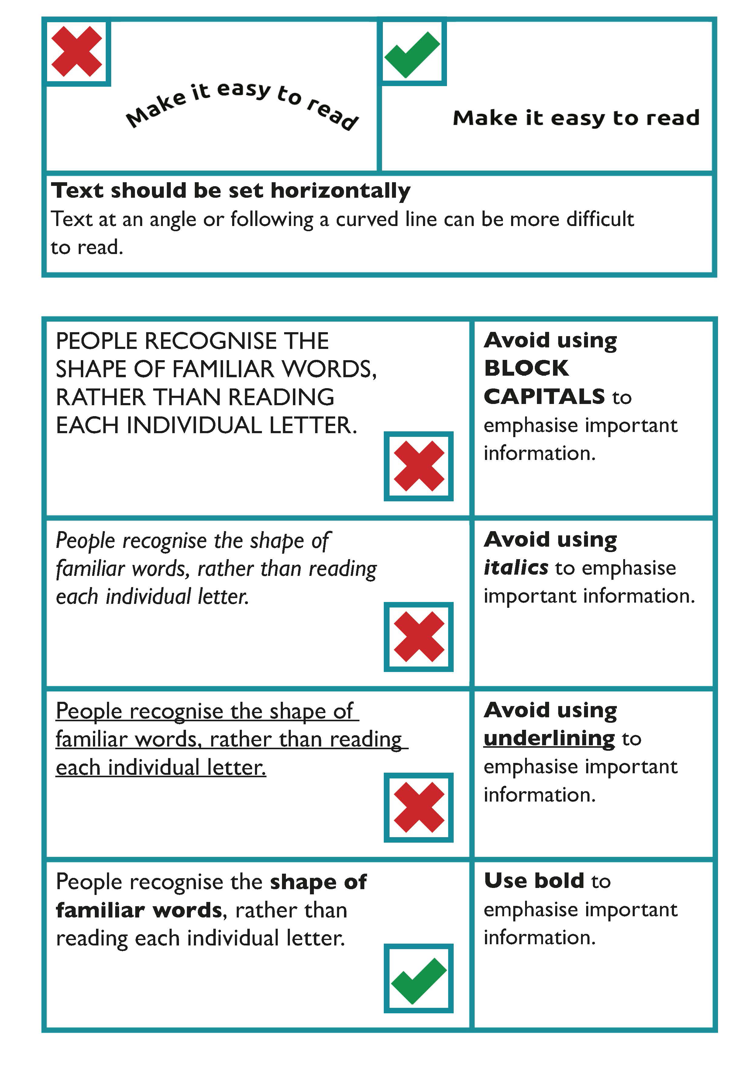
Make important points stand out
People often scan through documents, brochures and letters, so it is useful to emphasise important information, headings or paragraphs of text.
The general guidance in emphasising important information is to:
- Avoid using BLOCK CAPITALS
- Avoid using italics
- Avoid using underlining
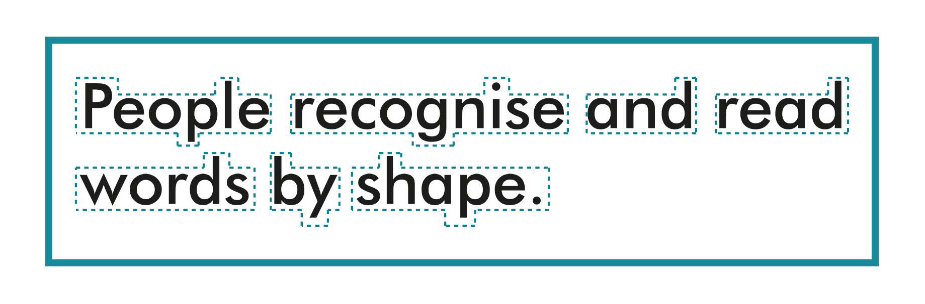
People recognise the shape of familiar words, rather than reading each individual letter. Setting a word in CAPITAL LETTERS, italics or underlining distorts the shape of the word, which makes it more difficult to read, particularly for people with a visual impairment.
Use bold or bigger sized font to emphasise text
To show the importance of a word or parts of your text, use a bolder type weight or bigger sized text.
However, bold text should be used for emphasis rather than being used consistently in the main body of the text.
Learn more
ISO 24509:2019 Ergonomics — Accessible design — A method for estimating minimum legible font size for people at any age provides a method for estimating minimum legible font size for single characters, but not for words or sentences, in self-luminous or reflected mode, used in documents, products labels, signs and displays.
Text should be set horizontally
Text at an angle or following a curved line can be more difficult to read. People should not have to rotate your document to read it.
Avoid splitting a word between two lines
Avoid splitting a word between the end of one line and the beginning of another as it disrupts the flow of the text. When using Microsoft Word, and similar programs, this can be controlled by turning off the hyphenate function.
Templates with accessible formatting
Some organisations may develop their own templates with embedded accessible formatting for documents such as letters, reports and lists which can also be used to produce documents which will be published online.
Headings and Sub-headings
This helps people to find information on a page. A table of contents may be generated from a heading structure.
Table of contents
A table of contents at the start of a long document helps people to navigate to the information they are particularly interested in.
To create a table of contents that’s easy to keep up-to-date in Microsoft Word or similar programs;
- Apply heading styles. For example, apply Heading 1 and Heading 2 to the text that you want to include in the table of contents. Word finds those headings, uses them to build the table of contents, and can update the table of contents anytime you change the heading text, sequence, or level.
- Click where you want to insert the table of contents. This is usually near the beginning of a document.
- Click References. The click Table of contents and then choose an Automatic Table from the gallery of styles.
Learn more
Accessible formatting prepares a document for online use. Learn more in the Digital section of the Toolkit where you can find guidance on How to make accessible documents.
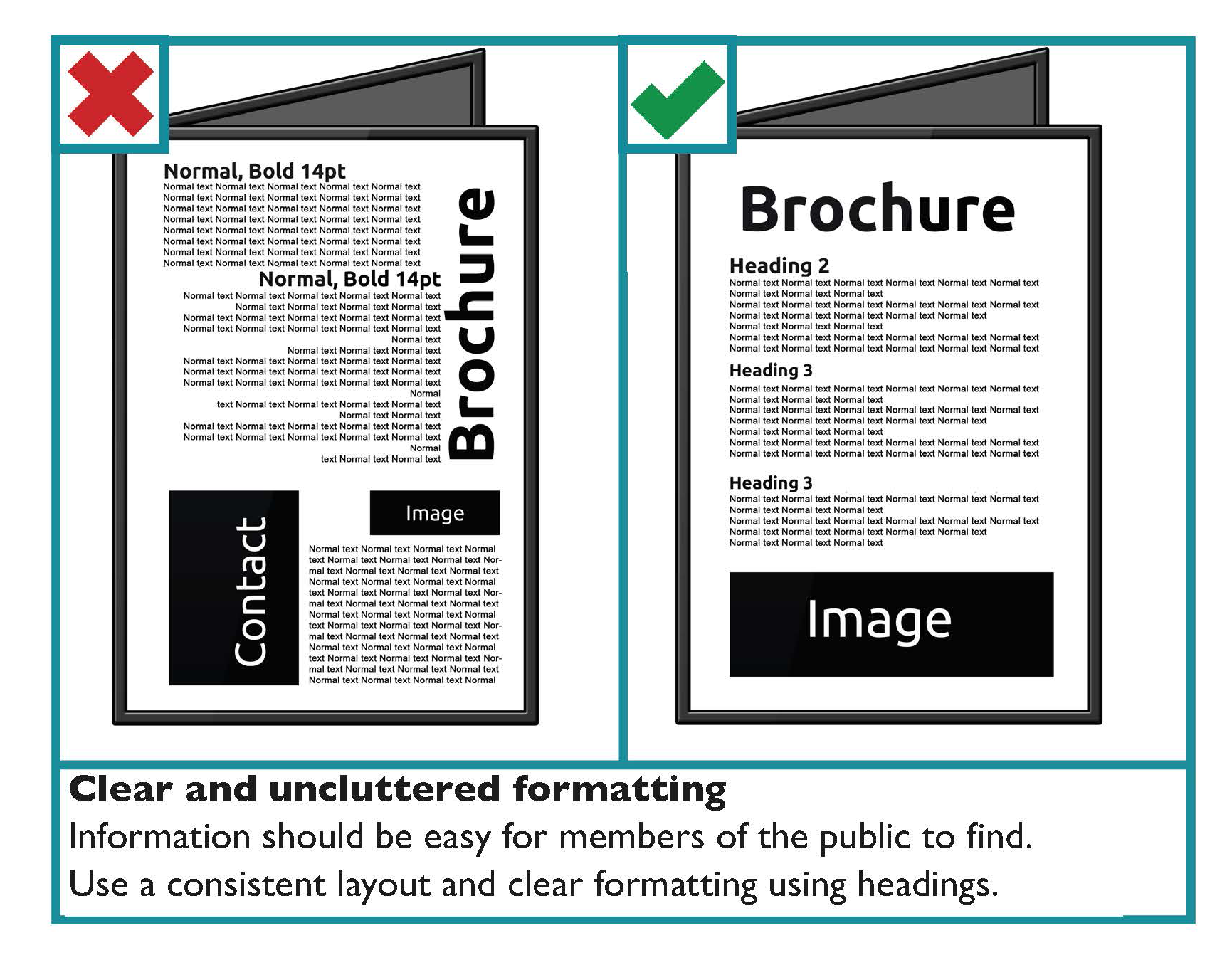
Use a consistent and logical layout
Use a consistent layout for each section to make information easier to find for the user. Use recurring features such as positioning headings, logos and page numbers in the same place in each section. This acts as a navigational aid for users. Use:
- Bullet point lists: these are used to break complex text into lists.
- Introductory paragraphs: the introduction can give a summary of the section if a section of a document is particularly long.
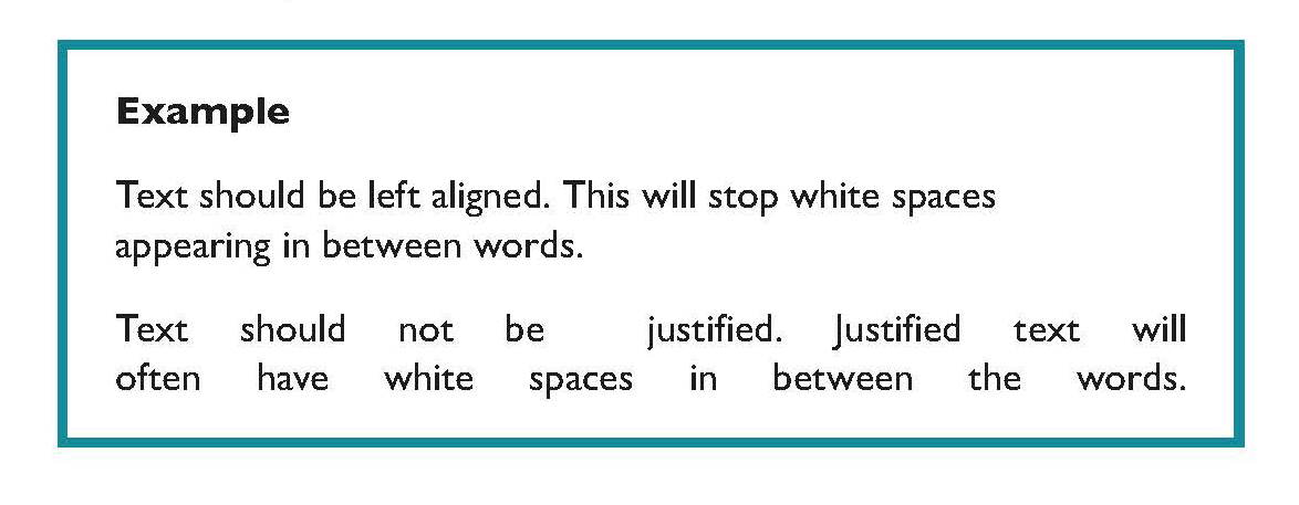
Use left aligned text
Avoid justified text as it can lead to large spaces of text between words. This can make sentences more difficult to read, particularly if a person uses text-to-speech software.
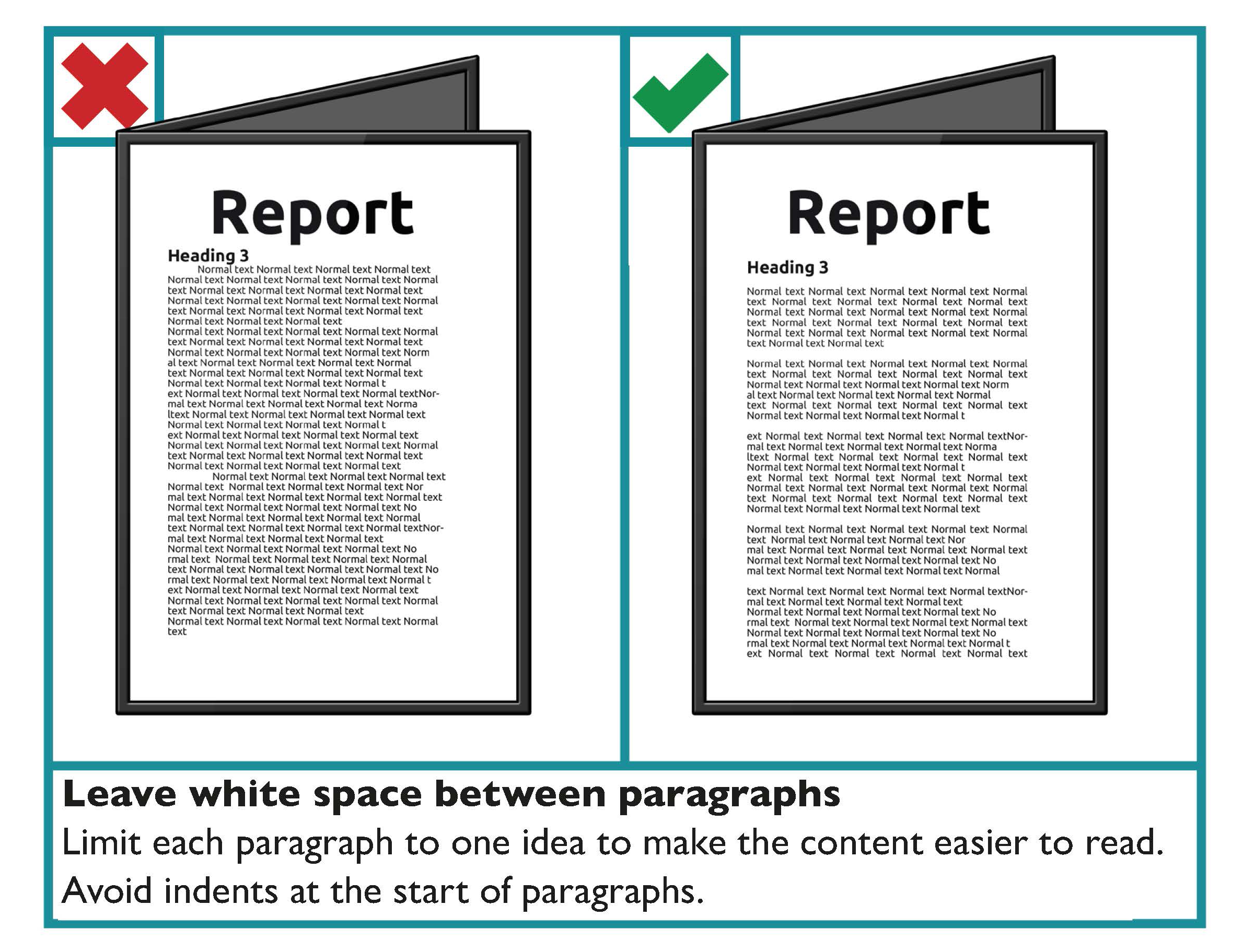
Limit each paragraph to one idea
It is important that you do not overload readers with information. Therefore, it is recommended that each paragraph is limited to one idea.
The following considerations are recommended for paragraph formatting:
- Leave a white space between paragraphs.
- Avoid indents at the start of paragraphs.
- Avoid continuing a paragraph over the page.
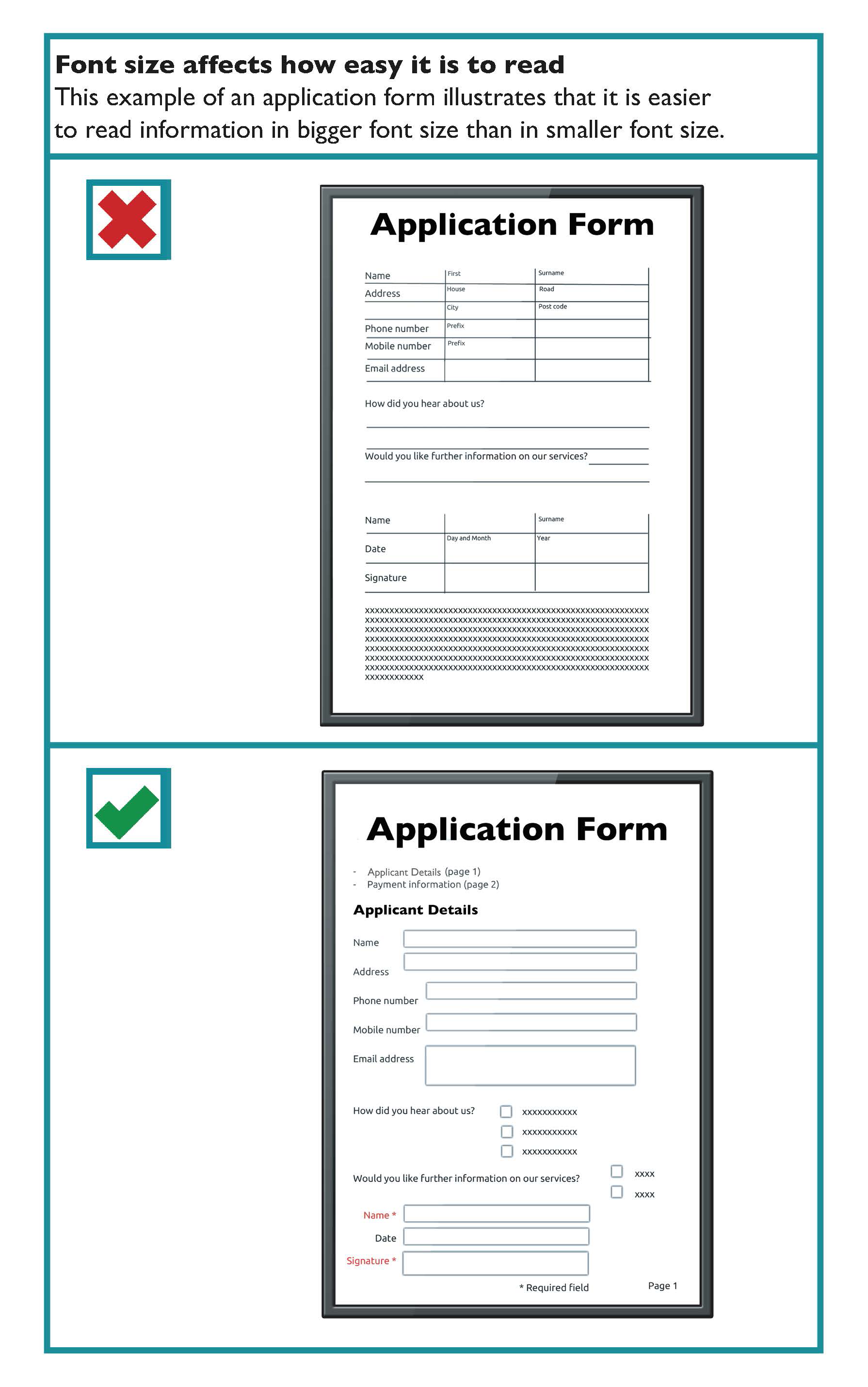
 Use images and graphs that are relevant to the text
An image should either support the main body of text or be accompanied by a text caption explaining its significance. Images are particularly useful for readers who have literacy, numeracy or learning difficulties or where English is not their first language.
Some key guidance when using images includes:
- Make sure the graphs or images clarify or add something to your content.
- Avoid using background images behind text. This makes text harder to read. However, where the image is even in tone, for example a blue sky, text can then be placed on the image. The key deciding factor is whether it is appropriate for your readers. Ensure good contrast between the image and the text in this scenario.
- Use images and graphs with clear edges and good colour contrast.
- Do not overlay one image over another.
- Avoid images or graphs with too much detail.
- Remember that some people may not be familiar with bar or pie charts and how they work.
- Emphasise the important facts and figures in graphs.
- Place explanatory text close by but separate to the image.
Use spacing to make your text easier to read
Good use of white space instead of a cluttered page makes your text much easier to read.
Ensure your paragraphs have enough space between them. This measurement is controlled by the “Spacing - After” option in the “Paragraph” feature in Microsoft Word. 12-point spacing between paragraphs is generally a good choice.
Ensure that lines of text within a paragraph also have sufficient spacing. This measurement is controlled by the “Line spacing” option in the “Paragraph” feature in Microsoft Word. Single line spacing between one line and the next should be the minimum in the body of your text. However, avoid line spacing of one and a half lines or more, as it is harder to read successive lines as a coherent text when they are too far apart.
Single column and double column layout
Single column layout is the preferred layout for text in a document.
Two column layout should be used sparingly. Two column text can mean there is more text on a page. It is often justified and the lines are shorter with more hyphens. This makes text harder to read.
If two columns are used, they can pose a problem for screen readers because the document’s reading order is not often clear and the content is then read in an undesirable sequence.
Two column layout should only be used when it would benefit the reader. For example, when the two columns are presenting a comparison.
If two column layout is used, check the format to ensure the correct reading order.
If you are using columns make sure the space between the columns (the gutter) clearly separates them. Where the gutter is too narrow between columns, a person with a visual impairment may read straight across from one column to the adjacent one.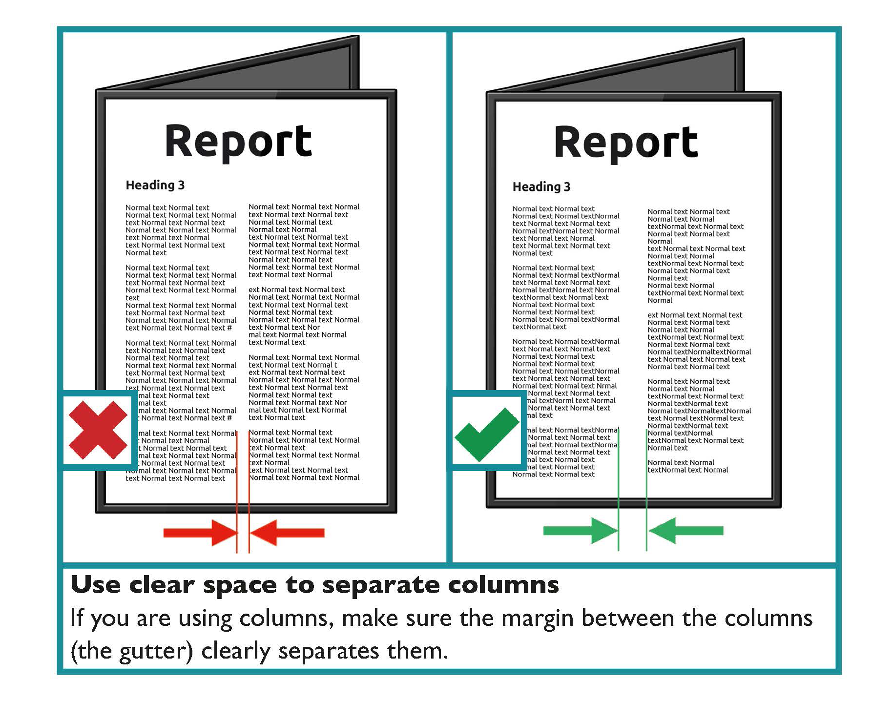
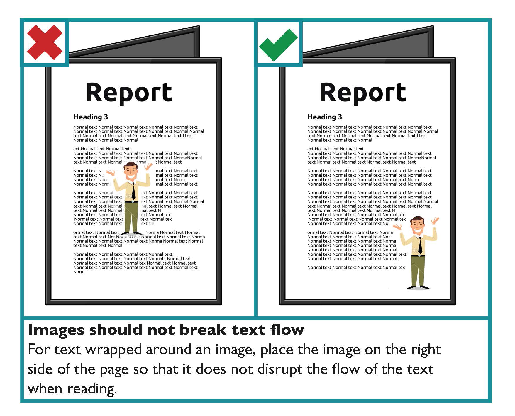
Images should not break text flow
For text wrapped around an image, you should place the image on the right side of the page rather than the left. By placing the image at the right side of the page, it does not disrupt the flow of the text when the person is reading.
Do not convey information just through images
All images should support the main body of text and should be accompanied by alternative (Alt) text in the alt attribute.
Learn more
In the Digital communications part of this Toolkit find guidance on alternative (Alt) text under the heading: Use Alternative (Alt) Text to make images and media accessible.
Use colours with good contrast between text and background
For all documents, from letters and statements to brochures and reports, it is important that you consider the colours used, specifically the colour of the text and the background. The selected colours affect how easy it is to read the information being communicated. Colour should not be used as the only visual means of conveying information, indicating an action, prompting a response, or distinguishing a visual element.
Choose colour schemes that can be easily identified by people with all types of colour vision.
Use a combination of different shapes, positions, line types and colouring patterns to ensure that information you are conveying is accessible by users who cannot distinguish differences in colour.
State the colour names where users are expected to use colour names in communication. Consider how colours and displays can be significantly affected by lighting conditions and the environment they are being used in.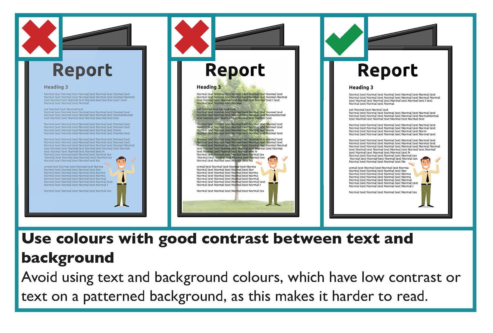
Key guidance on colour contrast is as follows:
- Make sure there is strong contrast between the text and the background colour.
- If using white text, make sure the background colour is dark enough to provide sufficient contrast. Contrast is best when using very dark colours together with very pale colours.
- White or cream paper makes text easier to read.
- Use a light coloured paper or a solid background colour to make a document more colourful.
- Avoid combining yellow and blue, and green and red, as these are difficult for people with colour blindness to distinguish.
- White text on a black background typically makes text look smaller, so you may need to increase the size and weight of the text.
- Avoid placing text in front of an image or patterned background, as this makes it more difficult to read.
Tools
Use a contrast analyser to ensure there is enough contrast between the foreground and background colours. WebAim provides an online colour contrast analyserwhich also gives guidance on the contrast ratio for normal and for large text. According to WCAG 2.1 standards, 4.5:1 is the minimum contrast ratio required for most text.
Learn More
Voice of Vision Impairment (VVI) works to represent the interests and defend the human rights of blind and partially sighted people in Ireland.
The National Council for the Blind Ireland (NCBI) has a technology department, NCBI LABS, that offers a number of services to people with sight loss.