
Techniques
Use templates and content management systems as intended
Ideally you should be able to work within a defined format to produce your content - this alone should ensure that most aspects of your content are consistent.
If you do not have a template, content management system or guidelines for producing content, consult with other content providers to define a consistent approach. Review the content produced to ensure that the approach is adequate to meet your needs and is easy to stick to.
Ask your technical teams if they can help you develop an accessible template for your website. Make sure you understand the purpose of each field in your content management system; accessibility can easily be compromised if content management systems are not used as intended.
‘Styles’ in Word and ‘Layouts’ in PowerPoint are excellent ways to achieve consistency in Office documents. They are very easy to set up and apply.
Be as consistent as possible throughout your content
- Structure your content in a consistent way. This will allow users to find sections of content easily;
- Ensure link prefixes, styles and positions are the same wherever you use them;
- Ensure headings and lists are consistent in appearance;
- Always use the same layout for data tables, so users can easily work out how to interpret their content;
- Be consistent in your style and tone of voice;
- Be consistent in the literacy level of your content.
Follow generally recognised conventions
If you have to change the format for certain pages or sections, ensure you follow generally recognised conventions for all elements – headings, tables, lists – to help users identify them with ease.
Examples of inconsistency
Inconsistency in button styles
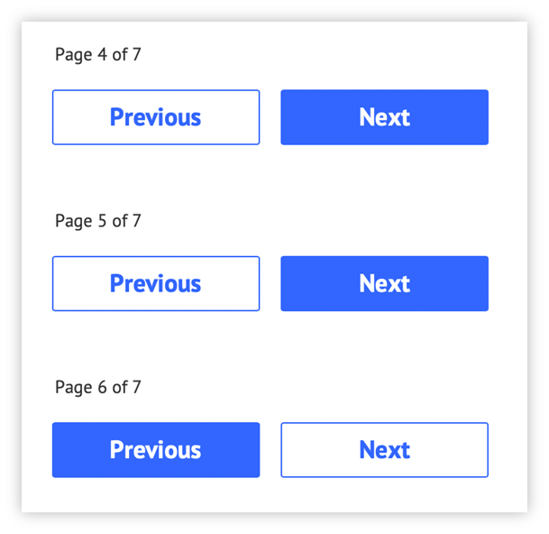
The style of the previous and next buttons has been swapped on page 6 and is inconsistent with pages 4 and 5. This will confuse users who have become familiar on earlier pages with the colour-filled button being the one they click to proceed.
Inconsistency in navigation display
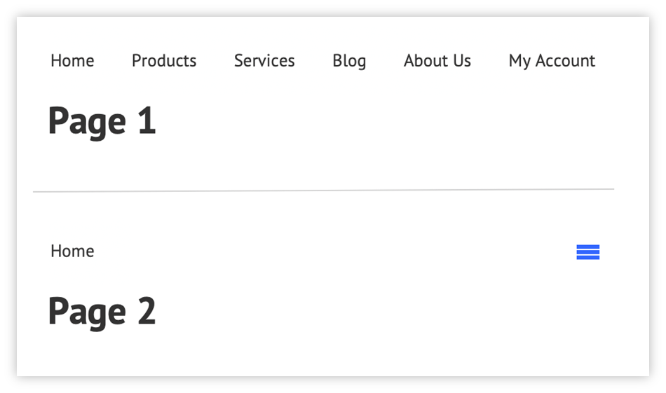
The presentation of the navigation is inconsistent across the pages. Users will have become used to seeing each navigation item on earlier pages and so may believe that other navigation options are not available on this page - not all users will understand what the “hamburger” icon represents.
References
WCAG 2.1
- 3.2.3 Consistent Navigation (AA)
- 3.2.4 Consistent Identification (AA)
EN 301 549 v 2.1.2
- 9.3.2.3 Consistent Navigation
- 9.3.2.4 Consistent Identification