
Techniques
Left-align your text
Do not right-align, centre or justify your text. Doing so makes it hard to read, especially for users with reading difficulties such as dyslexia.
Use bold and italic sparingly
- Use these styles solely to highlight key words and key phrases – do not attempt to convey any further meaning or information using these styles;
- Do not use bold or italics for whole paragraphs;
Note: bold and italicised styles, even when deployed using semantic HTML elements, <strong> and <em>, are not communicated by screen readers, so this information will only be conveyed to users who can see the text. One way of conveying bold or italic text to screen reader users is to add a visually hidden text prefix and suffix, denoting the beginning and end of the emphasised text.
What users see:
- This is italicised text;
- This is bold text.
What screen reader users hear:
- This is (begin italics) italicised (end italics) text;
- This is (begin bold) bold (end bold) text.
Liaise with your design and development team to help you add visually hidden, screen reader-only content.
Avoid changing from the default font or from those available in your template
- Not all fonts render well in screens;
- Some fonts can look smaller than others, despite having the same assigned size, making them more difficult to read;
- Avoid using font sizes that are not defined in your template or content management system.
Avoid using ALL UPPERCASE letters
People rely, to one degree or another, on the shape of words, to be able to read text quickly. If you use uppercase letters for entire words, phrases or sentences, some users will find it difficult to read.
Compare the shapes – especially note the ascenders (the tops of letters such as d, t, and l) and descenders (the bottoms of letters such as g, p and q) – of this word in the following two styles:
- SHAPE
- Shape
Do not underline text
Underlined text is a generally recognised indicator that the content is a hyperlink. If you underline words in you content, users will assume that this represents in interactive element.
Ensure your colour combinations have sufficient contrast
If you are adding to the colour palette you must ensure that any colours you have chosen for text content and its background has sufficient contrast to allow users with visual impairments to be able to read the content.
You can check the contrast ratio of your text to background colours using WebAIM’s contrast checker
Avoid placing background images behind text
Background images or gradients can quickly result in colour contrast issues, for example, when the text or the window is resized, the text shifts against the background. Dark text that was against a light sky may now appear over a dark mountain, making it very difficult to read. A busy background image often reduces the legibility of text placed over it.
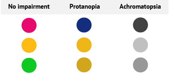
Do not convey information using colour alone
Not everyone is able to recognise different colours. If you use colour alone to convey information, users with impaired colour vision will be unable to understand what information you are trying to convey.
- Use colour as a supporting mechanism when conveying information. For example, using red for error messages is fine, as long as the fact that an error has occurred is communicated in a way that everyone can perceive, such as including a prefix or a heading to the error message;
- If you are selecting background and foreground colour combinations, make sure they have sufficient contrast.
Table 1 - Examples of how colour is perceived by users with visual impairments.
Do not rely solely on sensory characteristics to convey information
- Avoid instructions such as “Use the search on the left”, “Only enter the bold text”, or “Click the blue button” – these are not helpful to users who do not understand “left” or “bold”, or cannot perceive the colour blue;
- Use labels for elements that require instruction, so that you can say, for example, “Use the box labelled ‘Search’”;
- Avoid notifications and instructions that rely solely on sound – it is difficult to determine what action triggered the noise and what it might mean, and users with hearing impairments may not hear it.
Use text styles that facilitate readability
- Whilst no minimum line-height is specified in WCAG 2.1, we recommend using a line-height of at least 1.5 times the text size – this provides enough ‘breathing space’ for users to be able read text comfortably.
- Avoid using font sizes below those specified in your templates.
- In general you should avoid using a different font to those specified in your template or content management system.
Avoid putting text into images
- Users with visual or cognitive impairments, including dyslexia, rely on being able to change the colour, size, spacing, even the font family, to be able to understand written text. If you use images of text, users will not be able to alter the appearance of the text accordingly;
- Users whose primary language is not the language in which your content is delivered will only be able to translate words if the content is provided as text. Images of text cannot be translated.
- Users often need to resize content to be able to read it. Images of text suffer from a loss of quality when resized, so images of text can easily become less legible than actual text.
- If you need to use a specific style of text, for presentation purposes, try to use CSS and web fonts to achieve the effect. This will still allow users to change its appearance to suit their needs;
- If you absolutely must use an image of text, ensure the Alt Text exactly matches the text in the image.
Examples
Avoid excessive text styles
| It is difficult to read blocks of text if they are presented in uppercase letters. It also looks like the author is shouting! Do not use all capitals in your content, use sentence or title case only. | IT IS DIFFICULT TO READ BLOCKS OF TEXT IF THEY ARE PRESENTED IN UPPERCASE LETTERS. IT ALSO LOOKS LIKE THE AUTHOR IS SHOUTING! DO NOT USE ALL CAPITALS IN YOUR CONTENT, USE SENTENCE OR TITLE CASE ONLY. |
| Italics are also more difficult to read than regular text, especially online, and they can cause problems for those with cognitive impairments due to the change in shape of the letters | Italics are also more difficult to read than regular text, especially online, and they can cause problems for those with cognitive impairments due to the change in shape of the letters. |
| Avoid putting whole sentences and paragraphs in bold text. Bold text is less easy to read than regular text and its nature is not conveyed to screen reader users. | Avoid putting whole sentences and paragraphs in bold text. Bold text is less easy to read than regular text and its nature is not conveyed to screen reader users. |
| Avoid using underline as a style. It is less easy to read and users expect underlined text to link to other content. Reserve underlined text for links. | Avoid using underline as a style. It is less easy to read and users expect underlined text to link to other content. Reserve underlined text for links. |
| Do not right align text. Right-aligned text is difficult to scan. | Do not right align text. Right-aligned text is difficult to scan. |
| Do not justify text. Justified text uses flexible spacing between words and characters to ensure the text is lined up on both the left and the right. These spaces can create “rivers” of white space which make it difficult for users with dyslexia and other reading difficulties. | Do not justify text. Justified text uses flexible spacing between words and characters to ensure the text is lined up on both the left and the right. These spaces can create “rivers” of white space which make it difficult for users with dyslexia and other reading difficulties. |
| Avoid using fonts that are not in your template as they may not be supported by the user’s operating system. Depending on the font, they may also be more difficult to read. | Avoid using fonts that are not in your template as they may not be supported by the user’s operating system. Depending on the font, they may also be more difficult to read. |
Text that has too low a contrast ratio
This text has too low a contrast ratio with its background so is very difficult to read.
Do not use colour alone to convey information
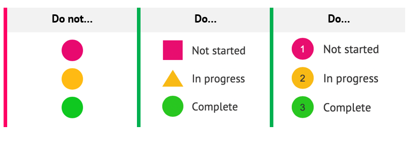
Table 2 - How to and how not to convey information with colour
| Do not write… | Do write… |
Here are the items we sell - new items are shown in red:
| Here are the items we sell:
|
You can use shapes and colours as a means of support in conveying information
Table 3 – How to use text to describe the status and shapes and colour for support
Use text rather than images of text

This heading is an image, which has been heavily compressed to reduce its file size, and then enlarged. It is very difficult to read.

This heading is text so it can be enlarged without any reduction in quality.
Videos
References
WCAG 2.1
- 1.1.1 Non-text Content (A)
- 1.3.3 Sensory Characteristics (A)