
Techniques
Make sure ALL form elements have a label – this is non-negotiable!
- Every single or multiline text box, drop down list, radio button and checkbox must have a label. This is so assistive technology, such as screen readers, can tell users what they need to input into or select from the form fields they are presented with. Without a label, it is not possible to accurately complete a form;
- All form labels must be clear, succinct, sensible and unambiguous. Use simple language and be direct in what you are asking users to input or select;
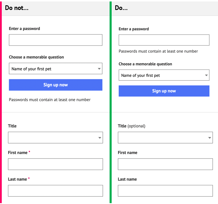
- Never use a ‘placeholder’ as the only form label. While they are recognised by some screen readers they are not a substitute for a label and, critically, once a field has been typed into the placeholder is no longer visible.
- Users with memory problems such as dementia, and users with cognitive disabilities rely on permanently visible labels to remember what each field is asking of them. Relying on placeholder text makes checking the form for errors very difficult for users.
- Default placeholder styles also frequently fail contrast ratio guidelines;
- If an input does not have a visible label because its expected input is obvious from the design, layout or proximity to other similar input fields – such as a search box, where the label is implied by the ‘Search’ text on the corresponding button – you must still include a label, although it is acceptable to hide it visually. You will need to inform your development team about the need, and required text for this label.
- Note: users who are less digitally literate, or who have cognitive impairments may not be able to determine the purpose of an input field from its associated iconography alone, so a visible label is always recommended. Visible labels allow users who use voice input to navigate, to interact with form elements more easily.
Always use the most appropriate form element for the question
- If it requires a few, free-text words, such as a name or street, use a text input box;
- If it requires selecting any number of options from a pre-defined list, use checkboxes;
- If it requires selecting a single option from a pre-defined list:
- use radio buttons if you have fewer than 7 or 8 options;
- use a dropdown if you have a large number of options, or if the default option is the recommended one.
Position hints and help text appropriately
- If you want to add hints and tips to your form – such as “passwords must contain at least one number”, add that text next to the form field so that it is visible and associated by proximity. This help text can be appended to the form label through code, so that it is announced by screen readers.
Include instructions
- Make sure you provide accurate, understandable and complete instructions at the top of the form;
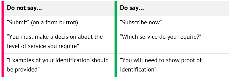
- Avoid using technical terms such as “required field” – to most people a field is where cows graze.
- If applicable, indicate how many pages there are in this form;
- Help prevent users from making errors by including specific instructions or help against specific form elements.
Make sure it is obvious which fields are required
- Do not simply use a red asterisk next to the form label to denote a required field:
- an asterisk will be announced to screen readers as “asterisk”;
- an asterisk will need to be defined somewhere on each page, close to the form – if your form is long this key may not be obvious.
Tip: rather than specifying required fields visually, consider a) informing the users that most questions are required, and b) specifying optional fields instead, using a text suffix to the question, for example, ”Title (optional)”.
Help users recover from errors
- It is highly likely, despite your excellent instructions and help text, that users will make errors when filling in your form. Help them to recover from these errors by providing useful suggestions as to how they can correct the errors. Whilst error handling will be coded by the development team, you can help by providing them with well-written, specific error messages for particular scenarios.
Keep forms short and break them into manageable sections
- Be succinct – only ask for the information you need. A good way to test for this is to see how many ‘optional’ questions you have included. If any questions are optional then you should consider removing them;
- Split long forms into logically separate pages and allow users to move freely between pages;
- Often there will be a number of input fields in a form that relate to each other, such as name and title fields or address fields. Make sure you group these questions together and communicate this, if not already supported by your content management system, to the development team. Groups of questions can then be coded in a way that is accessible to screen readers;
- If you have a lot of options in a dropdown you can also arrange these into groups with titles, to make them easier to read;
- Make sure each section has an accurate and accessible name.
Group similar items together and order questions logically
Often there will be a number of fields in a form that relate to each other, such as name and title fields or address fields – make sure you group these questions together. Groups of questions should then be coded in a way that is accessible to screen readers.
- Group form elements that belong together, for example, title, first name, last name;
- Provide a title for each group.
Remember, this is a cross-team effort
- Labels must be associated with their respective form element – that, along with appending any help text to labels and coding the grouping of form elements, should be handled by your development team;
- Instructions and help text are key to users being able to successfully complete forms – help text must look like it belongs to the form element without disrupting the flow of the form. Form design should be handled by your design team but you may be able to help with instructions and text that helps users recover from errors.
Examples of good and bad form design
Table 1 - What to and what not to do when designing forms
References
WCAG 2.1
- 1.1.1 Non-text Content (A)
- 1.3.1 Info and Relationships (A)
- 2.4.6 Headings and Labels (AA)
- 3.3.1 Error Identification (A)
- 3.3.2 Labels or Instructions (A)
- 3.3.3 Error Suggestion (AA)
- 3.3.4 Error Prevention (Legal, Financial, Data) (AA)
EN 301 549 v 2.1.2
- 9.1.1.1 Non-text Content
- 9.1.3.1 Info and Relationships
- 9.2.4.6 Headings and Labels
- 9.3.3.1 Error Identification
- 9.3.3.2 Labels or Instructions
- 9.3.3.3 Error Suggestion
- 9.3.3.4 Error Prevention (Legal, Financial, Data)