Techniques
Help users understand how appropriate the content is for them
- Provide a short summary introduction - particularly for longer pages - 50 words or fewer, directly under the main heading;
- For long pages provide a 'table of contents' at the top of the page
- Link each item in the contents list to the heading to which it refers;
- Ensure the link text matches the text of the heading it links to.
Prioritise the most important information
- Use the inverted pyramid approach to structuring your content:
- Start with the conclusion;
- Then following with the detail;
- Add the background and any minor details towards the end.
- Place important items high in the page to minimise the need for scrolling:
- This will ensure that screen readers users will be presented with this information early on;
- This will minimise the amount of scrolling users on mobile devices have to do.
- Put the most important information first in links, titles and phrases:
- This will emphasise the uniqueness of the item and aid quick comprehension;
- Screen reader users, navigating by headings or links, will benefit from being able to identify the purpose of a section quickly.
Use short paragraphs and sentences
- If you are adapting existing content for digital use, break up larger paragraphs into smaller ones.
- Try to keep sentences below 21 words
- Try to keep paragraphs below 65 words
- Use lists instead of long, comma-separated sentences;
- Always use the available list functionality, rather than using hyphens or asterisks to simulate lists;
- If appropriate, add relevant tables and diagrams to break up large 'walls of text'.
Use headings to convey an outline structure of your content
A good heading structure with meaningful and representative headings helps users understand the nature of the page and its sections. Headings help to break up long sections of text into shorter, more manageable subsections, and they provide strong navigational cues, allowing users to navigate in a non-linear manner.
Descriptive and accurate headings allow screen reader users to navigate in a non-linear manner – they can jump straight to a section of content that interests them without having to read through the rest of the page.
- Always have a main (level one) heading which describes the nature of the page;
- For each main section use a level two heading;
- Any sub-sections should have a level three heading; further sub-sections should have a level four heading, and so on;
- Web pages support heading levels from one to six <h1> - <h6> and Word supports up to five heading levels, however some accessibility organisations advocate for restricting content depth to just four headings;
- Avoid skipping heading levels – do not jump from <h1> to <h4>
- Ensure all headings are descriptive, short and to the point.
- Always use the correct level heading. Your design team will have used Cascading Style Sheets (CSS) to style headings on your webpages, so that they are an appropriate font size (colour, weight, and so on) – if you think the font size for a particular heading is too big or small, ask your design team for help, rather than using an inappropriate level heading that happens to be the right size.
- Never use headings for stylistic purposes. If you want to change the font size (or colour, weight) ask your design team to create a style for you, rather than using an inappropriate level heading that happens to be the right size
- If you want big text in the middle of your page, ask your design team to create a style with big text, do not use an <h1>
Use the most appropriate list type – ordered, unordered or definition list
- Use <ul> for unordered lists – these are simple, non-hierarchical lists of items with a bullet point at the front of each line, like this text you are reading now;
- Use <ol> for ordered lists – these are lists with a hierarchy. By default they will have a number in front of them but these can use numbers, letters or roman numerals;
- Use <dl> for definitions. A <dl> has two elements which are used in pairs:
- <dt> is a definition term.
- <dd> is the definition of that term
Use images to engage your users
- Choose relevant and appropriate images – they must support your content;
- Use high quality images – if it is a photo, ensure it is in focus, well balanced in light and colour and has good composition.
- Follow the guidelines set out in CP 1.3.1 – All images must have a text equivalent (“Alt text”)
Examples
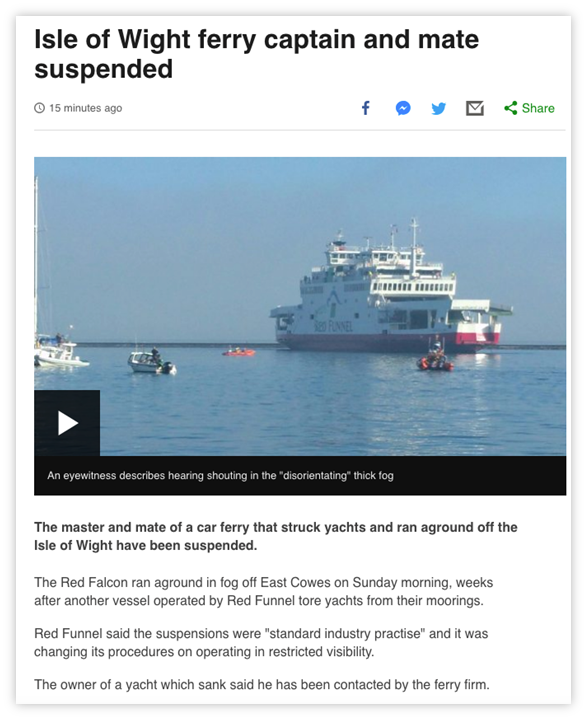
Use the inverted pyramid style of writing

The conclusion of the article is in the main heading of the page; the core detail is in the first sentence; the background follows after.
Break up content with lists
Table 1 - Use lists instead of long, comma-separated sentences
| Do not write… | Do write… |
| We provide the following services: window cleaning, rubbish removal, vacuuming, dog walking. | Our services:
|
References
WCAG 2.1
- 1.3.1 Info and Relationships (A)
EN 301 549 v 2.1.2
- 9.1.3.1 Info and Relationships
