Make your website easy to navigate
The public should be able to use your website no matter what device or operating system they use, or their level of experience in using the web. The following guidance aims to help make accessing and navigating your site easier for everyone.
All navigation should be possible through the keyboard only
A fully accessible site should have no applications that depend on a mouse or similar cursor control (joystick, trackball, and so on).
Be consistent with layout
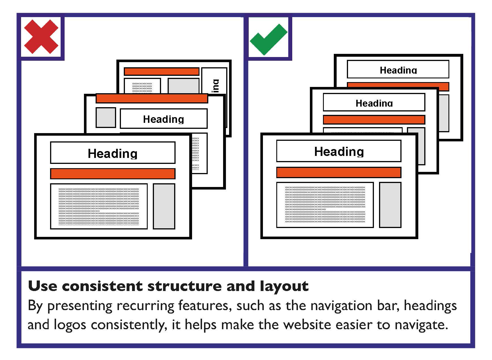
Well laid out content makes it easier for a person to navigate the site and find the content that they are looking for. Consistency is important.
The overall formatting and style of the content — the layout, structure, font, colour, and so on — should be consistent to make information easier to read.
The positioning and appearance of recurring items, such as the logo, navigation bar and headings, should be consistent.
The exception for consistent formatting and layout may be the homepage. Your homepage may have different formatting — it is similar in concept to the cover of a printed publication.
Always provide a link back to the homepage from every page of the site.
Learn more
The Centre for Excellence in Universal Design (CEUD) provides information on Web Accessibility Techniques.

Navigation bars should be easy to identify and distinguish
Use clear navigation bars that are distinguishable from the content.
Navigation bars should provide feedback
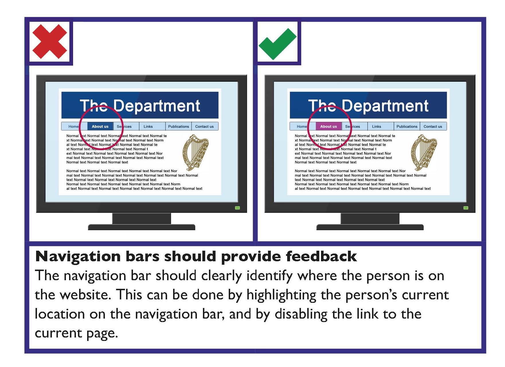
The navigation bar should clearly identify where the person is on the website. This can be done by highlighting the person’s current location on the navigation bar, and by disabling the link to the current page.

Make webpages appear and operate in predictable ways
Webpages, applications and online interfaces should be intuitive and predictable in how they operate. Websites typically have a set structure. This helps people to easily find information and navigate new websites.
Your website should be easy and intuitive to use for members of the public. Examples of established website features, which make navigation more intuitive to use, include:
- ‘Breadcrumb’ navigation: This provides information about where the current page is in the site structure and provides navigation to higher levels.
An example of this could be Home > About > Services.
- Within page ‘contents’ section: For long pages, a contents list for the page should be provided.
- Primary navigation bar: This is usually presented horizontally near the top of the page.
- A search box: This is usually in the top right area of the page. The search box should be visible on each page without scrolling.
If possible and appropriate web content should be usable on a variety of devices
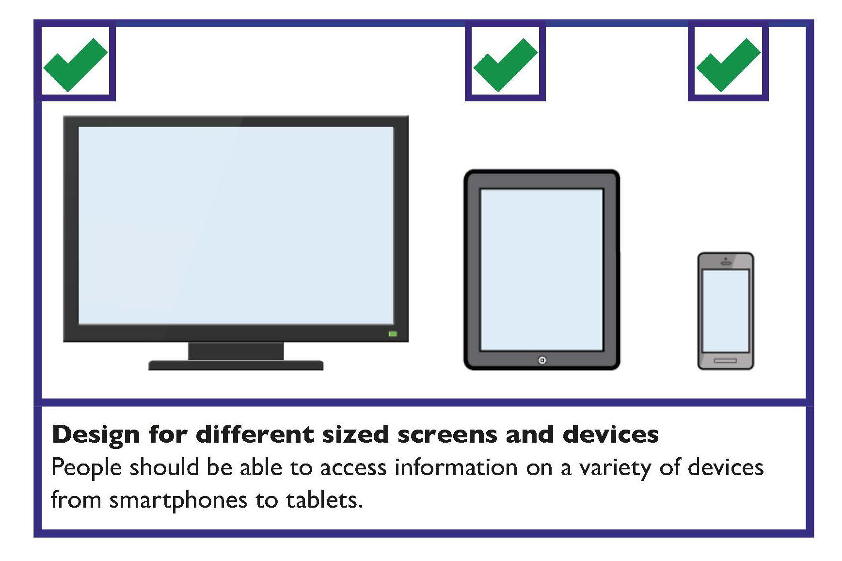
Web content and applications should be usable by the widest variety of browsers, devices and assistive technologies by using fluid design and relative widths. (Note: Talk to your web designer about ‘responsive websites’.)

Learn more
The Centre for Excellence in Universal Design (CEUD) provides information on how to Design accessible navigation.
For further information on page structure, see section 2.2 in CEUD’s Universal Design Guidance for Online Public Services (2012).
Website Navigation Checklist
- All website navigation should be fully accessible through the keyboard.
- Be consistent with your navigation layout.
- The navigation bar should be easy to identify and distinguish from the rest of the content.
- Navigation bars should provide feedback to identify where the person is on the website.
- Provide enough time to allow the person to read, digest and respond to information.
- Make webpages appear and operate in predictable ways, which are intuitive to use.
- Web content and applications should be usable by the widest variety of browsers, devices and assistive technologies.
- Avoid the use of pop-ups.
