
Forms must be properly structured and optimised to support the person in completing the form without errors.
- Guidelines for the design of forms are as follows:
- Give the form a clear title. Identify whom the form is for and its purpose at the start.
- Give instructions in bullet points on the first page.
- Ensure all terms and conditions are clearly explained in plain English.
- Divide the form into clear and logical sections with informative headings and clear numbering.
- Avoid unnecessary or repeated questions.
- Make it clear which fields are mandatory and must be completed.
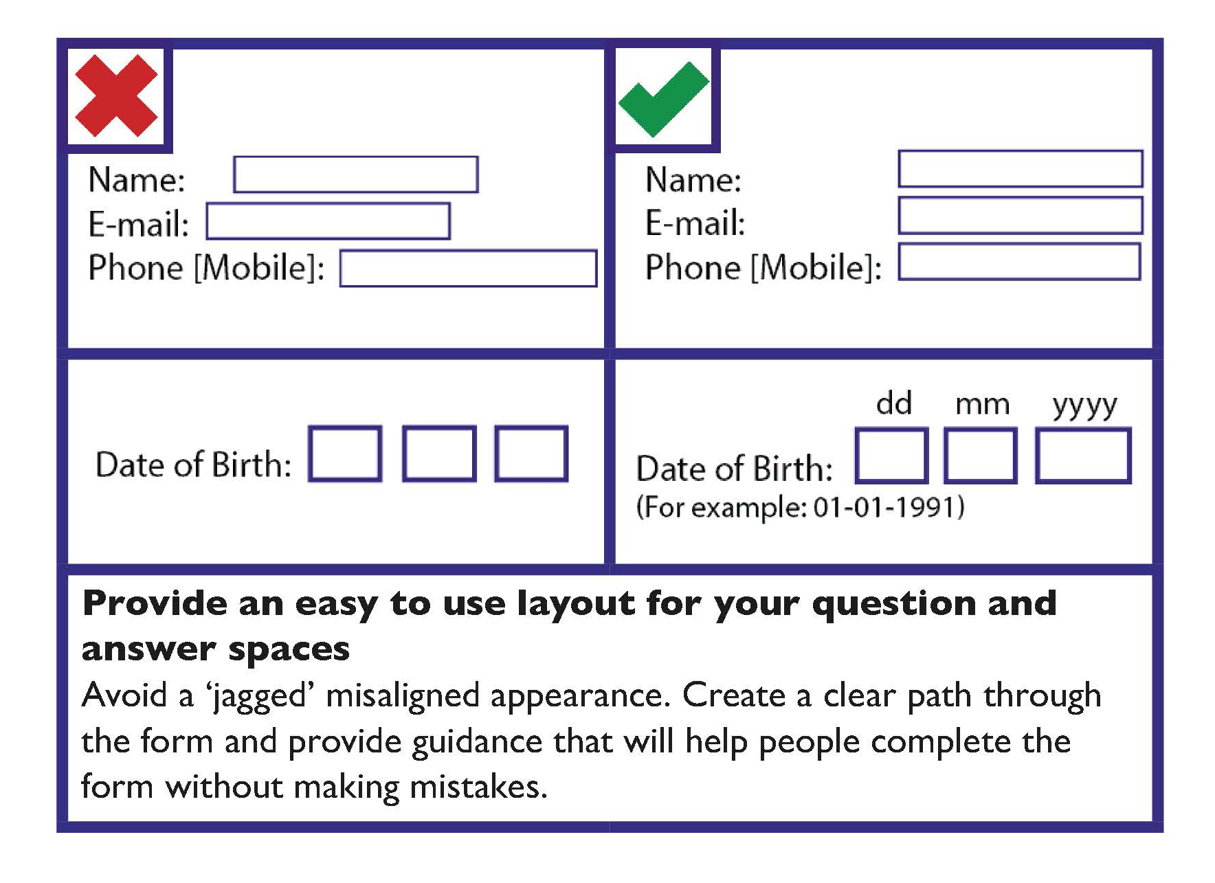
- Make sure people have enough space for providing answers.
- Where possible use boxes rather than lines for answers.
- Create a clear path through the form.
- Avoid multi-column forms unless necessary.
- Avoid creating a 'jagged' misaligned appearance.
- Make sure ‘tick boxes’ are clearly linked to the answer.
- Ensure that ‘tick box’ borders and answer lines are solid and at least one point wide.
- Many people move between form fields with the tab key. Use the form layout and if necessary use the tab index attribute in HTML to support this.
- Make the ‘next’ or ‘submit’ button obvious and distinctive. This is particularly important where it is provided near competing buttons such as ‘back’.
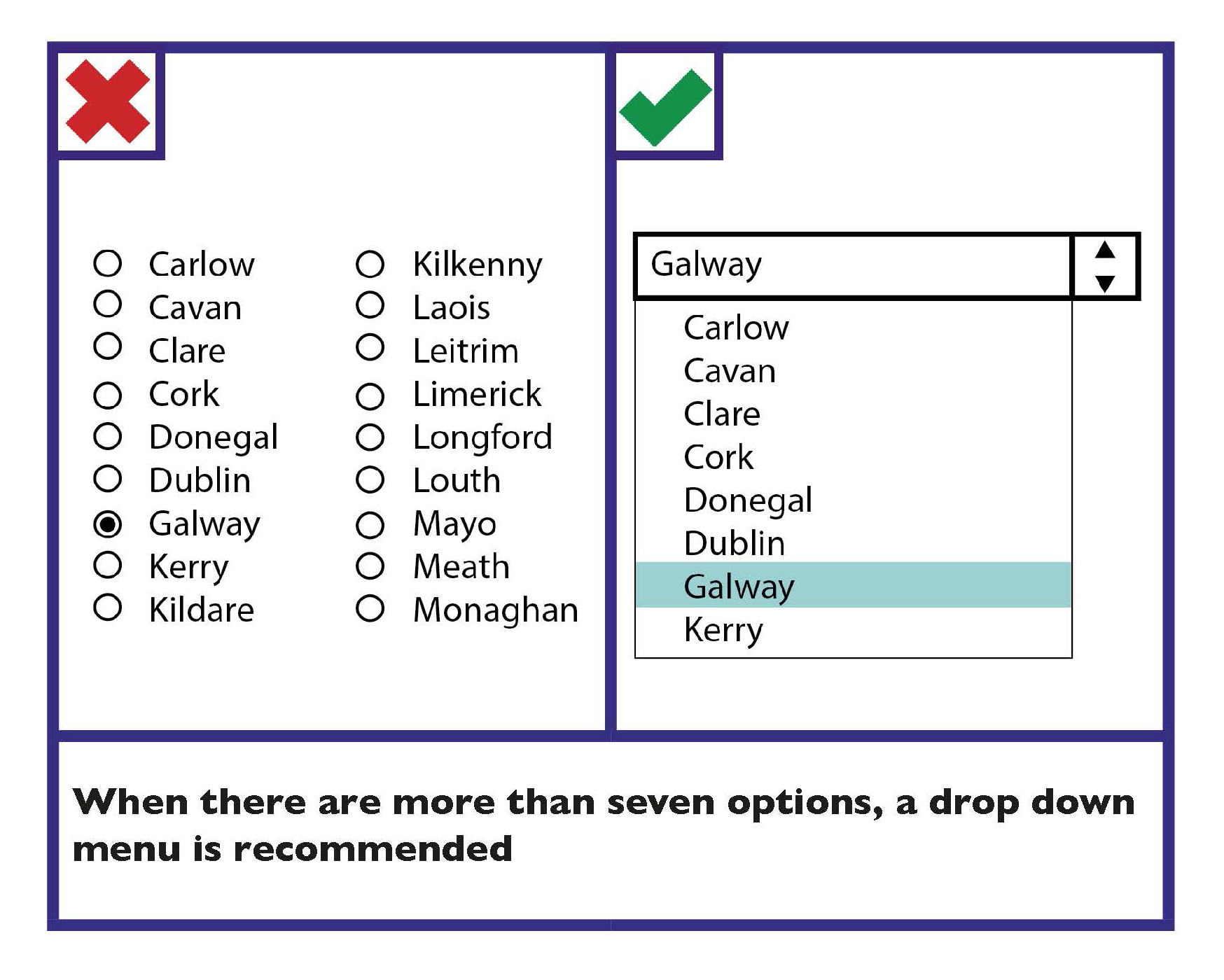
- Use the simplest way of presenting options for ease of use:
- It is recommended that for less than seven options, ’tick boxes’ should be provided.
- For more than seven options, a drop down menu is recommended
Online Forms Checklist
- Give the form a clear title.
- Provide clear instructions at the start of the form.
- Provide questions in a logical order.
- Group similar questions together under a useful heading.
- Avoid unnecessary or repeated questions.
- Make it clear which fields are mandatory.
- Make numbering as simple as possible.
- Make it clear where answers should be provided.
- Make it easy to navigate through the form.
- Make it easy for the person to select options.
- Make the ‘next’ or ‘submit’ button obvious and distinctive.