
Key guidance when using multimedia is as follows.
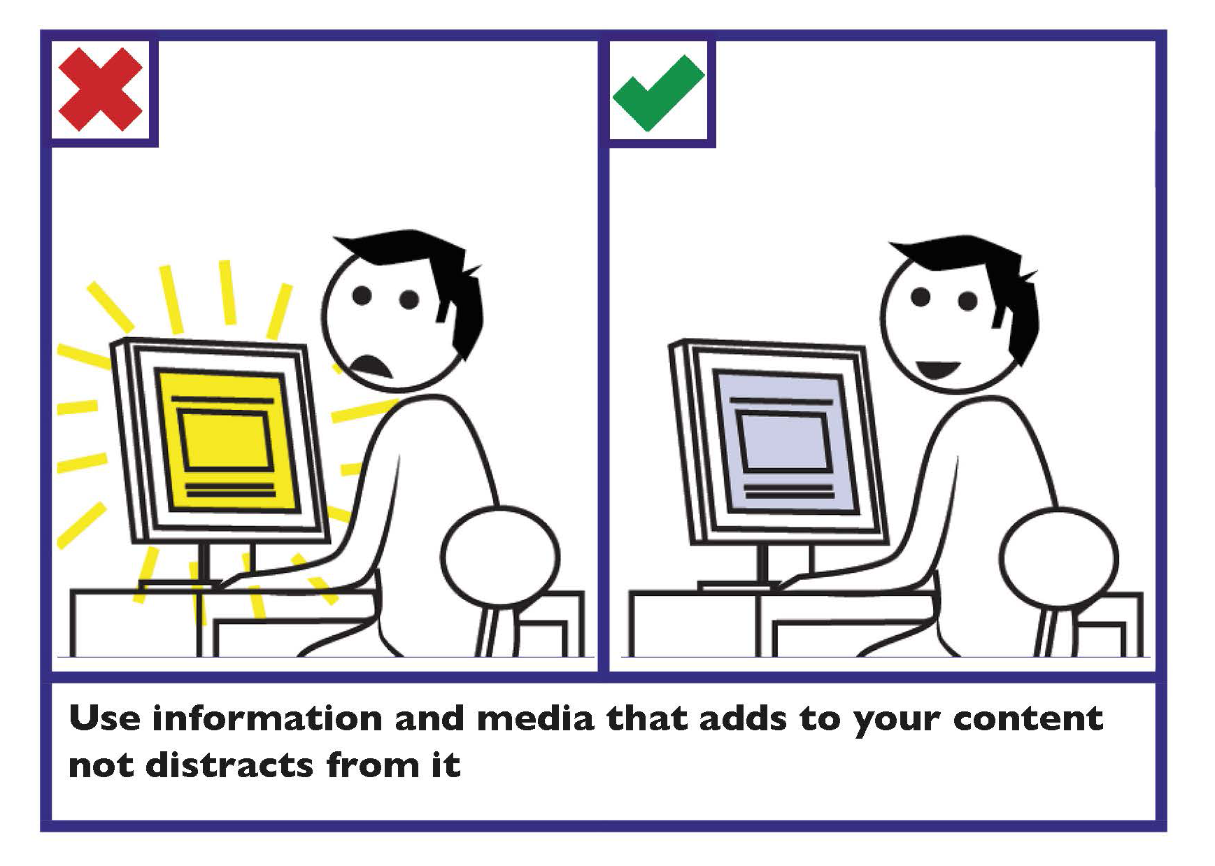
Use your design to enhance information, not distract from it
Use features such as animation and video to add to your content, rather than to distract from it.
Ensure multimedia is inclusive
Ensure multimedia does not exclude information from those who cannot see, hear or play it.
- Avoid the use of video players to play multimedia. All video content should use HTML5 to play MP4 or OGG content.
- For embedded multimedia, supply a link to a standalone version.
- Provide controls to skip, pause or stop the presentation.
- Provide captions for multimedia, so that it can be understood by all members of the public regardless of the volume the multimedia is played at. This is an important consideration as one in seven of members of the public have hearing difficulties.
- Where captions are not provided, provide transcripts for the multimedia. This can be provided either on the same page or as a link to a transcript on a different page.
- If using a slideshow (also known as a ‘carousel’), ensure that it is accessible.
Learn more
Find more information in Section 2 Spoken and Signed Communication, Communicating with persons who are d/Deaf or those who are hard-of-hearing.
Find information on creating an accessible slideshow on the World Wide Web Consortium ‘Carousels’ webpage.
Information technology - User interface component accessibility - Part 23: Visual presentation of audio information (including captions and subtitles) outlines the requirements and recommendations on the production and design of the visual presentation of audio information (including captions and subtitles) that support users who cannot make use of the audio content.
Avoid content that flashes more than three times per second
High flash content may cause seizures among some people.
Images
Some key guidance when using images includes:
- Add Alternative (Alt) Text when using an image or graph.
- Avoid text within images.
Colour
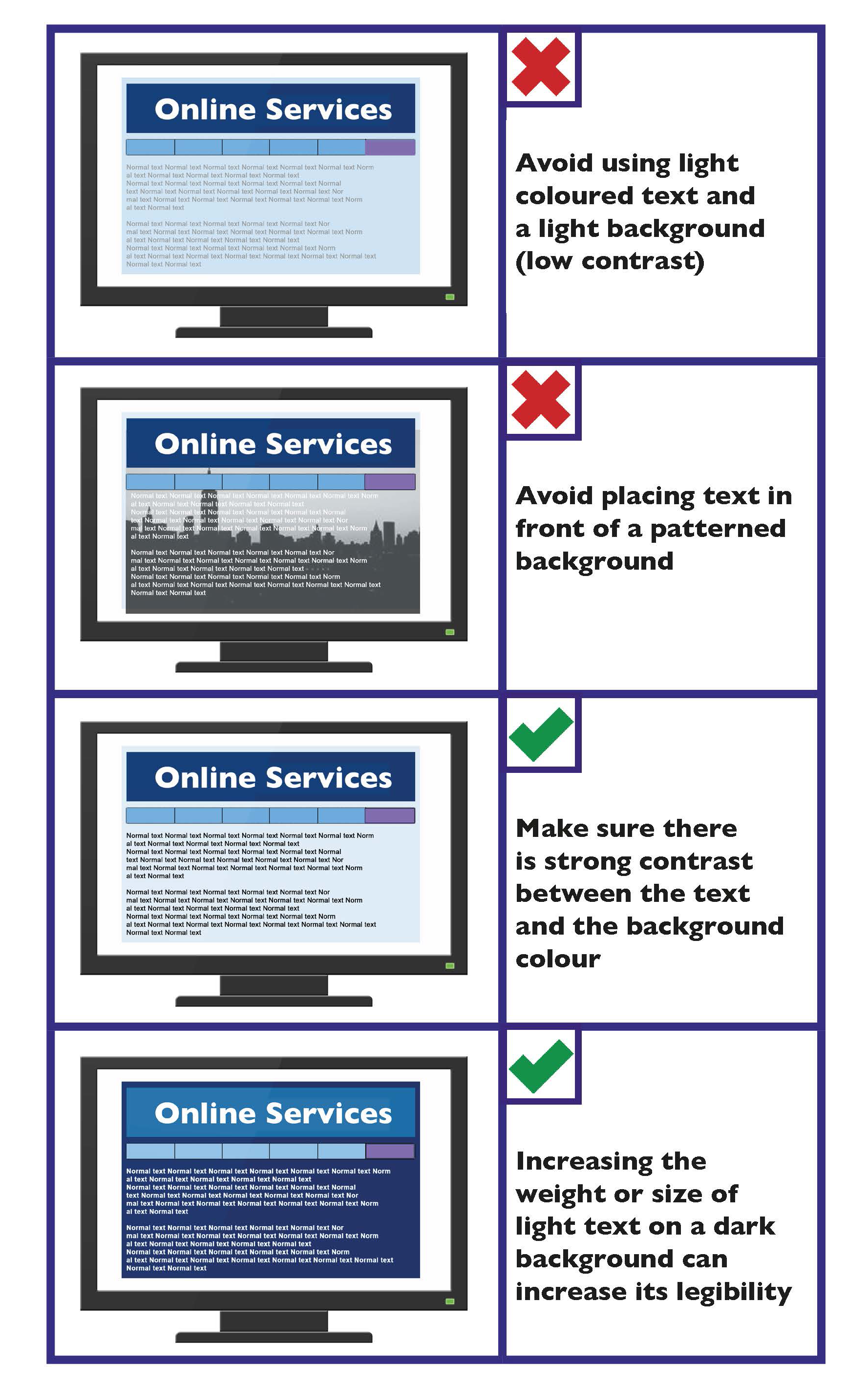
Create good contrast between text and background
The contrast between the text and the background affects how easy it is to read information.
Key guidance on colour contrast is as follows:
- Make sure there is strong contrast between the text and the background colour.
- If using white text, make sure the background colour is dark enough to provide sufficient contrast. Contrast is best when using very dark colours together with very light colours.
- Avoid combining yellow and blue, and green and red, as these are difficult for people with colour blindness to distinguish.
- Pale text on a dark background typically makes text look smaller, so you may need to increase the size and weight of the text to make it easier to read.
- Avoid placing text in front of an image or patterned background, as this makes it more difficult to read.
Tip
Print your page in greyscale. This will help identify if you have sufficient contrast.
For further information see Section 1 Written Communication, Use colours with good contrast between text and background.
Multimedia Checklist
- Use your design to enhance information, not distract from it.
- Provide controls to skip, pause or stop the presentation.
- Offer different download sizes.
- Avoid flash content that flashes more than three times per second.
- Provide captions/subtitles for multimedia.
- Where captions/subtitles are not provided, provide transcripts.
Images Checklist
- Add Alternative (Alt) Text when using an image or graph.
- Avoid text within images.
Colour Checklist
- Create colour contrast between text and background.
- Carefully consider colour combinations.
- Increase the size or weight of a light coloured font on a dark background.