
Make text easy to read and understand
Always use the simplest and clearest language possible. Avoid technical language that a member of the public may not understand. If you must use technical language, clearly explain what it means in plain English.
Where applicable, provide important information in other languages
If a large percentage of your customers do not speak English as a first language, where applicable, provide content in other languages or offer a translate button.
Help members of the public to scan text
Break text into chunks using short paragraphs, lists and sub-headings in order to help members of the public quickly understand and absorb information.
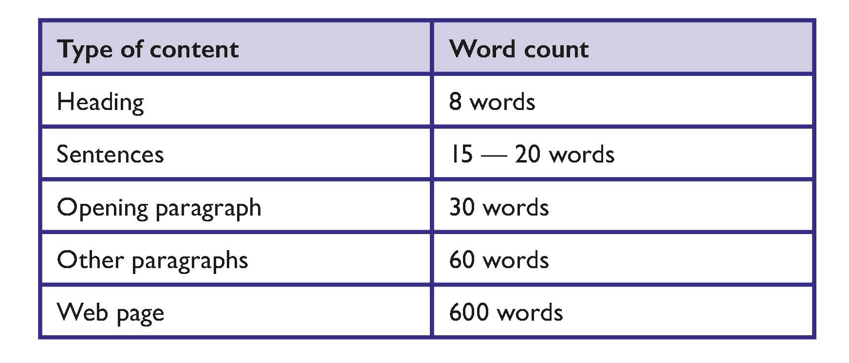
Keep content clear and concise
Adopt word-count targets that are appropriate for members of the public and your content.
Suggested word counts are as follows:
Write for members of the public
People interact with text differently online than they do in print. Most people are more inclined to scan text on a website. Therefore, content should be presented in a way that members of the public can obtain key information quickly when they scan your website.
Steps to achieve this include:
- Present the key conclusion or facts at the start of the text.
- Present information in order of importance. Support the key conclusion with the most relevant information.
- Present supporting detail or background information.
- Provide links to background or related information if available.
Tip
The CEUD provides guidance on Web accessibility techniques for use by:
- Developers
- Designers
- Content providers and editors
Tools
Readability checkers can work well in conjunction with plain English guidelines and user testing.
The public sector website gov.ie has a readability checker as part of its content management system.
There is a readability checker in MS Word.
Some publicly available readability checker apps might not be secure.
Use a clear, readable font
Use a clear font that people are familiar with and recognise easily. For example, Verdana or Helvetica.
Use bold or bigger sized text to emphasise text
The general guidance in emphasising important information is to:
- Avoid using BLOCK CAPITALS
- Avoid using italics
- Avoid using underlining
Avoid unnecessary technical terms
If you must use technical words, clearly explain what they mean.
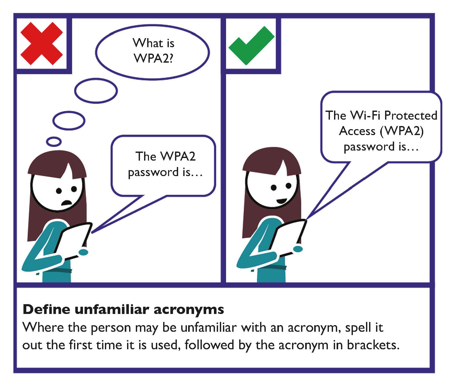
Define unfamiliar abbreviations or acronyms
Where a reader may be unfamiliar with an abbreviation or acronym, spell it out the first time it is used, followed by the abbreviation or acronym in brackets.
For example, the Personal Public Service (PPS) number.
Try to keep unfamiliar abbreviations or acronyms to a minimum.
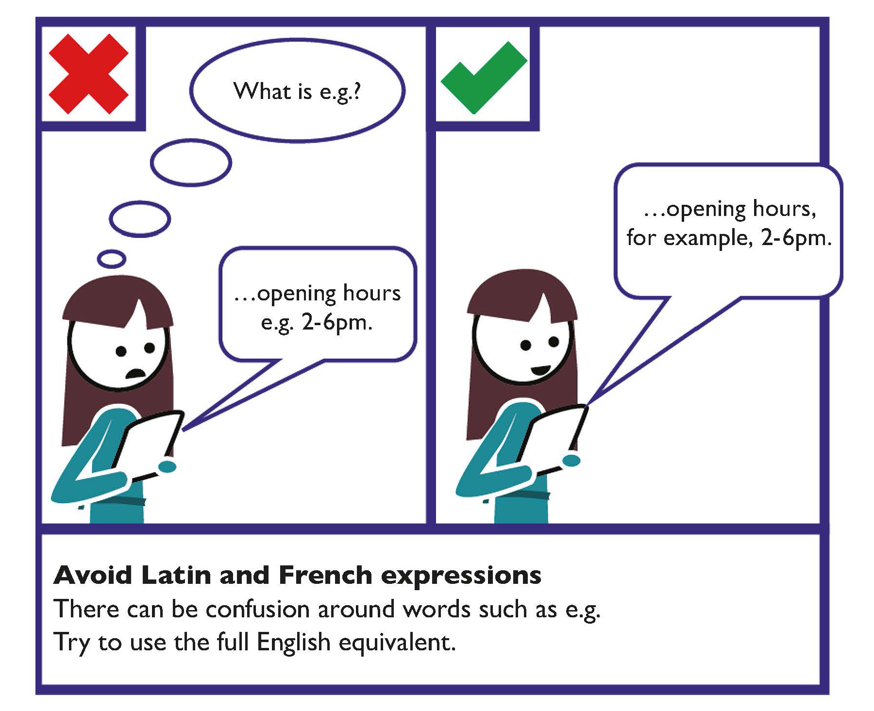
Avoid Latin and French expressions
There can be confusion around words such as e.g., i.e. etc.
Try to use the full English equivalents such as: ‘for example’, ‘that is’ and ‘and so on’.
Use your full organisation name on each page
Spell out your organisation’s name in full on every page. This is particularly important for members of the public who land there from search engines.
Use a house style
Develop a house style (or adopt a third-party style guide) to ensure consistency. This can also be applied to writing and layout standards.
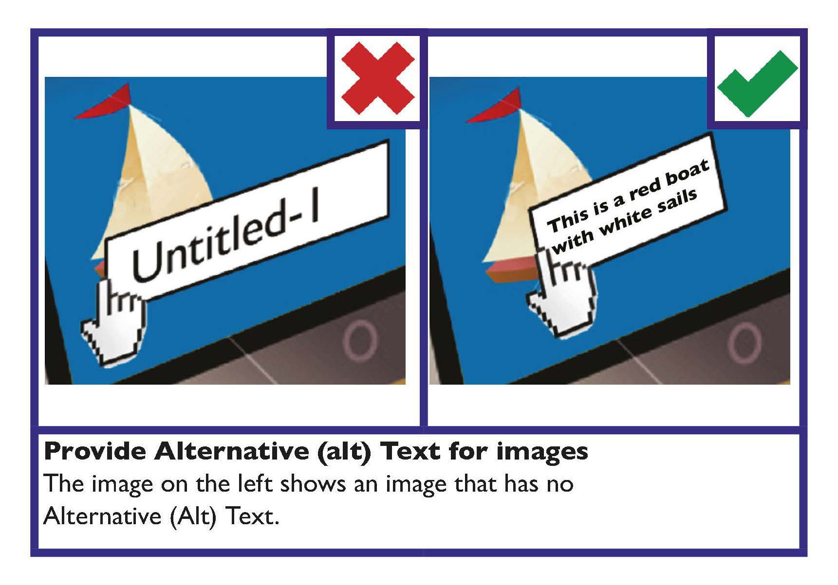
Use Alternative (Alt) Text to make images and media accessible
Alternative (Alt) text is text associated with images or media that conveys the same essential information as the image. Screen readers announce alternative (Alt) text in place of images.
Alternative (Alt) text can also be changed into other formats that some people may require, such as large print, Braille, speech, symbols or other languages.
Alternative (Alt) Text basics:
- Provide alternative (Alt) text in the alt attribute.
- Succinctly describe the main message of the image.
- Mark decorative images as decorative in the alt attribute.
- Add descriptive text within the body of text near the image when alternative (Alt) text can’t be provided in the alt attribute.
Learn more
Web accessibility guidance on CEUD’s website hosts a link to WebAIM’s guidance on alternative (Alt) text.
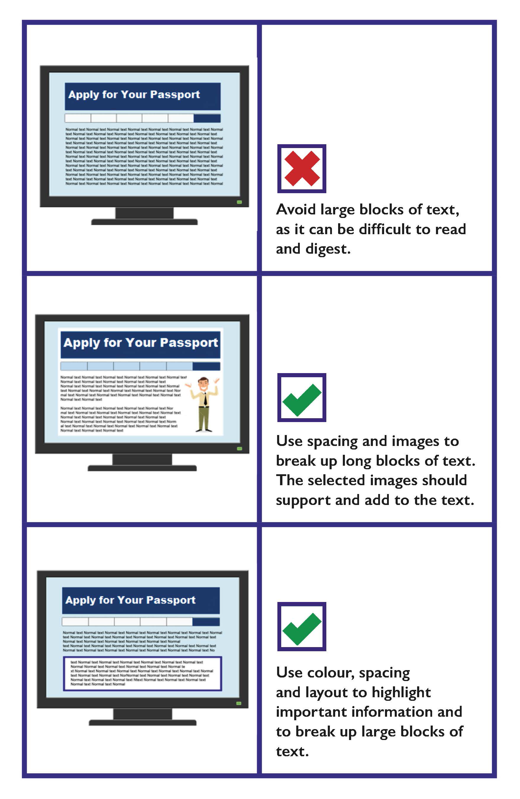
Use colour, spacing, images and layout to break up long blocks of text
- Use images to break up long blocks of text.
- Use images to support the information in text.
- Use white space to separate blocks of information.
- Use colour, spacing and layout to highlight the important information.
Use good quality, relevant images
Use good quality, relevant images that add to or support your text content. Avoid images that are low quality or images that are not relevant to the text content.
Writing for the Web Checklist
- Ensure you comply with Directive (EU) 2016/2102 on the accessibility of the websites and mobile applications of public sector bodies.
- Avoid technical language, Latin and French expressions and unfamiliar acronyms and abbreviations.
- Where applicable provide important information in other languages.
- Present content so that readers can absorb and understand the content quickly. Help readers to scan text by:
- Presenting key conclusions at the start.
- Presenting information in order of importance.
- Presenting detailed or background information.
- Providing links to related or background information.
- Keep content clear and concise.
- Use the full organisation name on each page.
- Use a house style.
- Use Alternative (Alt) Text to convey the same meaning as the images or media.
- Use good quality, relevant images that add to or support your text content.