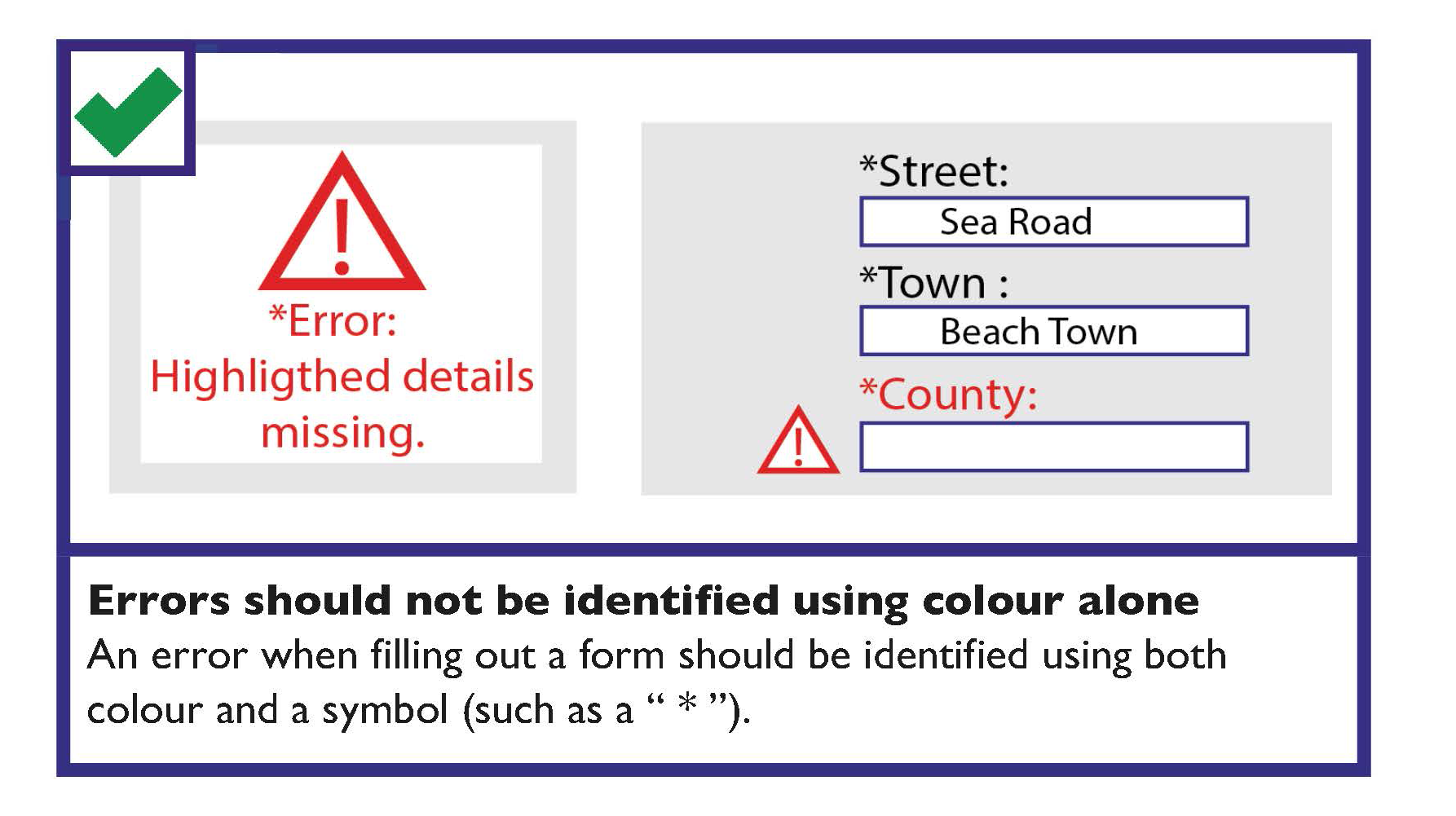
If the person is required to complete a form online, the form should be validated when they have completed the form. This is to make sure that the correct information has been provided before it is submitted. If an error in the form is identified, then there is a three-step process to correct the error:
1. Make the person aware that there is an error in an obvious and easy to understand way
There are a number of ways that you can make the person aware of the error:
- Consider alternatives to pop-up windows to avoid the difficulties these can cause for users of screen readers and other assistive technologies.
- Provide the error message on the web page itself.
- Provide the error message as the first item on a new page or focus should be set directly to it.
- Highlight the error. This should be identified using both colour and a symbol (such as a ”*”). Errors should not be identified using colour alone.
2. Indicate the location of errors on the form itself
If only one error has occurred, it may be more helpful to display the message and set focus to a point immediately before the area on the form where the error was made.
If several errors have occurred, the incorrect information should typically be displayed together. It is helpful to inform the person about the number of errors that were found.
3. Allow the person to resubmit and revalidate the form

Error Messages Checklist
Where an error occurs:
- Make the person aware that there is an error in an obvious and easy to understand way.
- Indicate the number and location of errors on the form.
- Allow the person to resubmit and revalidate the form.
